Sunday, January 31, 2021

New Color Combinations

                                                                   (C) 2021 Dale DiMauro

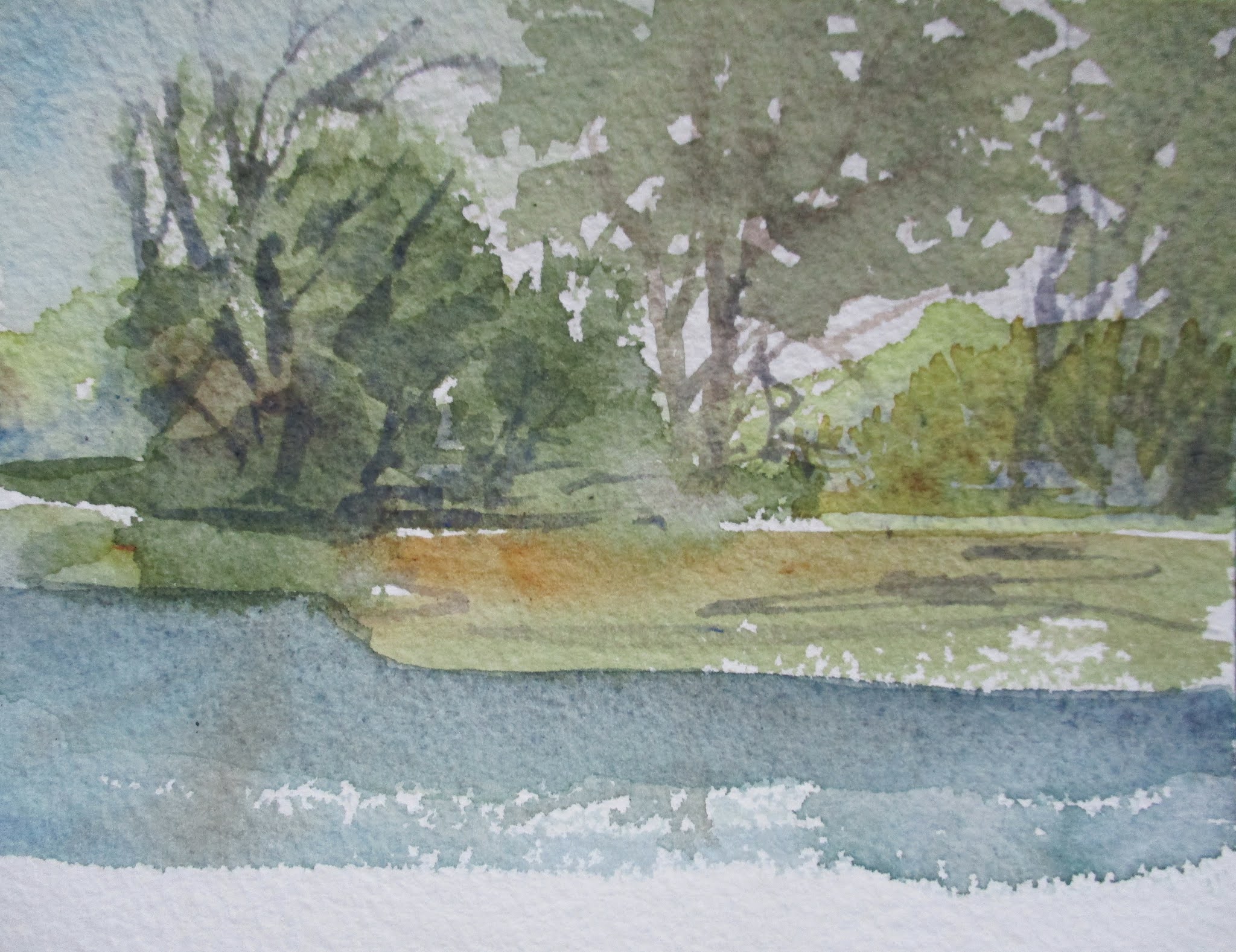
Mixing the three primary colors gives an artist such a range of color it is mind-boggling. First there are so many pigments you can draw from for your primary colors. For example, for red you could select from burnt sienna, alizarin crimson, cadmium red or Windsor red, among many others. Then you can select your yellows and blues from a whole catalog of choices which gives you so many color combinations.

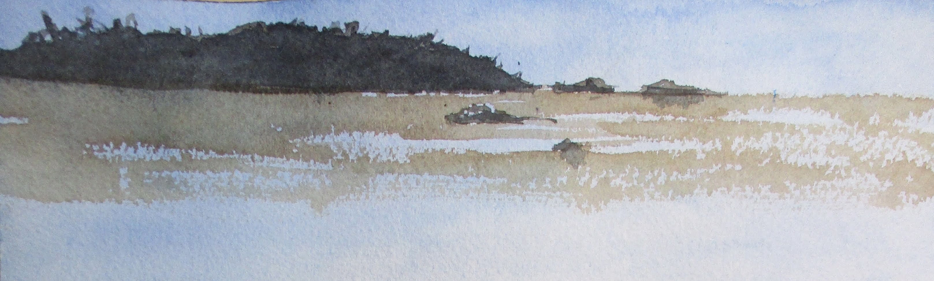
In this watercolor the vegetation is nearly black. And not a dull black but a lively one. It has taken years to discover this dark. I was experimenting the other day when I came upon mixing phthalo blue with yellow ochre and a reddish brown on my palette.

This is a dark you may see when you are driving along the Maine coast in the form of spruce trees, in the distance. I have learned that some of these colors are so ingrained in our unconscious mind from our experiences and memories of childhood. Most of these color associations originate in the landscape we call home or have lived.

Wednesday, January 27, 2021

Late Fall Landscape

                                                                    (C) 2021 Dale DiMauro
  

Painting the late fall landscape can be a season unto itself. On one hand you have the last saturated colors of the season, while the low, long light brings much cool temperatures across the landscape.

This was the first painting I did on a watercolor block in some time. Usually I work on several paintings at a time. This way if I become stalled or not able to return to a painting I can remain fluid in my approach.

It may seem like an odd little picture but I was attracted to the lay of the land and the dramatic late season light. 

Painting the rich yellows and oranges of the fall landscape truly pushes your understanding of your palette. Some of the oranges I used here are seldom used on my palette. It is important for me to veer away from some of the gaudy colors which can cheapen the season.

Sunday, January 24, 2021

Quill Brushes & Winter Landscape

                                                                  (C) 2021 Dale DiMauro
 

Painting the Winter landscape has always been rewarding to me. However, this Winter with COVID-19, mask wearing and sparse snow accumulations, it has been rather uninspiring to date. When the landscape and buildings are covered in a fresh blanket of snow with the distinct light and shadows it can be quite a spiritual experience.

Increasingly, I have embraced using quill watercolor brushes. These brushes are so versatile for laying down big washes and fine detail with their lovely tip. When painting outside I seldom need more than two of these brushes. Thus, I find it hard to lose any brushes and it makes clean-up quick particularly with the challenges one faces working outside.

Finally, I am enjoying the increased length of day with sunlight beyond five in the afternoon. If it not a cloudy afternoon this is a special time of day.

Wednesday, January 20, 2021

STILL LIFE

                                                           (C) 2021 Photograph Dale DiMauro
 

Still life is a subject matter I have not painted in quite some time. At times it seems like watercolor is not the best medium to express this but then I look in watercolor magazines and view these amazing paintings by a wide range of artists.

One afternoon this stunning sunlight shone across the hardwood floor in my living room. I scrambled before the light changed to arrange this as a still life. I found clementines from the kitchen, pottery from upstairs and a basket from my office, etc. 

The next question was do I paint this as a plein air, over perhaps, several days or take photographs and paint from them? Soon we had a period of cloudy days and both my inspiration and patience had faded.

However, I am reconsidering painting a still life. But how should I approach it? That remains to be seen.

Sunday, January 17, 2021

Hudson River School?

                                                                   (C) 2021 Dale DiMauro


Saturday in southern Vermont was a nasty day weather-wise with heavy snow. Shrubs and trees all over the region were bent over or crushed from the weight of the snow, in unnatural ways. It took me quite a while to free up the plant life on our property from the wet snow. From past experience, if not addressed, these plants sustain real damage in the form of damaged and broken limbs and severed trunks.

This watercolor was created between different stints of shoveling snow. So far I have only spent around twenty minutes of painting time. However, I like the start.

Since the New Year I am slowly transitioning to a larger palette, at least for the Winter - which is easier to clean. Instead of adding any more pigment to this established set, I have started painting until I use it all up. Along the way I figure this will force me to combine pigments I would not normally use thus expanding my skill and knowledge of color.

Wednesday, January 13, 2021

300lb Arches Watercolor Paper

                                                                      (C) 2021 Dale DiMauro

Arches watercolor paper has been one of my preferred surfaces to paint on. Both the sheets of paper and blocks provide a range of sizes and versatility to paint inside the studio or out in the elements. However, I am used to the thinner 140lb sheets. 

This watercolor was done on the 300lb cold pressed, Arches paper. It feels like a luxury to paint on with the texture and ability to retain layers of paint. Also, it dries a bit slower than the 140lb paper which can be an advantage.

I forgot what a treat this paper is to work on. This experience is making me reconsider my approach to watercolor. Generally speaking, I prefer using the thicker paper for when painting on a full sheet as perhaps it does not buckle as readily.


Sunday, January 10, 2021

Local Field

                                                                     (C) 2020 Dale DiMauro

This is a watercolor doodle that became a landscape painting. Last Wednesday afternoon I turned on the television and saw the attack on the nation's Capital as many other people did. I didn't know what to make of the horrific news but I had to do something to distract me. I grabbed the largest brush I have and painted the sky before moving on to the rest of the painting.

For me color-wise this is a different kind of painting. Back-lit lighting can make for a dramatic scene but I have not taken advantage of this setting much.

The warm colors in the foreground add a lot to the feel of this scene. I even added shadows with warmer colors, too. In addition, the tree does not seem as dominant with it's reddish-brown cast.

For me it is ironic that all the cool colors are in the background because that is where the sun is. However, it is an optimistic watercolor which I find appealing both for the time of year we are in as well as for the political and public health crises we are experiencing.

Thursday, January 7, 2021

Recent Plein Air Painting

                                                                        (C) 2021 Dale DiMauro
 

It had been a while since we had a beautiful sunny day. Even the weather forecast was for another cloudy day. However, one day early this week around noon the clouds parted and the sun emerged bringing a glorious afternoon.

I had been looking to squeeze in some plein air painting. This was painted looking outside a window in my house. I painted this in an hour or so. Nevertheless, the light changed a lot.

The winter light can be so captivating across the snow. I like the clean colors and warm light. This experience inspired me to take a walk and photograph this great light on the landscape.

Sunday, January 3, 2021

New Year, New Horizons

                                                                      (C) 2021 Dale DiMauro

With the advent of a new year comes new resolutions. This first post of 2021 welcomes a better understanding of my palette. Over time I plan on mixing and painting with greater yellows and browns.

I feel like I hardly use yellow and browns in my watercolors. Some of the greatest watercolorists who have ever lived such as John Singer Sargent and Andrew Wyeth were masters of color even if they used minimal amount at times. For example, I admire Sargent's use of yellows and browns in his canal paintings of Venice. There is a historical quality to these images without the use of heavy shadows or strong contrast in light.

This watercolor sketch uses color mixes I do not utilize enough. One has Indian yellow and Windsor violet. Another has cadmium red and ultramarine. Another favorite is quinacridone gold and alizarin crimson. I think you get the picture. The more I play with them the better sense of how to utilize them will emerge.