Wednesday, December 30, 2015

birds, mountains & water

(C) 2015 Dale DiMauro

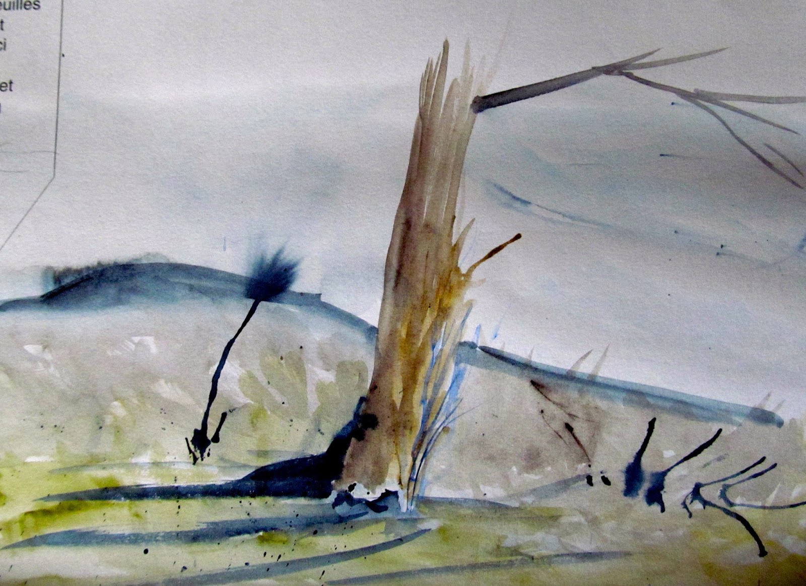
Earlier today, I came upon this little watercolor doodle on Arches 140 lb cold press paper, which was done a few months back. This close-up view reveals the texture of the watercolor paper, which was done on a scrap of paper the size of a large bookmark.

The abstract quality of this image is what caught my eye. The loosely painted sky with the simple tree-line and the reflections on the water remind me of some of Winslow Homer's Adirondack watercolors. The birds provide scale and movement to the scene. 

I may be mistaken but am pretty sure I used just two pigments for this: Payne's gray and ultramarine blue. Sometimes with experimentation you can learn a lot through these little studies.

Sunday, December 27, 2015

Before Winter

(C) 2015 Dale DiMauro

This is a local scene here in Vermont. It is walking distance from where I live. I amble through the back woods and climb to an old expanse of corn field belonging to the Brattleboro Retreat. It certainly doesn't feel like late December with such mild weather and soft earth beneath my feet. I cannot stop thinking about the fact that in a couple of days, after a winter storm of one sort or another: freezing rain or snow, it will all look so different.

Earlier this evening I started this little watercolor. I had been meaning to do a picture with an absence of buildings, and this sunny field caught my eye. All the raw earth colors of this time of year, which include the yellow ochers, raw siennas, and umbers, are exposed before they are covered with a deep blanket of snow or swaths of white and gray, creating a patchwork of ice and bare ground across the local landscape.

I appreciate the natural light at this time of year when the sun is low. It is a limited resource, yet it still makes the birds sing and highlights the open spaces.

Wednesday, December 23, 2015

Happy Holidays !

(C) 2015 Dale DiMauro

Often less says more. Sometimes a simple sketch or line drawing is just right. With spring-like temperatures here in Vermont, on some of the shortest days of the year, it feels like paddling weather. In front of our house a huge puddle has formed from tonight's rains. Our home faces south, and this week new growth has emerged, primroses and poppies. Unbelievable. 

Merry Christmas and happy traveling to all you people out there. Thank you for following, reading, sharing and offering your critiques. This all enriches the blog. Everyday I am amazed at people who are accessing the blog, from far flung countries across the globe to neighboring towns.

Sunday, December 20, 2015

Self-Portrait (Study)

(C) 2015 Dale DiMauro

Recently, I started this watercolor study of myself. My wife and I had been in a local corn field this fall on one of the most beautiful days of the season, when we took some photographs. 

This is a study for a larger painting I intend to do with a horizontal format. I have even considered doing a vignette, which is a picture with soft edges or an incomplete background. A vignette draws the eye to a focal point, such as a face with detail or an object worked on to a more complete state. 

I do not know how you can paint a self-portrait without referring to a photograph. It is interesting how we see ourselves in two dimensions yet exist in three dimensions. The self-portrait is a staple for artists, yet I find it a strange experience to be so focused on my own physical form.

What appeals to me are the colors of my skin in contrast with the blue of my shirt and the sky. I also like the shadows that cross my face, arms, and upper torso. 

One of the dilemma's in doing a portrait is what to include as well as what not to include. Should I include the hands or should it be a shoulder and head shot? How many cornstalks and where should they be located? 

Positioning the face on the paper is exciting, but how big shall I make it? I find it necessary to make the head no bigger than life size. I don't wish to exaggerate my flaws, but neither do I want to seem arrogant by making myself larger than life.  

Wednesday, December 16, 2015

All aboard!

(C) 2015 Dale DiMauro

This painting was inspired by two train excursions my wife and I took earlier this year. We had a brief break from our travels when the engineer encouraged passengers to step outside and get some fresh air for many and a smoke for others. I was struck by the abstract form, shadows and industrial quality of what we were riding in.

When I started this painting I was attracted by the composition, with this gray mass dominating the page. However, I found painting the various grays to be quite challenging as there is minimal other color in the painting. As the painting has developed I have come to appreciate the subtle variations in gray and their application is critical to expressing the form of the rail cars. In addition, painting the red stripes was important as the viewers eye is drawn to this color, which is complementary to the various gray color range.

What gives the painting its final impact in my mind, are the darks that I have added since last discussing this subject. The dark area below the train and between the cars provides such depth and a cool feel to the changing light. The brush of green at the bottom of the picture was to offer some contrast without drawing too much interest yet provide seasonal context. I consider this painting essentially finished.

The question of where to sign a painting and how large to make the name is not taken lightly. I have been contemplating signing this watercolor in the lower left with a red pen on a modest scale. Yet the name cannot be lost to the viewer once it is framed so it needs to be in from the edge of the paper as if in a margin when typing a word processing document.

Lastly, the framing material I have on hand is a charcoal gray, which I think will harmonize with the painting and contrast nicely with a white mat.

Sunday, December 13, 2015

Watercolor Study

(C) 2015 Dale DiMauro

All of the watercolor blocks that I have seen or used come with a cover and backing board. I painted this image on a corner of the inside cover of an 18" x 24" Arches watercolor block, which is their largest format. Since twenty sheets of watercolor paper are glued on all four sides of a block, artists generally do not need to worry about stretching the paper as there is minimal buckling. When you finish a painting all you need to do is separate the top sheet from the others with a palette knife.

This cover sheet is a perfect place to try out new or different techniques such as painting with a palette knife or practicing a few brush strokes with a new brush to see which effects you can create. It is also a great space to jot down notes or references or make a quick sketch. Additionally, it is a valuable area to work out details you later need to paint.

I did this watercolor as a warm up as I had not painted for several days. These watercolor sketches are painted very freely and dry quickly as the paper is quite thin. This particular sketch was painted with a very wet brush on wet paper, which causes the obvious color bleed.

Wednesday, December 9, 2015

New Brushes

(C) 2015 Dale DiMauro

Recently, I purchased these watercolor brushes from Jerry's Artarama, a mail-order art supply company. These brushes were priced very reasonably, in particular the larger sizes, which can get quite pricey, and that is why I purchased them.

The red-handled brushes function just like a Kolinsky, which is the standard for quality in watercolor circles. A Kolinsky brush has a reputation for holding a lot of water or pigment while consistently holding the bristles into a point. However, these red-handled brushes, labeled Creative Mark are called Mimik Kolinsky and manufactured with synthetic hair blends, thus, much cheaper than the squirrel and kolinsky sable that has been on the market. On the train painting I have been working on, I have used these brushes and find they hold an excellent point, and I love the feel they provide in my hand.

The other two brushes, called Harmony Squirrel Quill in sizes 6 and 12, I like for putting down a quick broad stroke early on in a painting. I am not necessarily plugging these products but am quite pleased with their reliability and craftsmanship. For me the brush you hold or the pencil or pen you grasp is quite personal. I prefer a brush that will make a mark that I can count on.

Sunday, December 6, 2015

Gray Matter

(C) 2015 Dale DiMauro

This painting at times has been a bit of a challenge. The form itself is like no other object I have ever drawn or depicted. This train has layers of metal stretched in subtle curves and molded forms that I do not see on a daily basis. The other thing about this picture, is that, it is all basically gray. Don't get me wrong. There are beautiful grays. There are cool grays and warm grays and industrial grays. There are shadows of gray upon other grays. There are pings in the gray metal and so on...

Once I got started on the watercolor, the painting was developing nicely, however, I have had other demands on my time and thus have only been able to work on it in bits and pieces. I do find it to be an unusually strong composition. There is life and mystery beyond the edge of the scene, in the shadows and down the tracks.

Recently, I have spent time contemplating the importance of gray in painting. The grays and neutral colors, at least in watercolor, do not merely set the mood or time of day but also enable the truly vibrant colors to shine. For example, the red stripes in the painting stand out in this color scheme. 

Based on habit, I either use Payne's gray, a cool, mixed with other colors or Davy's gray, a warm, right out of the tube. I have also mixed various other grays from sepia or cobalt blue but have lately begun to expand my range of gray. There is a world of rich grays, which I have been exploring, for example, from mixing burnt sienna and ultramarine. In fact, by combining any two complementary colors you achieve a gray or neutral color, which can be made warmer or cooler as needed just by incorporating the right pigment.

Wednesday, December 2, 2015

On the Avenue

(C) 2015 Dale DiMauro

This is a watercolor I have been working on over the last couple weeks with some interruptions from our kitchen remodeling. I had not painted a house in a while and was eager to get going on one. What appealed to me about this scene is the backlit landscape, the patterns of snow on the roof and the warmth from the sunlight on the hardwoods in the foreground, to the left.

I do not feel the photograph does justice to the painting. Days like today with heavy cloud cover and low light are challenging to attaining a good photograph. I have learned it is best to take pictures of my work outside in indirect light, when possible. The rainy day made this impossible.

(C) 2015 Dale DiMauro

If I have learned any great insight in painting it is that the subtle transitions of color from one element to another can have great impact. Color can communicate temperature, distance, and mood in relation to other colors, depending on how you convey it. In the above detail, from this watercolor, the stripe in the road is of significance. Some lines will divide a space into two, but this one just subtly directs the eye into the picture.  The opaque yellow complements the dark gray. The stripe for me adds some warmth to the pavement yet dissipates pleasantly into the shadows. To get the technically challenging
straight line, I used a ruler that was raised above the paper (supported by three pennies I taped underneath). I felt like it was too easy to mess up the painting if it was not convincing in its execution.