Sunday, March 31, 2019

Landscape Painting

(C) 2019 Dale DiMauro

Most of my life I have drawn or doodled landscapes. Often in pen or pencil, but with the addition of watercolor, there is an emotional or atmospheric component. Some of these are imaginary while others are derived from a physical place. 

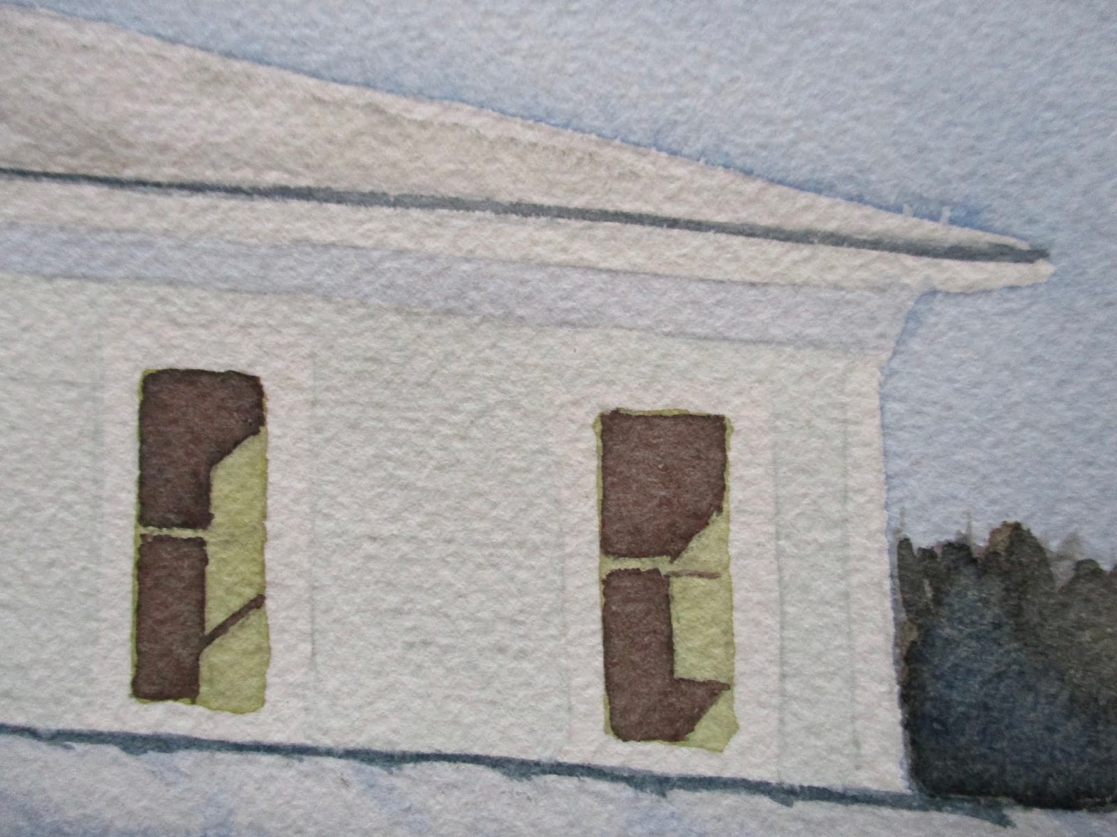
This one started out imaginary but evolved into a coastal Maine reference. Sometimes the marks on a paper can influence one's direction. Paintings in watercolor can exploit the quality of suggestion. That is, the texture of the paper or fragmented and incoherent washes can suggest an illusive quality. 

In this landscape, the zig-zagging blue wash made me think of coastal Maine. This led me to add the dense evergreen patch which I associate with coastal Maine. I even added the cast shadow in the foreground, from some of these evergreens. Strong associations come from the smell of the ocean and the quality of the light.

Wednesday, March 27, 2019

Keene, NH: Robin Hood Park

(C) 2019 Dale DiMauro

In Brattleboro, VT, where I live, the temperatures are rising, the snow is shrinking and the length of day continues to increase. It is the first time I can walk around my house in the last six months without slipping on ice. My lawn is actually beginning to re-emerge. I wouldn't be surprised if it requires mowing in the next two weeks.

It is also the time of year to begin plein air painting, once again. Along the way we will likely confront some sort of storms before Spring bursts forth. Regardless, it will be an exciting time to record the ever-changing light and colors of the season. What's exciting about painting outside is you have to be adaptable and reduce your expectations to the moment you are confronting.

Sunday, March 24, 2019

Andrew Loomis: Drawing the Head & Hands


For those artists out there who seek solid drawing skills in capturing the human form Andrew Loomis is and has been the master. This is the third book by Loomis I have acquired. His drawings are inspiring while displaying an economy of line and precision. 

This book, Drawing the Head & Hands, by Andrew Loomis was originally published in 1943. Unlike many books it has not lost resonance over the years. 

From my experience there are certain ages which are particularly challenging to capture. Loomis cites children between eight and twelve as more difficult than very young children or adults to draw. He identifies characteristics throughout the aging process for both genders to pay attention to when drawing individuals.

After perusing the current books available on figure drawing it feels good to return to Andrew Loomis books, which pre-date our dependence on the all-consuming world wide web.


Wednesday, March 20, 2019

Little Compositional Sketches

(C) 2019 Dale DiMauro


Developing a composition is fascinating in my mind's eye. This photograph I took on a hike inspired the small sketch above on the left. There is something captivating about the light and shadows as it rolls across the contours of the land at this time of year. 

However, the photograph is way too busy. As a result the viewer does not know what to focus on. By eliminating many of the unnecessary smaller trees and branches while shifting the large tree trunk off center a bit you create some depth in the picture. Ultimately, this draws the viewer into the landscape.

One off-center tree creates a natural arch to frame the scene. Or not. The guardrail has been eliminated because it divides the picture in half. Finally, one can now describe that big tree trunk with some details such as the pattern of the bark or the characteristics of it's branching.

These are some of the thoughts that race across my mind as excitement builds toward turning these ideas into a potential painting.


Sunday, March 17, 2019

Hahnemuhle Watercolor Book

(C) 2019 Dale DiMauro

Last month I purchased this watercolor sketchbook. It is manufactured by a company in Germany called Hahnemuhle. It is my understanding that this paper is durable and tends not to buckle. In addition, I like the idea of being able to paint on the go. 

This is my first painting using this paper. It may not be my finest painting but I found the experience intriguing. 

Up to this point I have favored cold pressed paper which has a bit of a tooth to it's surface. I most likely will continue using cold pressed paper but the Hahnemuhle behaves from my experience, similar to a hot pressed paper. Hot pressed paper leaves watermarks where water sits on the surface when it dries. While painting, some of those marks left around the face I found quite lovely. In addition, this paper seemed to take multiple washes quite readily.

In conclusion, I have had a hard time finding quality watercolor books to paint in. Most of the ones available, when found, are way too small for my liking. Hopefully, this book will take me on a journey through experimentation and development over the next thirty pages.

Wednesday, March 13, 2019

Manganese Blue

(C) 2019 Dale DiMauro

This watercolor began to take shape this morning. It is inspired by the warm, extended length of day we have been experiencing lately. 

For some time now I have been toning my paper or parts of it before digging in. The bottom of the sheet was painted yellow to exaggerate the blue shadows. There is a lot of manganese blue in this picture, which gives the shadows on the snow an electric energy.

Recently, there have been many opportunities to paint trees. Along the way I have been concentrating on painting more fluid branching.

When the watercolor sheet begins to buckle I have resorted to wetting the back side of the paper under the faucet at the kitchen sink. This seems to be a true and tested approach to leveling out the paper regardless of the weight of the sheet.


Sunday, March 10, 2019

Red & Green


(C) 2019 Dale DiMauro

This week it was important to paint a summer scene as temperatures hovered below average with a couple of winter storms, to boot. Part of me was seeking a different subject matter to paint. It was also an opportunity to modify the landscape to my liking.

The pencil sketches on top show the evolution of the composition. I wanted the building to frame the larger landscape in the background. For me, the road rolling across the landscape like a ribbon is an exciting part of the picture. 

The painting below is underway. It was important for me to explore using complementary colors in the focal point. That is the red and green you see in the foreground.

There is a warmth in the painting which I find comforting. Pure watercolor with clean brushstrokes and solid color.

Wednesday, March 6, 2019

Ed Hopper windows

(C) 2019 Dale DiMauro

Recently, I have returned to painting New England houses and snow scenes. This is a detail from a watercolor in progress. 

There have been numerous complements on the windows painted. There is an Ed Hopper quality to the natural light projecting across the interior walls. In addition, the austere quality of the window treatment and sparse decorations make for a striking presentation. Perhaps, it makes one question what is going on with this room in question.

It further emphasizes the importance of keeping the painting simple with bold washes where possible. In fact, after the New Year, I promised myself I would paint with the largest brush I could use for any given task. Perhaps, this way I would noodle around less and avoid going back into an existing wash.

In the process of initiating these recent paintings, I have come to realize how broader my thinking has evolved when it comes to color mixing. By habit I write down in a journal any color combination I read about or come upon which peaks my interest. As a result, I am forever testing out new and exciting color combinations. These windows, I believe, have richer colors than I would have come up with in the past.

Sunday, March 3, 2019

Brattleboro Outing Club

(C) 2019 Dale DiMauro

Last Friday I cross-country skied at the Brattleboro Outing Club. I longed for the conditions experienced. The sun was glorious and the temperature was mild, requiring light layers. I didn't experience any of the hard ice that dominated much of this winter. The increased length of day made it such a wonderful time, too.

This watercolor is a sort of memento of the outing club experience. There is appeal in the yellow siding of the buildings in contrast to the cool blue shadows cast across the open space. 

I am still finding my way with this thick Arches watercolor paper(300 lb). Recently, I have experimented with hot press in addition to the rough and cold press versions. This picture is painted on the cold press paper. The 140 lb Arches paper in the block or individual sheet form I am very accustom to.