 |
| (C) 2016 Dale DiMauro |
This may seem like an odd little post. Nonetheless, the other day my art mentor Gerard Doucette, recommended I try a technique which suggests movement on the surface of a still body of water. It is the kind of surface disturbance you see on small lakes and ponds around where we live here in Vermont.
The above photograph is a detail from a watercolor I am not far from finishing. The blue-green foreground represents the water on a pond with a pine tree in the foreground, to the left.
When using a flat brush, held vertically, a painter in watercolor can achieve this phenomenal result. By using a damp brush, with a horizontal motion, which strengthens the perspective, you lift pigment from the paper with a paper towel. Prior to this step, you need to have put down the pigment(s) that you are using to represent the body of water. All the whitish streaks on the area of water are the result of this technique. I have far from mastered the technique but it holds much promise.
It does take practice to perfect the technique and acquire good judgement but the results are amazing.
The reception for the Vermont Watercolor Society's exhibition "Seasons in Watercolor" was yesterday at the Moore Free Library in Newfane, Vermont. Even though this photograph doesn't show it, we had quite a gathering of visitors including family and friends.
Nine local watercolor artists are exhibiting their paintings, and collectively, it is quite an impressive display of work. Each artist has a distinct style, subject matter and differing techniques. The Crowell Gallery, which is behind the library, where the paintings are exhibited, is such a great space to exhibit paintings. The cathedral ceiling with the exposed beams, white walls and sense of privacy, appeals to many.
The show comes down on Thursday after being up since June 2. If you would like to see the show in person, the hours for the library and gallery are Tuesday and Wednesday 1 to 5 pm and Thursday 2 to 7 pm.
 |
| (C) 2016 Dale DiMauro |
Lowell Lake is a lovely body of water to paddle on, particularly on a hot summer day. The State of Vermont purchased two hundred some acres to be set aside for this state park in the late 1970's. With numerous islands and wildlife at arm's length, there is a vista in all directions and ever changing cloud cover.
When I was there most recently, it was an overcast morning with dramatic cloud patterns which really brought out the rich, cool greens of the vegetation. The reflections from this vegetation framed the cool passages of the relatively, still water.
I tried to capture these qualities without overdoing it. I introduced burnt sienna right out of the tube to the right middle ground to enhance the color variation of vegetation and provide a contrast to the cool temperature of the overall picture.
This is a continuation of the last posting, in a more finished state. Many people think this picture was plein air painted, but in fact, it was done in the studio.
 |
| (C) 2016 Dale DiMauro |
Recently, I went on a paddle with folks from the Brattleboro Outing Club. We paddled on Lowell Lake in Londonderry, Vermont on a cloudy morning. The inspiration for this picture comes from the clouds, stillness of the water and green foliage from the local landscape.
Clearly, I have just begun this watercolor, however, I do like the cloud in the middle of the sky so far. The cloud has dimension, yet I like the shadow as it sits over the distant ridge. When the dark middle ground evergreens are put in, this picture will come to life.
In the last year I believe my sky's have improved as they have become more diversified in color and content. My judgement as far as how far to go with developing the sky without overdoing it, has evolved. Hopefully, I will continue to get better.
 |
| (C) 2016 Dale DiMauro |
Sometimes when I am tired or my time is limited I grab a scrap of watercolor paper and simply try to match a color I see out in nature or in a photograph. This forces me to broaden my horizons and mix pigments I would not normally try. I find there is world of subtle variations within one color range from another which offers tremendous opportunities when explored.
For example, there is a huge range of greens which one can draw upon. Many of the muted greens similarly function as a range of gray whether warm or cool in temperature. While these colors or values may bore some people, if used to their advantage it can make the focal point in a picture truly shine.
In the above photograph taken many years ago, I tried to match the color of the early spring growth after hiking a local mountain. There is something reassuring about identifying with the local color as it is associated with our experience in the natural world. Many of the colors I came up with were a combination of either cobalt blue/ raw sienna and or winsor blue.
 |
| (C) 2016 Dale DiMauro |
This is my window display at the 2016 Art Walk in Keene, NH. The window I got to display in is part of Mon Amie Fine Jewelry which is at 39 Central Square. This window display is up from June 3 to June 12 which means it is coming down on Monday.
This has been the first time I have participated in the Keene Art Walk. I have not attended prior Keene Art Walk's either. However, I found it quite fascinating what other artists exhibited as well as how they displayed their stuff. This year was the 25th Anniversary for the Art Walk so it has a following in Keene and beyond.
As you can see from the picture, I couldn't really hang any paintings from the window so my wife and I had to devise a creative approach to displaying the work. Fortunately, my wife was able to exhibit the paintings as she works in Keene, primarily on three easels, as I was busy working for the Strolling of the Heifers last week.
 |
| (C) 2016 Dale DiMauro |
When I think of a summer day in Vermont, I visualize paddling and hanging out by a body of water. When it is hot and humid I like to escape to a shady spot where I can take a dip, check out the wildlife and pull out either my sketchbook or watercolor set. Also, I enjoy reading a book along the shore under a big shade tree.
This watercolor I have been working on reminds me of those dog days of summer. I like the rich, cool blues of the water, the green vegetation on the distant shoreline and the fellow paddler sitting on the warm pine needle groundcover.
This picture has been painted freely with vibrant wet-on-wet washes. The man does a lot of communicating with his hands and I believe this image captures that quality about him. Originally, the tree trunk was behind his hands in the dead center of the image but I off set it to his left. This enhances the presence of his gesturing hands, which I think are crucial in the composition of the picture.
 |
| (C) 2016 Dale DiMauro |
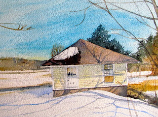
Last winter I did not get to cross country ski as much as I usually do because of our lack of snow. Late in the season I even purchased new skis with metal edges in an attempt to improve my chances for next season. I volunteered to help elementary school kids as I usually do, embrace the outdoors. Still, like many outdoor people I was waiting for snow to come and it didn't.
This little watercolor is a memento of winter, that you could slide into your wallet to remind of you of what winter is like in Vermont. This was painted on Arches 300lb watercolor paper. This thicker paper I find gives me more time to work the color in to the paper as it stays wet longer.
The natural light of late winter projected on the landscape and the warmth of the earth colors appeal to me in this picture. Also, I like the shadows of the undulating landscape and how they describe the quality of the land.
 |
| (C) 2016 Dale DiMauro |
Recently, I have read several new watercolor books. One, Watercolor Techniques, by Michael Reardon, I particularly like. He paints in a manner quite different from me, but attains great results by utilizing complementary colors and conveys good overall composition.
As a result of these readings I have been inspired to experiment more than ever with new and exciting color mixes. I seldom use green right out of the tube as the color is flat and dull. However, when you mix a green on your own, such as the vibrant one in the foreground it brings a vital, fresh quality to the picture. This green is the result of combining veridian with quinacridone gold. These color mixes when applied to the paper make you look at other colors differently.
In addition, I purchased a new paint set for plein-air painting that produces vibrant, rich colors like no other. I learned recently, of the major difference between the professional half pan sets as opposed to being sold the student grade, as often found in your local art store. For years I have used professional grade Winsor Newton tube paints which I love and find reliable. However, I did not know there were even available professional grade watercolor pan sets. The student grade colors dry so faint and bleached out looking that it has frustrated me for years.The manufacturer of this new set I have is Yarka, a St. Petersburg, Russian supplier for over one hundred years.
Finally, I had computer problems which prevented me from posting last Sunday. In this day and age we and our computers are targets for all kinds of potential viruses and hacking in general. This can be a real disruption in our daily lives to not be able to readily go on-line.


