Sunday, July 31, 2016

Acadia National Park

(C) 2016 Dale DiMauro

On our recent trip to Bar Harbor, Maine we did a bit of hiking in Acadia National Park. We were told island visitors were up twenty percent for Acadia National Park's centennial year. However, we did not encounter congregations of people any larger than in years past. 

With the hot weather even reaching Mount Desert Island, we decided to hike in the late afternoon in the shadows of other mountains. This approach worked splendidly one particular day. We hiked Great Head above the ocean and Sand Beach then through a forested valley before climbing to the top of Gorham Mountain just as the evening clouds began to move in.  We had views in all directions of vast ocean and numerous mountains.

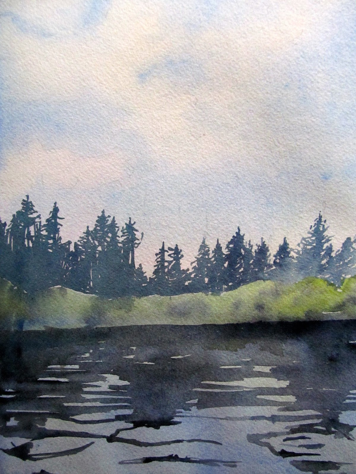
This watercolor was inspired by our hike up Gorham Mountain. Earlier in our trip we stopped at an art store in Portland, Maine where I picked up a tube of Winsor green (blue shade), which I was eager to try out. There is some Winsor green mixed with burnt sienna in the midground vegetation.

Wednesday, July 27, 2016

Albert Bierstadt: Autumn Birches(Approaching Storm)


Last week, my wife and I visited the Portland Museum of Art, in Portland, Maine. We admire many of the traditional paintings from their collection, which we usually can find on exhibit in one of the several back galleries. I have always been taken by Albert Bierstadt's painting, Autumn Birches (Approaching Storm). When you walk in the gallery where it is being exhibited, it captures your attention immediately. It is not just the striking red foliage but the storm-like clouds, which some attribute to the conflict leading to the impending civil war.

Bierstadt painted this oil on board around 1860 in the White Mountains of New Hampshire. He lived from 1830-1902. He was born in Germany but came to the United States as a toddler. Many landscape painters of his era traveled to scenic landscapes during the warm season and painted outdoors en plein air

Much of this information is reported on a display panel next to the painting, hanging at the Portland Museum of Art, in Portland, Maine.

Sunday, July 24, 2016

Thumbnail sketches

(C) 2016 Dale DiMauro

Before I took a little summer break, in part from the heat, my art mentor Gerard Doucette, urged me to develop a strong compositional approach. Not that prior paintings were weak, but early in the process emphasizing the value of quick ten-minute sketches. These are value studies where an artist determines what is important as well as what to prioritize. As such, the focal point of a picture is presented with clarity as well as how best to position it on the paper.  In some cases the focal point is best in the center of the piece but in others off to the side is stronger. Any unnecessary elements are discarded as they simply clutter the overall painting. Details are not a consideration at this stage.

These sketches above are compositional studies Gerard did with me regarding a picture I have been thinking a lot about lately. Annually, we have a local ski jump in my town and the man depicted is a fellow marker who helps determine where a skier lands on the hill. 

First of all, I like that the viewer is looking up at the individual, which conveys a sort of reverence for the man doing his job. Second, since the painting will be orientated vertically it strengthens his position on the paper as he stands upright. Since he occupies the right side of the paper, we have shifted the mass of evergreens from the upper right corner to the upper left which balances out the composition.

These are simply some thoughts I put out there in an effort to strengthen my painting process, hopefully resulting in better paintings. Perhaps you can draw from this or at least look at my watercolors with a broader perspective.

Wednesday, July 20, 2016

Winslow Homer: " A Fishergirl Sewing"


My wife and I headed out on our annual summer vacation to Maine last weekend. The increasing heat and humidity in Vermont, which is typical for this time of year, were great incentives. We visited the Portland Museum of Art, in Portland, Maine, early in the week and I came upon this book in their gift shop which depicts great watercolors by Winslow Homer I had never seen. 

The title for this book is: Winslow Homer in England by Tony Harrison (published in 2004 by Hornby Editions, Ocean Park, Maine). It is a revised and enlarged version of Winslow Homer in Cullercoats (published in 1995 by Station Press in the U.K.).

The image on the cover is Homer's watercolor "Fisher Girl with Net" (1882), which, like many Homer paintings, is owned by the Sterling and Francine Clark Institute in Williamstown, Massachusetts. Homer at The Clark was the subject of my previous post.  

Winslow Homer painted over seven hundred watercolors, mostly of American scenes, whether it was of outdoorsmen hunting or fishing or children in rural settings. However, this book features his time in England, when he studied the lifestyles of coastal fishing folk and their daily routines.  

I particularly like Homer's watercolor, "A Fishergirl Sewing" (1881), which measures 12" x 18 1/2". The book notes that the girl is actually baiting lines, not sewing. I am fond of this picture for Homer's handling of the brush in painting the woman. He conveys the scene without much color, yet there is warmth in the depiction of the figure from the skin tone, her posture, and the rendering of her clothing, including the folds in the fabric. However, most of the scene is conveyed through the use of various grays and browns, muted warm and cool washes.

I keep reminding myself, that Homer painted in a time before electricity and when materials such as watercolor paints were not as readily available nor reliable, as we have today. The dark and somber tones may have been determined by the limited color choices on his palette as well as the limited lighting.  

Sunday, July 17, 2016

A day at the Clark

Winslow Homer: American 1836-1910

This is a photograph I took last Thursday when my wife and I visited the Sterling & Francine Clark Art Institute in Williamstown, MA. The Clarks were very fond of Winslow Homer and had collected quite a few of his paintings. This Homer painting, done in oil in 1877, is titled Two Guides.

If you have not been to The Clark, you are really missing out. It is a world class art museum in a rural setting with an impressive new wing and enhanced setting. Their collection includes multiple works by each of the painters Sargent, Renoir, Homer, Innes, and Cassatt, among others.

In the summer, after visiting The Clark, we usually catch a quality play at the Williamstown Theater Festival. This year it was Rose Tattoo, written by Tennessee Williams and starring Marisa Tomei, a remarkable production.

Even though this painting is in oil, a different medium than my usual choice of watercolor, I admire how the clouds were done, which has been a subject of interest for me of late. The shadows cast by the clouds define the light over the distant hills, a view found daily in the outdoor spaces here in Vermont.


Wednesday, July 13, 2016

South pond

(C) 2016 Dale DiMauro

This is the early stages of a watercolor I started last week. I was inspired by the infinite water patterns on the surface of a local pond after paddling on a hot summer day. The clouds seemed to race across the sky, which were reflected on the water, as it was a sunny day.

I have been experimenting with painting more diverse atmospheric effects. In my clouds I have used ultramarine, Payne's gray and raw sienna. Lately I have been blending and softening the edges of the clouds by lifting paint. To do this I use a dry paper towel while the watercolor sheet is still damp. It dilutes the color in certain areas and takes out the hard edges. In addition, I drop in some pigment of red or yellow to brighten an area of the sky, particularly if there will be dark evergreens added later on.

For water as on the surface of a pond, I have been combining shadow green with Payne's gray and ultramarine to achieve deep, cool effects as seen above. There are times when simply suggesting movement on the surface of a lake with a few squiggly strokes of the brush may fool the mind into believing there is water lapping against the shore.


Sunday, July 10, 2016

Modern day Thoreau

(C) 2016 Dale DiMauro

On the dog days of summer there is no better place to be, but in the water, on it or at least near it. We had a picnic lunch on a small island with nearly a three-hundred and sixty degree view of the lake, vegetation and distant Vermont hills. Naturally, there was a ton of bird activity, vocally, but it was difficult to see many birds in the brush or on the open water.

There are such strong color combinations in this watercolor which are appealing. In the foreground are orange and blues while on the distant shore there are yellows and greens. I like the quality of light seen throughout the picture without seeing the source. The light projected on the man's shoulder through the various canopies is quite lovely, even though the photograph does not give it justice.

In a prior post, I mentioned how I used a lifting technique to remove paint to create those subtle horizontal disturbances on the water. I could have carried that approach farther but regardless I feel like it added a lot to the picture.

Wednesday, July 6, 2016

Looking down river(phase 2)

(C) 2016 Dale DiMauro

This painting makes me think of the coast of Maine with dark evergreens and rich blue, coastal waters. I like to work on a landscape painting when I can, even though people tell me it is hard to do in watercolor. It is an endless quest to arrive upon paint mixtures that approximate the colors of nature.

Some changes to the composition of the watercolor from the last post have been made. I removed the island which I was told looked like a shark and added the shorter evergreen as it breaks the scale of the bigger evergreen and is more pleasing to the eye. The result is greater substance to the foreground on the right. Also, I like how you can see through the trees.

When I started this painting I saw it as an opportunity to improve upon the clouds I paint. I have read where the sky sets the mood for the overall painting and it is the first area I paint in a watercolor. While clouds can be difficult to paint convincingly, I thought they came out okay. I used many pigments to create the sky. Theses included: raw sienna, payne's gray, ultramarine and cobalt blue.

Sunday, July 3, 2016

Looking down river

(C) 2016 Dale DiMauro

We have a state park in my town called Fort Dummer with southern oriented views of the Connecticut River. A nuclear plant is being decommissioned beyond this bend in the river. The river is quite shallow in some areas as it opens up with many pockets and inlets for wildlife habitat.

I have always admired this view from high up in the woods at a picnic table down into the river valley with the hills and much of the sky in view.

This picture was done on 300 lb Arches watercolor paper with which I have been experimenting more lately. I find this paper holds moisture longer, has greater texture, while building up greater concentration of pigments.