Wednesday, June 7, 2017

Muted Colors

(C) 2017 Dale DiMauro

This week there has been progress on this full sheet watercolor. First of all, this picture does not have much color, which is the strength of the composition. The muted colors help to make the red water bottle cap come forward. The background has been kept simple and lacking in detail, to avoid conflicting with the figure.

Mask was used to preserve some white areas for the hair. It has since been removed and painted over. The shirt which dominates a majority of the painting has distinct folds of fabric.

There has been much positive feedback regarding this watercolor. When matted, framed and hanging on the wall this picture will have an impact on the viewer. The posture, scale and water bottle details command your attention. However, there is still work to be done on the shirt, fanny pack, face and hat.

Sunday, June 4, 2017

The eyes have it or do they?

(C) 2017 Dale DiMauro


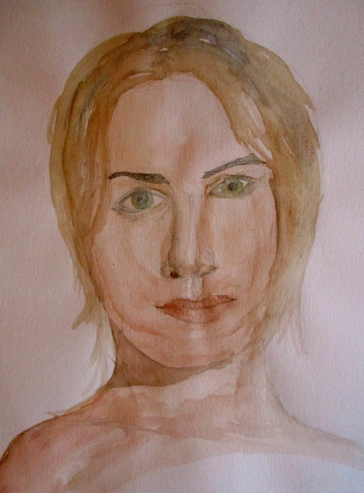
Last winter, I turned this drawing into a little watercolor in my sketchbook. Looking back at this image I find the shadow below the chin to be stunning. Is it a warm shadow or a cool one? The photograph does not do justice to the image. However, when I look at this warm shadow as I see it, I feel the time of day which was a mid-day shadow. For a little watercolor done in one sitting with  a minimal amount of pigments I am quite pleased with the overall affect I attempted to capture.

There is something about the lips and skin tone which are quite pleasing, too. It is a challenge to make the lips look like they weren't pasted on. They can lack dimension which gives them a flat appearance. I am not saying they were greatly painted but that they have a warm feeling to them.

Regardless, it is good to thumb through work in the past either to see your progress as well as consider how you would approach things differently. I do think drawing and painting makes you see things more clearly for what they are. 

The subject of this post was conceived because I could not stop thinking about those qualities I find in this image. I do believe meaningful art goes beneath the surface to some deeper understanding or conveyance. 

Wednesday, May 31, 2017

Big & Bold

(C) 2017 Dale DiMauro

Since winter I have embraced larger scale drawing and painting. Little-sized drawing pads seem inadequate these days. I think it is simply that this larger scale makes a greater impact. Recently, when I was with a group at the Museum of Fine Arts in Boston, the framed paintings hanging on the walls didn't seem so big.

In contrast the plein air paintings I have been doing on Sundays, are on small watercolor blocks. However, painting outside is an entirely different game as the light changes rapidly and the elements can be a real challenge.

This drawing was inspired from a photograph I cut out awhile back. I would give the photographer credit but it is misplaced at this point in time. What I try to catch is the way the light crosses the human form in addition to an individual's expression.

Sunday, May 28, 2017

The View from Mt. Wantasticut

(C) 2017 Dale DiMauro


With the recent rain here in Vermont, I put in a bit of work last week on this watercolor. It is on a full sheet(22" x 30") of heavy rag paper(3oolb) where you can build up glazes and achieve a range of effects across the surface.

One of the qualities I like about this picture is that the colors are relatively muted. There are few strong contrasts, as in distinct shadows, but what color there is, really pops off the page, as in the red water bottle cap. In addition, I find the distant, blue mountains against the skin color to be stunning. That area is yet incomplete. 

The folds of the shirt and contours of the fanny pack in their abstract shapes, could be a painting unto itself. I am excited where this picture is headed as originally the distant landscape was not given much thought.


Wednesday, May 24, 2017

Portrait: Walter Mondale

(C) 2017 Dale DiMauro

When I brought in the mail earlier this month I kept looking at the cover with this face on it. In today's political environment, Walter Mondale's persona seems to have acquired greater honor in this era of reality television and fake news. Yet Mr. Mondale's face is unmistakeable to anyone who has lived long enough to be aware of Walter's background.

People saw this drawing and knew exactly who it was. There seems to be a strong relationship between the eyes, nose and mouth that is unmistakable to all humans.

This pencil drawing was inspired by a photograph on the cover of Macalester Today by David J. Turner.

Sunday, May 21, 2017

Plein air painting

(C) 2017 Dale DiMauro

Plein air painting is a challenge but I am committed to working on one small one each week for a while. I purchased a new watercolor easel intended to be used outside and a beautiful palette/ pan set by Sennelier. The challenges to painting outside from prior experience include the changing light, weather patterns such as wind and bird droppings. Ultimately, you have to keep your composition simple and paint in a direct manner with minimal detail.

The most challenging thing for me is to plot out where I am going to paint in advance. This way I am mentally prepared for what I will be faced with. This painting was done as I sat on a picnic bench in a nearby state park while I sat in the shade and looked toward the sun. I kept this painting to one hour in duration.

This painting has too much green for me, even though there were layers of green in the scene. I am learning my way around this new palette which has bright, rich pigments. I like the warm tones and the soft and hard edges in this picture.

Wednesday, May 17, 2017

Henri Matisse

(C) 2017 Photograph Dale DiMauro

Today I was fortunate to join the Saxton's River Art Guild, on a bus trip to the Museum of Fine Arts in Boston, MA. One of the special exhibitions on view was Matisse in the Studio, which runs from April 9 - July 9, 2017. Henri Matisse was a french artist who lived from 1869-1954.

This painting by Matisse is titled, Marguerite with Black Velvet Ribbon, painted in 1916. This was done with oil paints on wood. The subject is Matisse' daughter who was twenty-three at the time she was painted.

With simple brush strokes and lines, Matisse suggests deeper emotion and substance than many other artists of his time.

Sunday, May 14, 2017

Blues & Grays

(C) 2017 Dale DiMauro

Over the last couple weeks I been developing this painting with many other demands stalling its progress. The seasons have changed greatly since I originally conceived of this composition. However, I now consider it a memoir of Winter 2017 as if I could take it out of my wallet like an old photograph marking a period in my life.

This is a view from our front door facing South. It has that backlit quality which I have to come to appreciate. In the late afternoon, in the Winter, on a sunny day I have observed a glow that can be projected on to the landscape or comes from it. The angle of the sun is low, projecting these long, yet dramatic shadows. When you notice the quality of this light, if you come upon these conditions, there are elements in the landscape that you didn't notice before. Anyway, this quality and light inspired this picture. It is not finished but I like the direction it is going. The little tree is basically an under painting for the evergreen that will be in it's spot. I like how the building is off center in the upper right.

Wednesday, May 10, 2017

Manganese blue

(C) 2017 Dale DiMauro

Over the course of this past Winter I have worked on a number of snow scenes as it is a major atmospheric quality here in Vermont. I have transitioned from exclusively using cobalt blue and ultramarine for my snow palette to include manganese blue. At times I use this pigment straight out of he tube and it has an electric quality that can light up a watercolor. This pigment projects a great feeling of temperature on to the watercolor sheet. There are not too many pigments from my experience capable of doing this.

You can see some of the qualities of this color in the above watercolor detail. At times I contrast it with a warm gray as in a paved road or against sunlit snow which has some raw sienna it to provide variation. Against cool-toned evergreens it can seem downright cold yet increase warmth in the sunlit areas.

My palette has more blues than any other color. The colors I mix continue to evolve as we speak, but manganese is likely to stick around. 

I do not seek to promote nor discourage the use of manganese in your watercolor palette. However, as I experience Winter in Vermont I see how it can be valuable in conveying the landscape. 

Sunday, May 7, 2017

Spring cleaning

(C) 2017 Dale DiMauro


Last week I started to thin stuff out of my studio space.  Stuff collected as it does from time to time in the form of framed paintings to art supplies and hand-me downs. I have had no where to put twenty or so framed paintings so they sat leaning on my flat files which I thus could not get at. So I started emptying out my closet to put new, more relevant, stuff in. 

Well, it is a huge improvement. I have a five-foot wide birch topped drafting table which I have not seen in it's entirety in awhile. It feels like I have acquired new real estate.

Some of this cleaning is inspired by the advent of Spring and much due to the dreary weather forecast for the next ten days. This little pen and ink with watercolor I came upon in my cleaning. To me it speaks of the enthusiasm for Spring and Summer here in Vermont, where the landscape is beautiful.

Wednesday, May 3, 2017

Portrait: Elie Wiesel

(C) 2017 Dale DiMauro

The other evening I was watching the television show Scorpion, with my wife.  Often, late in the evening, while the television is on, I search for something or someone to draw. Now that I have a comfortable reclining chair perfect for drawing, it easier to get in a mindset for drawing.

Since I am always searching for faces to capture, I have learned that older people or at least people weathered by some particular environment, offer greater character to convey, than others. It is amazing the subtleties of light across the face that you can pick up on when you pay attention.

The subject is Elie Wiesel, a Holocaust survivor, who was a noted author, teacher and activist. The credit for the photograph that inspired this sketch goes to the US Holocaust Memorial Museum. I just couldn't resist sketching his interesting facial features. I do not know that I captured his essence, but I had fun doing it.

Sunday, April 30, 2017

Watercolor sketch

(C) 2017 Dale DiMauro

The transition from winter to spring seems sudden, this year, in Vermont. Three Sundays ago I was cross country skiing, while today I mowed my lawn and put my kayak rack on the roof of my car. This week alone I saw a white skunk in daylight, a garter snake, dandelions, cats bathing in the sun and rolling in the dirt. A neighbor's dog even got free from its masters hold and took off for an inspired jaunt.

This is a simple watercolor sketch I did several years ago. It was inspired by the colors of spring. For me, there is something appealing about pen and ink combined with watercolor. The pen and ink conveys structure while the watercolor provides atmospheric affects.

On occasion, I pull out one of my fountain pens, which have beautifully flowing ink and start drawing. These fountain pens have water resistant ink, which do not smear when wet, enabling watercolor washes to flow freely with no concerns. My favorite fountain pens are made by Waterman, Pelican and Cross. 

However, I find many types of watercolor paper are too textured to draw on, at least with a pen. Hot-pressed watercolor paper is one alternative choice, which suits me just fine.

Wednesday, April 26, 2017

landscape sketch

(C) 2017 Dale DiMauro

This is a little landscape sketch I did this afternoon between appointments. I was pleased with this as it is not on particularly good paper and my time was limited. When you use inferior paper I have found, you do not know what your going to end up with. However, I do like to experiment. 

This image was done on a paper from an old packet of watercolor postcards that have been kicking around in my studio for a long time. Normally, this is about the size I test a color combination on before applying it to a painting. This small sheet is only 4" x 6".

What I like about this sketch is that it was done quickly with minimal fussing around. As one can notice, the grain of the paper runs vertically which creates interesting affects. After I lay down a wash I simply drop in pigment and brush it around a bit. I had fun working on this piece.

There is this new color that I am excited about, cobalt violet which can be seen watered down in the distant sky. Straight out of the tube it is an intense pale purple color but mixed with other pigments such as payne's gray, I find exciting, rich mixtures.

Sunday, April 23, 2017

Ligularia Spp.

(C) 2017 Dale DiMauro

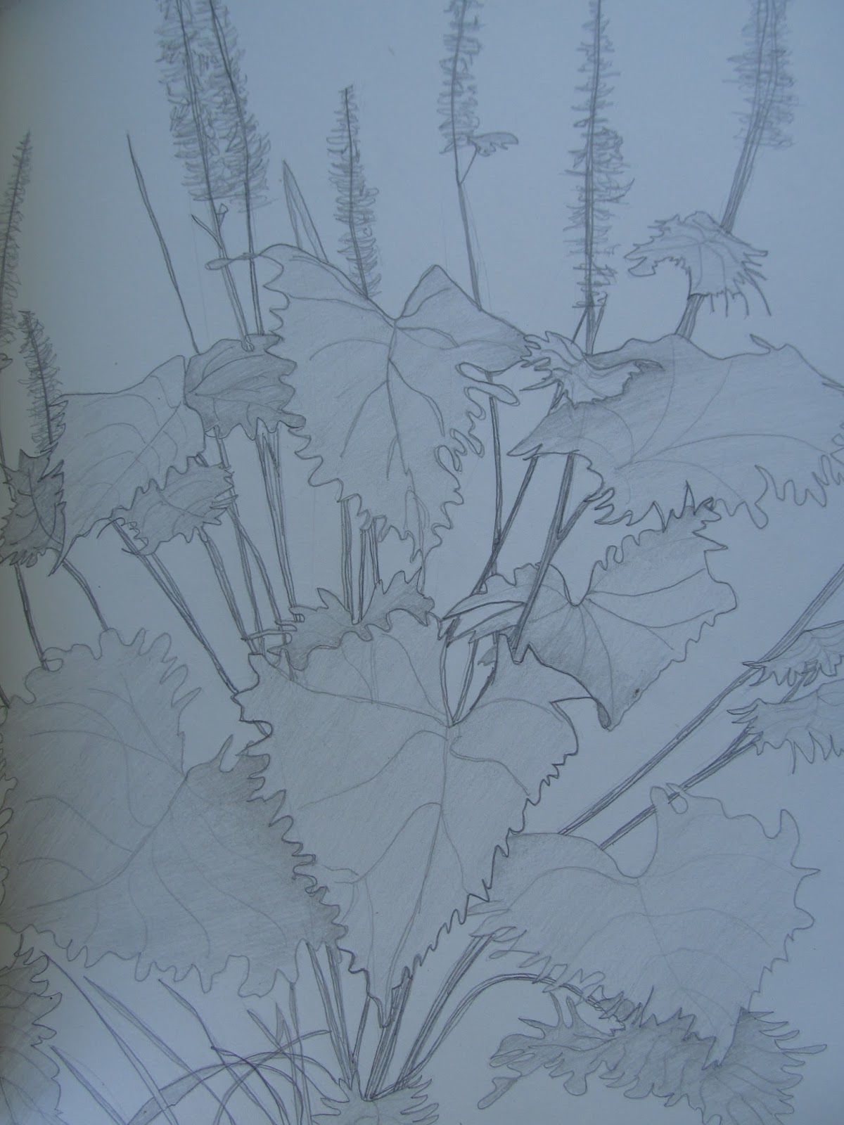
Towards the end of winter I was sorting through stuff in my closet when I came upon an old sketchbook with this drawing amongst others. It is of a plant from the genus Ligularia. I know at the time I was mesmerized by the architecture and grace of certain plants. Also, I had been studying plant communities, which are groups of plants that grow in similar conditions in natural environments. Plants from these communities tend to be healthier as they often share symbiotic relationships. 

This is a favorite garden plant of mine. When it flowers in June, the yellow-orange blossoms are striking against the lush green leaves. In addition to the form, I appreciate the veins of the leaves, as well as the serrated triangular shapes. I have to admit, I like the soft rendering of the plant in this drawing.

With the glorious day we just had here in Vermont, one could not help but think of spring. My wife and I just came back from a short trip to Saratoga Springs, New York where the river valleys seemed to become greener by the minute.

Wednesday, April 19, 2017

Watercolor blocks

(C) 2017 Dale DiMauro

These days watercolor blocks are popular. They come in a range of sizes from 7" x 10" and smaller to 18" x 24". Watercolor blocks are quite handy as they are portable and the paper does not require stretching. They are useful when working on a study or painting outside. Watercolor blocks are often ten to twenty sheets of paper glued together requiring an artist to separate each layer with a palette knife. There is a spot in the middle back where there is an absence of glue, which enables you to slide a palette knife through. 

They come with a cover sheet that protects the paper from the elements and general wear and tear. The inside cover is free space to record notes, doodle, test out color combinations and refine your composition. My art mentor Gerard Doucette, will often demonstrate a technique or idea in this space. I do little landscape studies and anatomy drawings in this area. 


For me this has become a fun area to work and experiment. These studies I do spur me on to finish a painting after I have had time constraints or been interrupted for a prolonged period.

Sunday, April 16, 2017

Old cigar box storage bins

(C) 2017 Dale DiMauro

Where I live in New England, there are many second hand shops. If you search out these places, there are treasures to be found. Within the layout of these stores there are displays for many vendors who sell all kinds of Americana from old wooden boxes to hand-made furniture.

Recently, I have taken a liking to these old cigar boxes which are great for storing artist pencils, paint tubes and supplies. I purchased these at a shop in Greenfield, MA, which always seems to have quite a selection to choose from. They are handy to transport art supplies, whether across the house or on a trip. I have found wooden boxes that close completely and others that have an open top, which are great to leave on my table.

One can certainly go to the local box store and purchase a plastic tupperware-type container, but for the same price or less I take some pride in reusing these storage bins, which have some regional history.

Wednesday, April 12, 2017

Ships at sea

(C) 2017 Dale DiMauro

There are some amazing marine painters producing inspiring work at their easels. Amongst others, I admire the work of Carl Evers and Jim Griffiths. Carl Evers was a master at portraying water and the many moods of the sea while Jim Griffiths captures historically accurate vessels from a different era with a fresh perspective. 

Both artists have been affiliated with the American Society of Marine Artists(A.S.M.A.) which paint historically accurate pictures of ships during their heyday based on considered research. There seem to be a limited number of these painters who work in watercolor. However, they are quite impressive.

In that vein, I was eager to attempt an ocean scene of my own, not expecting to achieve their prowess any time soon. From my own experience I do enjoy the atmospheric effects one experiences when in coastal Maine down by the docks or in a protected inlet. When you add the rich smells of the sea and the sounds of the coastal birds you can begin to imagine all kinds of history. 

Watercolor is a natural medium to capture the atmospheric effects of fog descending upon a ship or the last light of day. 

Sunday, April 9, 2017

Watercolor study

(C) 2017 Dale DiMauro

Many years ago, I purchased this hand-made artists watercolor-bound book, made in India. It is basically a sketchbook full of watercolor sheets. I have not been sure how best to use it as it has paper like none other. It has rough paper with a deckle edge and consists of sheets of a lighter weight than I usually prefer. In the photograph above, you can see that the paper is indeed rough, yet also tough. It takes some effort to work pigment into the lower areas of the paper.

However, after studying other artists who paint portraits, it occurred to me, that this is the perfect book to work on head or figure studies. I am very comfortable drawing on these sheets even though experienced artists will tell you not to draw on watercolor paper because if you have to erase, it will remove the fibers. Seldom, do I even carry an eraser when I draw so that aspect does not limit me.

I find the paper holds pigment well and dries quickly. Since I am not wetting the entire sheet I have not experienced any sheets buckling which can be a frustration for artists. In addition, individual sheets can be removed if desired. Finally, even though the paper is rough, I find it easy to attain detail when desired.

This week I began to use this book in earnest. I am only on the second page of fifty, yet am excited to see where I go with this. For years I have been searching for a watercolor 'book' with quality paper which provides the beautiful qualities that watercolor can attain. What is important to me is that I can peck away at a picture when time is limited or move forward in other directions. Progress is a great thing.

Wednesday, April 5, 2017

Figuring out the Composition

(C) 2017 Dale DiMauro

This is a drawing for a future painting. It is a contour drawing done on trace paper providing room for change prior to painting. It is important to figure out your composition as much as possible before you start your watercolor. Determining the size of watercolor paper that I need is an important consideration. It is better to have a sheet bigger than you need, from which you can eventually trim off any waste, than force your picture into a smaller sheet.

This is an image of my wife checking her phone as she waits for a subway train one morning in Brooklyn. Her wet hair is swooped up onto her head in a loose bun, and she has that slack-jawed expression of distraction and obliviousness to her immediate surroundings. The new normal in our contemporary society seems to be a lack of awareness of our environment and a hyper focus on the little screen. 

The first wash will likely be a gray-blue to set back the stark white of the paper enabling the figure to pop forward. Or I may even paint a graded wash which would become less intense as it fades into the distance. Either way the background will be kept simple.

I apologize for the poor photograph but have not had much success taking pictures of clear tracing paper in the past. It seems to capture that milky gray color with the crinkly quality of the paper. I try to take all my photographs in natural light as this was done and a majority of the time they come out just fine.

Sunday, April 2, 2017

Out in the Landscape

(C) 2017 Dale DiMauro

This is a watercolor study for a painting I keep coming back to in my mind. I worked on this one earlier this evening. 

It was mid- February when my wife and I went to Manchester, Vermont for the day. We recently had snow and the sky was as clear and blue as it could be. Late in the day we walked through the town park where the ball fields and trails are. The shadows across the snow and in the valley of the mountains were sharp and clearly delineated. This was the setting for this scene.

Not long after that day I started a full sheet watercolor, which I have since misplaced. I will state that it is hard to misplace a large watercolor. We were about to have some work done in the house so I stored it somewhere but I just simply cannot find it. I know sooner or later it will appear but this frustrates me because I was starting to gain momentum on the picture. 

In the meantime I wanted to carry it forward. Figuring out how I might paint the silhouette of the deciduous trees below the distant hill is important. Also, I want to capture the glow of the skin tone which borders on the edge of orange in the sun as well as the warmth of the posture. The proportions of the figure will become further refined as I carry it further.

I do like the peachy color down by my feet over the snow. As a matter of fact, I think it is stunning. It is a reason artists like me paint.