Sunday, August 9, 2015

Coast of Maine

(C) 2015 Dale DiMauro

I have been thinking about the subject matter for this painting for some time. Originally, I liked the dark, solid foreground balanced against the simple, yet abstract background.   

I intentionally took on several challenges in this picture. First, there is the really dark foliage in the foreground which to date I cannot say I had attempted. Generally speaking, I do not mix or apply darks or even black to the the degree I did here. For the foreground to be this dark often requires the background to be in the light. Yet I tried to get variety in the foreground with the verdant green growth in the front of the picture which is a combination of Payne's gray with gamboge. This combination provides an earthly color alive with moisture and light if you can capture it. However, the clump of evergreen trees in the foreground got away from me as I applied subsequent layers of watercolor. They ended up out of scale, unvaried and mechanical looking.

In addition, I am trying to get better at painting water with it's varying surface characteristics such as: placid, gentle waves, turbulence, whitecaps & reflections. Recently, I have been trying to capture the true color of the water I see, which always seems to be changing with the light. It is another thing to try to mix a comparable color. There is an overall cool feeling provided by the range of blues.

In watercolor you learn something every time you put paint to paper. Sometimes it is the most subtle change in color or how much the paint changes from when it was wet, until it is in a dry state. 

Wednesday, August 5, 2015

New finds from Maine vacation

(C) 2015 Photograph Dale DiMauro

On our recent excursion along the the coast of Maine I purchased the above art materials. The three tubes of watercolor paint I have already put to great use. They include Payne's gray by M. Graham & Co., which I ran out of in Maine. It is a cool color that dries much lighter than it comes out of the tube. I found a heavily discounted raw umber, manufactured by Winsor & Newton, which I use quite often for warming up an area of snow or for sunny distant woodland branching. The third tube is new to me, shadow green made by Holbein. With this cool green I seem to get a better deep water or ocean color with many variations of cools related to it.

The little watercolor block we found at the Currier Art Museum in Manchester, New Hampshire on our way back Sunday. It is only six inches by six inches, but I was able to do a little watercolor sketch of my father-in-law as a way to get a feel for the paper, as it is new to me.

The conte' pencil, in sanguine color, I found at the Portland Art Mart, where I had picked up two of the paint tubes. It provides a real terra cotta feel to portrait drawings with a rough scratchy mark or fine detail for the contour of a nose. So in the end we have more than photographs and memories to draw upon. Pun intended.

Sunday, August 2, 2015

Framing Joiner

(C) 2015 Photograph Dale DiMauro

My wife and I have been traveling, it has been hot, and I have not been able to paint as much the last week so this post may seem rather uninspiring. This is a photograph I took in late spring of a framing joiner I purchased from Cheap Joe's, a well-known art retailer in North Carolina. With the mat cutter that I already had and the above joiner, I have the tools to mat and frame my own paintings in-house. It is said that by the time you have framed your seventh painting you have covered the cost of your mat cutter.

The framing joiner shoots staples into the corner of your moulding providing simple, clean, strong professional framing. The staples attach to the back of the frame so you do not see them or have to fill in any holes. It came with staples for both soft and hardwood.

I have only practiced using this tool on some scraps at this point. Later in the fall, when the weather is less humid and I have more time, I will frame some pictures, but for now I have practiced on sections of a wide range of framing materials. I was surprised how easy the framing joiner is to use.  The staples go in cleanly and relatively quietly. 

Wednesday, July 29, 2015

Cool Cove


(C) 2015 Dale DiMauro


Since we arrived in Maine, I started this watercolor of a lobster boat. I do not have a ton of experience painting coastal scenes but have been eager for some time to give to it my best shot. I find I am laying out less of the picture in pencil, but if needed, will draw a little as I get into any uncertain areas. However, in watercolor it is advisable to lay out the picture in advance. There definitely are some flaws to the picture, in particular where I let a pigment run a bit, but overall there is a cool blue feel which is good on a July summer day. Recently, I was studying some of Winslow Homer's coastal scenes in his watercolors where he uses very free washes for the sky and thus attempted his approach above.

Some artists use very clean palettes but I am not one of those. I let different pigments mix with others from a prior painting and that is in part, one way I learn new color combinations. In the sky above, there was some red that was in one of my blue painting wells so I couldn't be fussy and had to work with it, once it was on the paper. Basically, I could lift the color from the paper with a paper towel, dilute it with water or embrace the 'happy accident' and learn from it.

I have been experimenting with a new color I purchased when we were at the Art Mart in Portland, Maine last week. This color is 'shadow green' which can be seen in varying degrees in the water around the boat even though it is mixed with payne's gray and indigo in other areas.

Sunday, July 26, 2015

Reflections in Time

(C) 2015 Photo Dale DiMauro

My wife and I have worked our way up the Maine Coast on our annual summer vacation with the weather turning much colder and damper. We have visited with relatives and even attended a high quality art show called "Gallery on the Green" in Southwest Harbor on Mount Desert Island. 

The above photograph is inspiration for a future watercolor painting. What I like about this image is the presence of the building, abstracted in the water. The physical form of the structure is not visible, but it is clearly present beyond the frame. The shimmering quality of the water is not drowned out in color, yet there is much variation in the shadows of the pilings. In fact, there are so few colors that what color exists subtly covers a great range.

Wednesday, July 22, 2015

Johan Barthold Jongkind

Photo (C) 2015 Dale DiMauro

On our arrival in the state of Maine, we were told the tall ships were in port. That is, in Portland's deepwater harbor. In fact, there were twelve tall ships; most were replicas of ships from the era of the War of 1812, and one was from as far away as Spain, a replica from the founding of St. Augustine, Florida in 1565. We were able to board the ships, talk with the crew and acquire a sense of how they set sail. They are quite a dramatic sight. Most impressive to me, are the individuals who climb up and out to the uppermost rigging to let out and bring in the sails. It is a great tradition.

The above oil by Johan Barthold Jongkind (1819-1891) titled "Norwegian Ship Leaves the Port of Honfleur" was painted in 1865. We saw it in the Portland Museum of Art, where it is part of the permanent collection. It reminded me of the tall ships we had just seen. Jongkind's picture is also one of my wife's favorite paintings, which she looks for each year when we visit this museum. I appreciate the simple composition, classic ship, varied sky and yellow water!

The entire collection of The Portland Museum of Art has just recently become available online (http://collections.portlandmuseum.org), but it is best to see the paintings in person.

Sunday, July 19, 2015

Thomas Gainsborough: the eyes have it

Photo (C) 2015 Dale DiMauro

My wife and I spent Friday in Williamstown, MA visiting The Clark Art Institute and then in the evening catching a play at the Williamstown Theater Festival where they have high quality acting on par with Broadway. If you have not been to The Clark, you are really missing out. Fortunately, for us it is a short drive to a regional museum with world renown.

This is a photograph I took of a detail of Thomas Gainsborough's (1727-1788) 1768 painting titled "Elizabeth and Thomas Linley" during our visit to The Clark. This brother and sister came from a family of musicians in Bath, England. According to the blurb next to the painting, she was a celebrated singer, and he was a precocious violinist. Our guide from a few years back, informed us that both died tragically at young ages.

I find the eyes to be all consuming in their different gazes and soul-revealing clarity. Physically, the eyes along with the red lips seem to unite the two children. One of the qualities of the painting I really love is the harmony of color from the young boy's rosy cheeks to the girl's subtly pink complexion and the overall warmth of the ochre background inviting us into the picture.

When we go to The Clark we alway look for this painting as if it is a memento of a loved one. It makes you stop in your tracks as if you are in their breathing presence.

Wednesday, July 15, 2015

Out on the Water

(C) 2015 Dale DiMauro

There was this marine painter called Carl Evers, who was a master at painting water in watercolor. His paintings of the sea in watercolors, many with goache, an opaque paint, are truly amazing. Somehow he acquired a rich grasp of the waves and huge swells of water with exquisite accuracy in color and character. Some of these characteristics--in addition to our anticipated, annual upcoming summer vacation to Maine--inspired me to paint this boat scene.

I have painted water in the past and have done okay with it, particularly the placid sort. However, I wanted to expand into moving water, whether ripples or raging rapids. Recently, I got a new rigger brush, a name derived from painting the rigging on ships. This brush is a size ten, which provides a healthy belly for holding pigment and water. I used it to build up the shape of waves in the foreground and thereby strengthening the perspective of the body of water. I included the sailboat behind the lobster boat because I like the wash of color contrasting with everything else and the feel of movement. In addition, I do like the dark mass of trees, which makes the boat come forward while adding an element of mystery.

Sunday, July 12, 2015

Out in the Sun

(C) 2015 Dale DiMauro


With our summer vacation to Maine fast approaching, the subject of this watercolor inspired me of the refreshing coastal waters, we shall soon be upon. There is something alluring about the cool lapping water, coastal breeze and different yet familiar sights. Today, in Vermont it is approaching a humid, ninety degrees. The pollen has been irritating my eyes for quite sometime, as it has others, but the humidity makes it more uncomfortable.

This little watercolor study is of an area of Bar Island off of Bar Harbor, Maine, which we visited last July. The tide comes in and goes out. However, if you are unaware you may be stranded with or without your vehicle, off the mainland.

Much of the sky was cut off when I photographed the painting. I think the golden ratio plays into this. The dimensions of this small painting are 5" x 9" which is an unusual size. However, when I photograph and thus reduce the size of a painting for the blog of standard sizes such as a 9" x12", 10" x 14" or 12" x 16" the proportions seem relatively intact from the original painting.

On occasion, I test my color combinations, for the right value on the side bar, which is the same sheet of watercolor paper as the painting, which is then cut off when I have completed the picture. 


Wednesday, July 8, 2015

Self-portraits

(C) 2015 Dale DiMauro

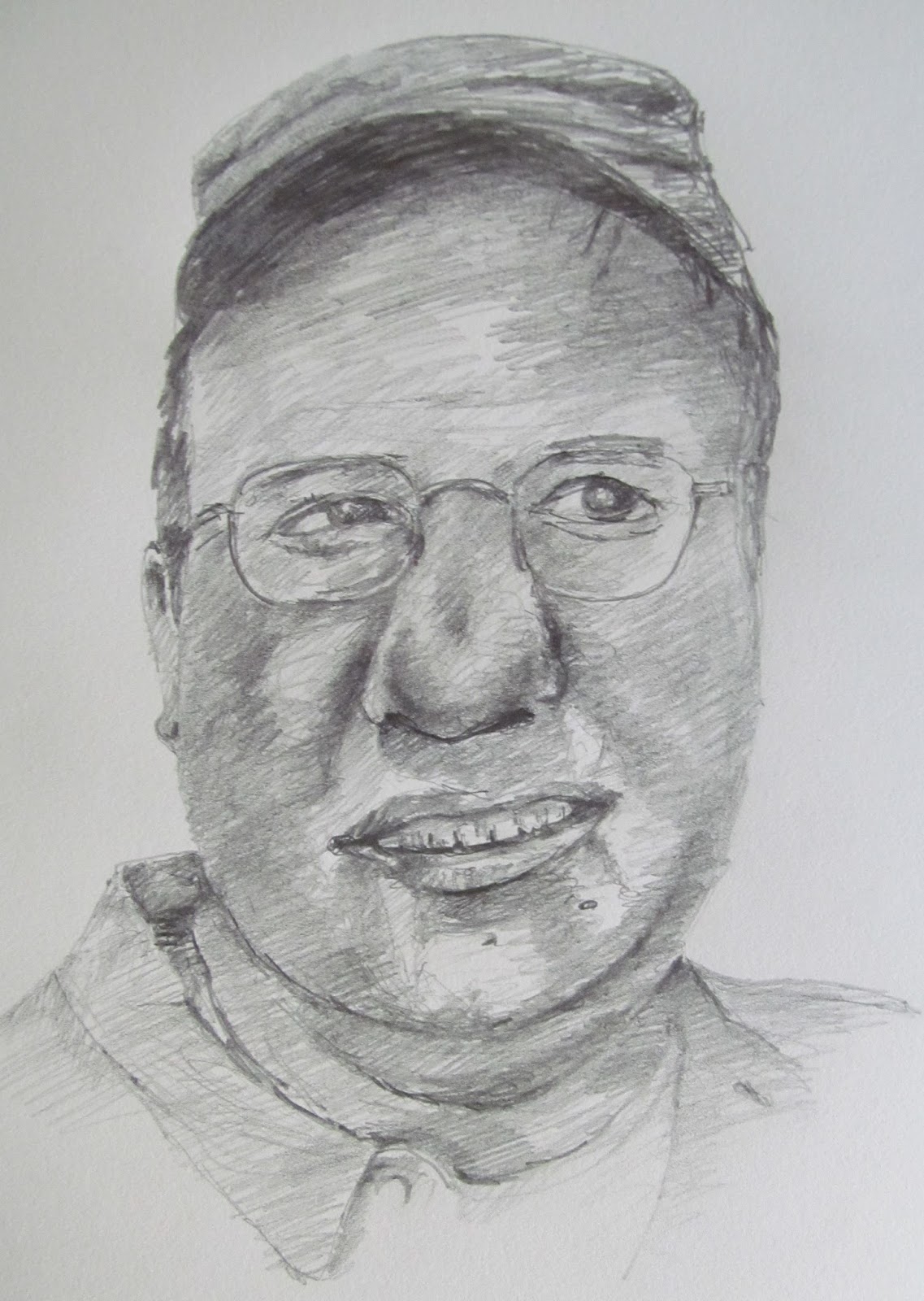
Earlier this week, on numerous occasions in the evening, I was sore from building a deck, so I decided to draw in front of the television instead of paint. The subject of my drawing has been my self-portrait, twice from two different photographs. Over time, I have drawn or sketched my share of people from life or photographs. Some turn out well, others are okay and occasionally they are a dud. The one above is a bit of a dud, and that is why I am blogging about it.

I find drawing myself with an objective view to be quite challenging. To draw a face with glasses, which is more common than not, adds an increased degree of difficulty. Often when you draw an individual with glasses, the eyewear dominates the portrait, and there can be glare. I prefer a three-quarter view over a frontal take because it can display more depth of expression and depict more of the topography of the face, but the photos I had on hand were frontal views. 

In the above drawing, the left side of my face was obscured as it was in shadow alongside my wife's in the photograph. My nose as depicted appears larger than it is due to a lack of definition and because the glasses in reality come further down my face. I believe the proportions of the face (i.e. eyes, nose, mouth and ears) are relatively correct. However, from this perspective the subtle modulations are lacking in definition.

Many people have commented that my facial studies and drawings reveal character. Some people have told me that I should exhibit them in a bigger venue, and others have said I need to draw these faces on a grander scale. This self-portrait is not ready for that. In my drawings I try to express individual personality in addition to some inner thought or mood. Perhaps with more practice, my self-portraits will reach a higher level too. Feedback anyone?


Sunday, July 5, 2015

Plein Air Painting

(C) 2015 Dale DiMauro

Here in Vermont, where I live, once the spring rains come everything greens up from the ground plane to high in the tree canopies. There is a wide color spectrum of green from the cool blues, found low and near water to the warm yellows found in meadows and up in some of the trees. After all, this is the Green Mountain State!

Recently, our garden has begun to bloom. We have many different lovely daylilies, which bloom in a wonderful variety of colors. However, I particularly like the 'Hyperion", which is said to be the most fragrant daylily. This daylily, which we have many of, blooms for nearly a month with lemony yellow/greenish blooms. When there is a border of these in bloom, it is simply stunning.

I seldom plein air paint as it is a real challenge in watercolor due to the changing light, slow dry times and necessity to finish a painting in one sitting. However, when it is really hot and muggy out, it is nice to go down by a river for a swim, paint and read in the shade. My wife took this picture of me earlier in the day as I was painting in our front yard.

I have acquired, over time, good painting tools, which make it much more enjoyable than when I started out. First of all, the easel is metal, sturdy and folds down readily for transport, and it has a plastic tray that clips nicely to the easel legs so all I really have to hold in my hand are the brushes. My water container clips on to the easel, making it a pretty hassle-free experience.

When I do paint outside it is important to keep things simple. I usually paint small studies that I can expand upon later. It is especially important to get the drawing aspect of the picture correct.

(C) 2015 Dale DiMauro

Wednesday, July 1, 2015

Early winter snow

(C) 2015 Dale DiMauro

This is a watercolor I started before I broke my wrist in early February. Now that we are in July where the temperature can heat up I plan on finishing this one, a cool season subject. I started this picture on a full sheet which is 22" by 30". To see a painting framed on this scale, across a room, can make quite an impact.

I was taken by the freshness of the scene. There is a lot of temperature in the elements from the cool of the snow to the warmth of the bark on the trees. The clouds seem to part before your eyes, revealing clean snow in contrast with the dark railroad trestle directing you into the picture. I find the painted crosswalk spellbinding.

The more experience drawing and painting, the greater I understand the importance of the dark areas revealing light and the sometimes subtle balance of both. I will post my progress and challenges along the way.

Sunday, June 28, 2015

The Benefactor

(C) 2015 Dale DiMauro

As a break from posting watercolor paintings and to offer variety, I figured it would be best to publish a portrait drawing. In late winter, as I was recovering from a broken wrist, I was eager to try out these new charcoal pencils purchased from Jerry's Artorama. While charcoal pencils traditionally make a mess, these claim to not smear at all. I find this claim to be quite accurate, and, in addition, they come in four different colors: black, white, sepia and sanguine. The above drawing was done with a sepia  pencil, a color traditionally used throughout art history. 

The subject is taken from one of my wife's alumni magazines in which they provide profiles of alumni with a page-length photograph. This is a drawing of a photograph taken by David J. Turner in the Spring 2014 issue of Macalester Today.

Using these jumbo pencils, one feels a waxy sensation as the lead is applied to the paper. For me, they are quite pleasant to use; however, it is not easy to keep a sharp point, thus areas around the mouth and eyes are not as precise as with a regular HB pencil. What do you think? 

Wednesday, June 24, 2015

Outward Bound (finished)

(C) 2015 Dale DiMauro

This is the finished version of the watercolor I posted from Sunday. In some ways the composition is very different from other buildings I have painted. The building is no longer in the center of the picture; in fact, some of it has been cut off. The focus really is about the changing of the seasons and the larger landscape. The building offers context, and I do like the shadows and warmth it projects. 

I seriously contemplated putting a figure on the covered porch, reading a book. However, I had already put in the trunk of the tree which sits right behind the porch and felt the figure would be lost in that very trunk. I believe painting a figure in the landscape would also reflect on the changing of the seasons with the warmer temperature and more conducive climate for outdoor activities. Regardless, I did not intend a figure to be the focal point. Often in town, here in Vermont, you go for a walk or hike and pass a home and you are not even aware when someone is around. I was searching to express that quality after I had started this picture when people begin to move outside from their winter 'cocoon'. People begin to rake the lawn, prepare the garden, and open their screen windows in eager anticipation of spring. 

When I do a picture of a Victorian house or some other architecture of this period, I frequently find people referencing Edward Hopper. Houses have many stories to tell, particularly when there have been many residents through the years and numerous building alterations. I do appreciate when an older home with fine architectural detail sits elegantly on the land with mature trees that complement its scale. Maybe that is my background in landscape architecture coming out.

I have altered the landscape significantly in this watercolor. All overgrown plantings and dark foliage have been eliminated. The land has been opened up to the the river valley in the background where the light is.

The sky in this picture I truly enjoy. I like implied movement in a picture and the passing of the clouds does it for me. The colors are not overstated. The shadows stretching across the ground plane suggest nearby trees and provide variety. Green, I find to be the hardest color to mix to satisfactory results. Most store bought greens come out of the tube in an 'artificial turf' like color. The green in the foreground is comprised of quinacridone gold with Prussian blue and occasional brushwork with ultramarine blue.

Sunday, June 21, 2015

Outward bound

(C) 2015 Dale DiMauro

This is one of those houses I have walked and driven by in my hometown countless times. 
If you live in a small town like I do, with some history to it, you make note of it, because it defines the town. Most of the older homes are in a prominent location, in the downtown area, and in our case are fortunately kept up. This particular house is pleasing to the eye with the mansard roof, multiple dormers, old shutters and timeless architectural details. The way this home sits on its flat lot in contrast to the distant ridge and river valley below and beyond make it an appealing subject to paint.

However, I did not want to depict it as it truly is. Recently, when I started this watercolor I had aspirations of painting a large picture but was going to start with a study in order to work out some issues with the landscaping. I wanted to enhance the presence and mystery of the river valley, which is to the right of the building.  This is the area of the picture where I imagine the greatest light to be, in contrast to the building, which casts its own shadows, existing tree canopies, and the driveway, which juts across the foreground. I intend to delete all the little bushes of rhododendrons and other random plantings, which are detrimental to strengthening the experience of the historic home and the sequence of spaces, which lead the eye to the view of the river.

I am always trying different approaches to the sky as they are so important in the picture. Some really contrast with the building while others offer subtle effects that set a quieter mood. In fact, the first area I paint in a watercolor is the sky, and in many cases it involves many washes including several blues. In this sky I can feel the clouds passing the chimney as they clear away towards a beautiful sunny day. I will let you know how it turns out or in which direction it takes me.

Wednesday, June 17, 2015

Summer squall

(C) 2015 Dale DiMauro


When I was preparing for my colonoscopy last week, I had to drink a lot of Miralax over a three hour period, which eventually makes you visit the bathroom way too much. As a divergence, I started this watercolor so I could focus on something else. I was forced to paint this picture in a very direct manner, with a simple color scheme and abstract shapes as I would have to run off to the bathroom for a while, frequently before a wash would dry.

This is a ubiquitous summer scene in the fresh water ponds, lakes and inlet coves of the state of Maine. Often you will have a beautiful summer day, when all of a sudden these dark clouds move in quickly, the breeze picks up and all signs of life disappear momentarily. You will hear birds squawk in the distance, waves lapping against the shoreline while whitecaps build out on the open water and then before long it all passes and their are breaks of sun again. At least this is an experience I retain from many summer visits to Maine since youth.

I introduced raw umber into the sky to create warmth and variation. The water is comprised of indigo, ultramarine blue, payne's gray and ivory black. The warmth of the rock formations on the shore is from yellow ochre. I added birds to dramatize the event and provide a sense of urgency, as a result of the conditions.

If I were to take this scene further, which I might at a later time, I would reduce the amount of water in the foreground and increase the amount of sky, thus making the viewer feel diminutive. I do like the dark foreboding quality of the water in the foreground, which immediately sets the mood. 

Sunday, June 14, 2015

The Good Wife, (further progress)

(C) 2015 Dale DiMauro

The latter part of this week was not particularly productive for me regarding drawing and painting. I had to prepare and thus recover, from a colonoscopy at the Cheshire Medical Center in our neighbor state of New Hampshire.

I started this painting of my wife back in late May but had become sidetracked with other demands of my time. My art mentor, Gerard Doucette, thought I should simplify the background even though I had already arranged the composition. I followed his advice with a couple of big, dark washes of warm and cool pigments around and behind my wife's head, thus pulling her forward in the picture. Her mouth looked as if it were pasted on her face because there was a hard edge around the lips which I lifted with a scrubber and paper towel. 

Now I am at the point where once the face is complete, there will be some final details such as finishing her hands and then the picture will be nearly done.

I do think the strength of the picture is the warmth of light conveyed across the model's face and reflected on her clothes. I have been experimenting with the combination of gamboge and payne's gray resulting in a rich earthly green, which I particularly like. You will find variations of this color in the foliage.

Wednesday, June 10, 2015

Sketchbook drawing

(C) 2015 Dale DiMauro

This is a drawing from my sketchbook following our trip to Washington D.C. in late April, 2015. We went to the National Portrait Gallery where I was inspired by paintings of American figures and past presidents. To my eye, the paintings of the earlier presidents was not at the level of the paintings of later ones. A lot has changed since our forefathers were around. The painting techniques, media, scale of the picture, composition, and expectations, etc. have evolved tremendously. One thing which has not changed is that most artists favor putting the left eye in the center of the picture above the midpoint. I mentioned this in a prior post but feel it is worth re-emphasizing. In this case, I intuitively positioned the subject that same way!

When we were in Washington D.C., my wife and I visited Ford's Theater where President Abraham Lincoln was shot. We found the National Park Service Ranger to be well informed and knowledgeable. However, the above drawing is not of that particular Park Service employee.

On a subconscious level, this picture is a composite of the individuals who crossed the stage that fateful night when President Lincoln was shot. I had recently read the Lincoln manhunt book of the events following the assassination, so many of the events were fresh in my mind. The dimly lit theater with threadbare curtains and the shadowy president's box lent some influence. Other guests had declined President Lincoln's invitation to the theater enabling John Wilkes Booth to continue with his murder plot.

The facial expression in the drawing evolved from a gregarious personality to a more reflective, diminutive individual with increased age. He seems to project the mood of the country following that period in our country's history. More specifically, his eyes are not locked in on any specific point of reference as if he has been traumatized.

I sketched this picture late one evening while the television was on with my favorite drawing pencil, an HB Cretacolor.


Sunday, June 7, 2015

Fly Fishing

(2015) Dale DiMauro adapted from a photograph
attributed to the American Museum of Fly Fishing

In Brattleboro, Vermont where I live, we have had a run of beautiful days for quite some time. In fact, the now famous Strolling of the Heifers which weaves its way through our downtown benefitted yesterday, from one of these dry and sunny, seventy-degree days. I enjoy this weather and really try to take advantage of some of the outdoor opportunities we have around here which include kayaking, tennis, hiking and skiing.

This weather inspires me to draw and paint outdoor scenes. I have driven by the Battenkill River in western Vermont many times and have sought to paint a watercolor of it before. Noted artist Ogden Pleissner portrayed the river life many times just as Norman Rockwell was inspired by his close proximity to this same valley. However, I did not have much time this past week but wanted to paint a figure in the landscape.

The above watercolor has the influence or look of a Winslow Homer. Not only is it an outdoor scene done in watercolor but you can see pencil lines which were left, a Homer trait. It has a relatively simple color scheme which harmonizes the picture while enhancing the focal point, which is the figure. However, it was not painted outside as many of Homer's were.


Wednesday, June 3, 2015

Sign of the Times

(C) 2015 Dale DiMauro

This spring Vermont experienced a prolonged dry period before it finally rained early this week.  I went kayaking with a friend a few weeks ago. To reach the water we drove down a dirt road between cornfields, and the dust our vehicles kicked up was unbelievable. I have spent my life mainly in the Northeast and the Northwest, two areas with plenty of rain and humidity.  This dirt road in the dry spell made me think of the Dust Bowl.  

The painting above looks like the Midwest due to the isolation of the house, the flat landscape, and the dry dirt road running along its side. In fact, the house stands in a village in central Vermont. I have exaggerated the Midwestern qualities in this picture because this spring has felt so different, somewhat foreign. People have said this looks like an Edward Hopper painting, perhaps because his work often creates that sense of alienation and isolation, which was common in modernism.

I intentionally isolated this building from the neighboring houses to heighten its starkness. I usually paint very blue skies but attempted a varied sky with streaks of rose and Winsor blue, which show on the painting but not so much in the photograph. The house clearly is unoccupied and the "for sale" sign emphasizes its precarious future. 

However, to me, there are a lot of positive aspects to this picture. First, it is spring, which brings promise. I like how the distant lawn rolls off the horizon and makes you wonder what lies beyond. I also like the upper window where you can see through the glass and back out into the sky. The unusual rock in the foreground was likely found from the nearby river and brought to the site to mark the property boundary, perhaps over a century ago.

For this watercolor I used Arches 300lb watercolor paper which is a thicker and heavier weighted paper than my usual 140lb. This thicker paper can take repeated washes with scraping and lifting of pigment but dries more slowly.