Wednesday, December 30, 2015

birds, mountains & water

(C) 2015 Dale DiMauro

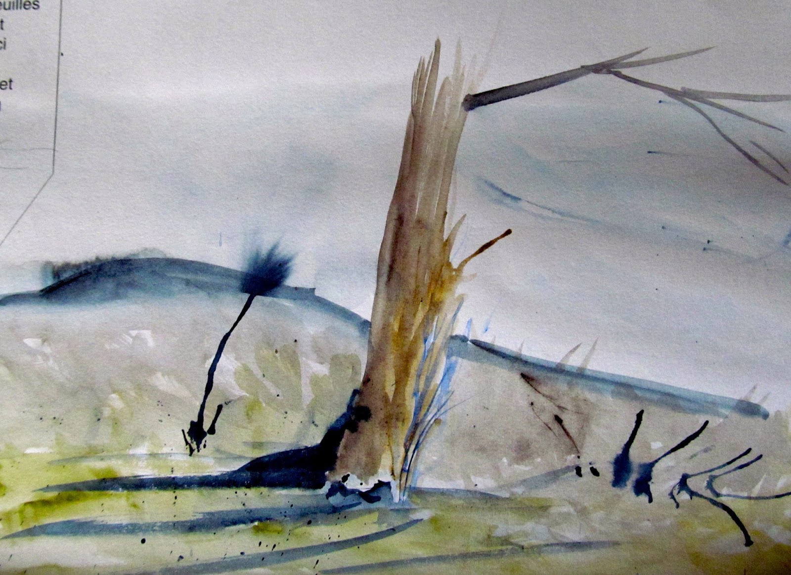
Earlier today, I came upon this little watercolor doodle on Arches 140 lb cold press paper, which was done a few months back. This close-up view reveals the texture of the watercolor paper, which was done on a scrap of paper the size of a large bookmark.

The abstract quality of this image is what caught my eye. The loosely painted sky with the simple tree-line and the reflections on the water remind me of some of Winslow Homer's Adirondack watercolors. The birds provide scale and movement to the scene. 

I may be mistaken but am pretty sure I used just two pigments for this: Payne's gray and ultramarine blue. Sometimes with experimentation you can learn a lot through these little studies.

Sunday, December 27, 2015

Before Winter

(C) 2015 Dale DiMauro

This is a local scene here in Vermont. It is walking distance from where I live. I amble through the back woods and climb to an old expanse of corn field belonging to the Brattleboro Retreat. It certainly doesn't feel like late December with such mild weather and soft earth beneath my feet. I cannot stop thinking about the fact that in a couple of days, after a winter storm of one sort or another: freezing rain or snow, it will all look so different.

Earlier this evening I started this little watercolor. I had been meaning to do a picture with an absence of buildings, and this sunny field caught my eye. All the raw earth colors of this time of year, which include the yellow ochers, raw siennas, and umbers, are exposed before they are covered with a deep blanket of snow or swaths of white and gray, creating a patchwork of ice and bare ground across the local landscape.

I appreciate the natural light at this time of year when the sun is low. It is a limited resource, yet it still makes the birds sing and highlights the open spaces.

Wednesday, December 23, 2015

Happy Holidays !

(C) 2015 Dale DiMauro

Often less says more. Sometimes a simple sketch or line drawing is just right. With spring-like temperatures here in Vermont, on some of the shortest days of the year, it feels like paddling weather. In front of our house a huge puddle has formed from tonight's rains. Our home faces south, and this week new growth has emerged, primroses and poppies. Unbelievable. 

Merry Christmas and happy traveling to all you people out there. Thank you for following, reading, sharing and offering your critiques. This all enriches the blog. Everyday I am amazed at people who are accessing the blog, from far flung countries across the globe to neighboring towns.

Sunday, December 20, 2015

Self-Portrait (Study)

(C) 2015 Dale DiMauro

Recently, I started this watercolor study of myself. My wife and I had been in a local corn field this fall on one of the most beautiful days of the season, when we took some photographs. 

This is a study for a larger painting I intend to do with a horizontal format. I have even considered doing a vignette, which is a picture with soft edges or an incomplete background. A vignette draws the eye to a focal point, such as a face with detail or an object worked on to a more complete state. 

I do not know how you can paint a self-portrait without referring to a photograph. It is interesting how we see ourselves in two dimensions yet exist in three dimensions. The self-portrait is a staple for artists, yet I find it a strange experience to be so focused on my own physical form.

What appeals to me are the colors of my skin in contrast with the blue of my shirt and the sky. I also like the shadows that cross my face, arms, and upper torso. 

One of the dilemma's in doing a portrait is what to include as well as what not to include. Should I include the hands or should it be a shoulder and head shot? How many cornstalks and where should they be located? 

Positioning the face on the paper is exciting, but how big shall I make it? I find it necessary to make the head no bigger than life size. I don't wish to exaggerate my flaws, but neither do I want to seem arrogant by making myself larger than life.  

Wednesday, December 16, 2015

All aboard!

(C) 2015 Dale DiMauro

This painting was inspired by two train excursions my wife and I took earlier this year. We had a brief break from our travels when the engineer encouraged passengers to step outside and get some fresh air for many and a smoke for others. I was struck by the abstract form, shadows and industrial quality of what we were riding in.

When I started this painting I was attracted by the composition, with this gray mass dominating the page. However, I found painting the various grays to be quite challenging as there is minimal other color in the painting. As the painting has developed I have come to appreciate the subtle variations in gray and their application is critical to expressing the form of the rail cars. In addition, painting the red stripes was important as the viewers eye is drawn to this color, which is complementary to the various gray color range.

What gives the painting its final impact in my mind, are the darks that I have added since last discussing this subject. The dark area below the train and between the cars provides such depth and a cool feel to the changing light. The brush of green at the bottom of the picture was to offer some contrast without drawing too much interest yet provide seasonal context. I consider this painting essentially finished.

The question of where to sign a painting and how large to make the name is not taken lightly. I have been contemplating signing this watercolor in the lower left with a red pen on a modest scale. Yet the name cannot be lost to the viewer once it is framed so it needs to be in from the edge of the paper as if in a margin when typing a word processing document.

Lastly, the framing material I have on hand is a charcoal gray, which I think will harmonize with the painting and contrast nicely with a white mat.

Sunday, December 13, 2015

Watercolor Study

(C) 2015 Dale DiMauro

All of the watercolor blocks that I have seen or used come with a cover and backing board. I painted this image on a corner of the inside cover of an 18" x 24" Arches watercolor block, which is their largest format. Since twenty sheets of watercolor paper are glued on all four sides of a block, artists generally do not need to worry about stretching the paper as there is minimal buckling. When you finish a painting all you need to do is separate the top sheet from the others with a palette knife.

This cover sheet is a perfect place to try out new or different techniques such as painting with a palette knife or practicing a few brush strokes with a new brush to see which effects you can create. It is also a great space to jot down notes or references or make a quick sketch. Additionally, it is a valuable area to work out details you later need to paint.

I did this watercolor as a warm up as I had not painted for several days. These watercolor sketches are painted very freely and dry quickly as the paper is quite thin. This particular sketch was painted with a very wet brush on wet paper, which causes the obvious color bleed.

Wednesday, December 9, 2015

New Brushes

(C) 2015 Dale DiMauro

Recently, I purchased these watercolor brushes from Jerry's Artarama, a mail-order art supply company. These brushes were priced very reasonably, in particular the larger sizes, which can get quite pricey, and that is why I purchased them.

The red-handled brushes function just like a Kolinsky, which is the standard for quality in watercolor circles. A Kolinsky brush has a reputation for holding a lot of water or pigment while consistently holding the bristles into a point. However, these red-handled brushes, labeled Creative Mark are called Mimik Kolinsky and manufactured with synthetic hair blends, thus, much cheaper than the squirrel and kolinsky sable that has been on the market. On the train painting I have been working on, I have used these brushes and find they hold an excellent point, and I love the feel they provide in my hand.

The other two brushes, called Harmony Squirrel Quill in sizes 6 and 12, I like for putting down a quick broad stroke early on in a painting. I am not necessarily plugging these products but am quite pleased with their reliability and craftsmanship. For me the brush you hold or the pencil or pen you grasp is quite personal. I prefer a brush that will make a mark that I can count on.

Sunday, December 6, 2015

Gray Matter

(C) 2015 Dale DiMauro

This painting at times has been a bit of a challenge. The form itself is like no other object I have ever drawn or depicted. This train has layers of metal stretched in subtle curves and molded forms that I do not see on a daily basis. The other thing about this picture, is that, it is all basically gray. Don't get me wrong. There are beautiful grays. There are cool grays and warm grays and industrial grays. There are shadows of gray upon other grays. There are pings in the gray metal and so on...

Once I got started on the watercolor, the painting was developing nicely, however, I have had other demands on my time and thus have only been able to work on it in bits and pieces. I do find it to be an unusually strong composition. There is life and mystery beyond the edge of the scene, in the shadows and down the tracks.

Recently, I have spent time contemplating the importance of gray in painting. The grays and neutral colors, at least in watercolor, do not merely set the mood or time of day but also enable the truly vibrant colors to shine. For example, the red stripes in the painting stand out in this color scheme. 

Based on habit, I either use Payne's gray, a cool, mixed with other colors or Davy's gray, a warm, right out of the tube. I have also mixed various other grays from sepia or cobalt blue but have lately begun to expand my range of gray. There is a world of rich grays, which I have been exploring, for example, from mixing burnt sienna and ultramarine. In fact, by combining any two complementary colors you achieve a gray or neutral color, which can be made warmer or cooler as needed just by incorporating the right pigment.

Wednesday, December 2, 2015

On the Avenue

(C) 2015 Dale DiMauro

This is a watercolor I have been working on over the last couple weeks with some interruptions from our kitchen remodeling. I had not painted a house in a while and was eager to get going on one. What appealed to me about this scene is the backlit landscape, the patterns of snow on the roof and the warmth from the sunlight on the hardwoods in the foreground, to the left.

I do not feel the photograph does justice to the painting. Days like today with heavy cloud cover and low light are challenging to attaining a good photograph. I have learned it is best to take pictures of my work outside in indirect light, when possible. The rainy day made this impossible.

(C) 2015 Dale DiMauro

If I have learned any great insight in painting it is that the subtle transitions of color from one element to another can have great impact. Color can communicate temperature, distance, and mood in relation to other colors, depending on how you convey it. In the above detail, from this watercolor, the stripe in the road is of significance. Some lines will divide a space into two, but this one just subtly directs the eye into the picture.  The opaque yellow complements the dark gray. The stripe for me adds some warmth to the pavement yet dissipates pleasantly into the shadows. To get the technically challenging
straight line, I used a ruler that was raised above the paper (supported by three pennies I taped underneath). I felt like it was too easy to mess up the painting if it was not convincing in its execution.

Sunday, November 29, 2015

Painting Test Strips

(C) 2015 Dale DiMauro

Many painters that I know use a scrap of watercolor paper to test pigment mixes prior to applying them to a painting. I test my colors to achieve the value that I am seeking, which in essence is the degree of darkness. Since watercolor dries much lighter than the initial wet mix, this test strip is a valuable tool. In addition, I make notes in a little field book regarding certain pigment combinations that I come upon. This way I have a portable record for future reference. In addition to trying different pigment mixes I also use scraps of different paper as there is a wide range of watercolor paper and thus a great range of effects one can achieve.

The little portrait at the bottom was done quickly, primarily as a means to achieve a relatively accurate skin tone, which can be challenging. Doodling on the paper and testing out color combinations keeps me from thinking too much. It is also a resource which I can come back and build on if I end up going in a different direction. 

Wednesday, November 25, 2015

Winter on the Avenue( Detail)

(C) 2015 Dale DiMauro

Recently, I started this watercolor of a very local building in our neighborhood. This is one of those corner stores that offers basic staples such as milk, newspapers, and Ben & Jerry's ice cream. Clearly, some of the things they offer aren't really necessities. Also, the building is not actually on a corner.

I had not painted a building in a couple of months. I like the light behind this structure, which really amplifies the complementary colors of blue and yellow. There is a lot of temperature in this painting from the pavement to the snow, shadows, distant hills, and sky.

If you live in Vermont, as I do, you have to embrace the piles of snow everywhere because they are not going away until late April or perhaps even May. Within those piles of snow are a fascinating range of color. Recently, I have been using cobalt, ultramarine, raw umber, and Payne's gray to express the warmth and coolness of the snow I experience.

Sunday, November 22, 2015

Portrait drawing in pencil

(C) 2015 Dale DiMauro

Recently, I purchased this book, Draw Faces: in Fifteen Minutes by Jake Spicer, an author from the United Kingdom. I am not necessarily plugging this book or author but find its layout and principles to be sound and readily communicated. Anyone beginning to draw or seeking to improve their skills will find this book as a good starting point. 

I have studied many of the great draftsmen throughout human history such as Durer, Da Vinci, Sargent, and Wyeth, to name a few. When I am drawing a face either from a picture or from life, I find the nose to be the most challenging. The nose really has no lines but projects a range of shadows. I noticed that Andrew Wyeth, for example, used reference marks to rapidly proportion the face as he began a portrait drawing.

Since drawing is a solid basis for painting and developing a composition, I find routine drawing to be important in developing one's abilities. Thus, I am always searching for subjects to draw and books that will help me improve my understanding of painting or the human form.

I had always relied on drawing with an HB pencil, the pencils you are provided in public school to write with or fill in the ovals of your S.A.T. exams. Recently, I have been exploring a greater range of pencils, particularly the B range, which provide a softer mark for greater expression. The above drawing was done with an HB and a B pencil.

Wednesday, November 18, 2015

Train travel

(C) 2015 Dale DiMauro

My wife and I traveled on Amtrak twice this past year, to Washington D.C. and New York City. It was fascinating to perceive the landscape in a way other than from the road. There are people traveling by train you would not meet on the road as rail transport is more inclusive. These trains roll through the countryside and right through the center of our major cities. We noticed the rapid growth of invasive exotics such as knotweed swallowing up the backside of neglected bridges and framing graffiti or, as my wife clarifies, art. As you are traveling, you can get up and use the bathroom or walk back to the train car with the cafĂ© in it. At one point I looked up and we were traveling over the East River, parallel to the Brooklyn Bridge, while at other points we were below grade, moving through a tunnel.


When I started this unfinished watercolor, I was struck by the range of grays and the subtle variation within this color range. There are cool grays, warm grays, and industrial grays with pings or dents included. The grays define the form, yet I find the stripes of blue and red really make the picture. Early on I detected the abstract shapes of the rail cars and saw how trains are truly moving containers. I do like how the cables and hoses dangle barely above the tracks.


Sunday, November 15, 2015

Flat files finished

(C) 2015 Dale DiMauro


Recently, I wrote in a post that I was pushing to finish this flat file that I had started several years ago. I had constructed twelve drawers, installed handles and applied preservative while the frame was yet to be complete. The heat and humidity of the summer discouraged progress; then I felt pinched with the decreasing length of day and ensuing cold of winter approaching. I felt pressure to complete the flat file in part, because our unheated garage is the best space I had to work on it. Well, I finally completed it about a week ago. As a result, it has freed up space in our garage. I desperately needed the space that the flat files provide as well, to better organize my paintings and storage of unused watercolor paper. Also, I don't like leaving my watercolor paintings in the sun of my south-facing studio space.  

In the above photograph, the flat file I completed is on the left. It is constructed mostly of red oak with several coats of polyurethane to preserve its condition and reveal the lovely wood grain. Several people have commented that it is a fine piece of furniture. The flat file to the right is one I had purchased several years ago. It has provided space for drawings in addition to paintings, but it is filled to capacity.

The watercolor resting on the flat file is a copy of an Ogden Pleissner painting I did to force myself to paint bolder and larger in scale. It was done on a rough sheet of watercolor paper, which I usually do not use. I prefer to use cold-pressed paper, which has some texture but not nearly as much as a rough sheet.


Wednesday, November 11, 2015

Kitchen Utensils

(C) 2015 Dale DiMauro

This is a little watercolor I just painted in the last forty-five minutes from start to finish. I set this ceramic container with our kitchen utensils on my studio desk, set up a lamp to project the light and resultant shadows and painted it quickly from life. 

We are replacing our kitchen counter and double sink with a much improved version. Thus, our kitchen is in disarray. Seeing familiar items in unusual places makes me perceive them differently. Our ceramic container with its varying colors of ladles, wooden spoons and spatulas seemed like it might be quite attractive in warm interior light.

To get the speckled blue look of the container I sprinkled table salt immediately after I applied the blue wash. In the first wash, the warm tan color you see in the background was applied wet-on-wet. That is wet brush on wet paper. The other technique I used was wet brush on dry paper for the individual utensils. 

I like the fresh look and simple composition. It is a nice change of pace to try to create a painting so quickly.

Sunday, November 8, 2015

Postage-size pencil studies

(C) 2015 Dale DiMauro

When preparing for a painting it is important to consider alternative compositions, such as the combining of many elements into just a few. Sometimes a little refinement can provide great impact in a composition before you even start painting. A few doodles or simple pencil studies while you are waiting at the dentist's office for example, get the juices flowing. You may change from a horizontal to vertical format because it strengthens the overall layout or enhances the focal point.

The above pencil drawings are two of four I drew on the back of an 8 1/2" x 11" sheet of paper I received at a meeting. These sketches are about 2 1/2" x 4" and were completed in about five minutes. 

In the top sketch I considered shifting the entry drive so that it sweeps across the foreground from the left to the right of the picture while making a more pleasing approach along the contours. In contrast, the existing drive diagonally cuts across the foreground in such a linear fashion that it divides the picture into two.

In the lower sketch I considered positioning the entry drive so that it sweeps into the scene from the lower right with subtle shifts in the lay of the land to create greater variety and depth as you arrive at the focal point, the barn. 

In addition, I considered adding a fruit tree along the drive to add more depth to the picture. Should it be in the foreground where it would be very visible or to the middle ground where it has less presence?


Wednesday, November 4, 2015

Heading Down River

(C) 2015 Dale DiMauro

This is a watercolor I started in early October which was finished the other day. I had the good fortune of paddling with a group of outdoor enthusiasts, in September, from the Brattleboro Outing Club, on one of the most beautiful days of the year. The humidity of Summer was gone, the colors were vivid and the water was sparkling. 

I was struck by the quality of the reflections projecting from our colorful kayaks and the mesmerizing patterns of the moving water. I have painted scenes of placid water before with some skill, but had yet to tackle dark, moving currents. The vertical format seems to strengthen the movement and clarify the colors. 

Friends have told me this is my best watercolor to date. They like both the composition and the way I went about painting the watercolor. I personally, like how the trees and vegetation above the paddler were handled. I am considering entering this picture into an American Watercolor Society competition.

Sunday, November 1, 2015

Halloween

(C) 2015 Dale DiMauro


We greeted eighty-four trick-or-treaters last night to our Vermont front door. My wife finds it's odd that this one evening every year Americans feel entitled to bang on people's doors and demand candy and even money for Unicef, but she also finds it impressive that the community comes together to make it all happen. There were some great costumes that came to our house, including a Donald Trump. The little ones certainly were cute and had great outfits.
There is something appealing about dressing up for this Halloween tradition to change our identities and even spook people we know or don't know. Changing our perception of ourselves and others can be quite exciting. What we see is a reflection in part, of who we are, but it certainly is not the whole story. 

This is a detail of a drawing I did recently.  It is understood that our two eyes are separated approximately by one eye's width and that no two eyes look alike. From the above image can you imagine what the rest of the face looks like or what you would like it to be? Can you tell if this man is frowning or smiling? What is revealed in this small glimpse?

Wednesday, October 28, 2015

Fall Colors

(C) 2015 Dale DiMauro

Last week I hiked on the trails behind our house, here in southern Vermont. I wanted to catch all that fall color before it passed us by. What struck me was the amount of yellows that dominated the tree canopies. 

I picked these three leaves which caught my eye, off the forest floor and set out to paint their colors and shapes. The day before I planned on working on this painting I put the leaves under a heavy book so they would not curl up on me. To start I put a wash of quinacridone gold over a wet watercolor block providing that warmth you see projecting from the paper. Next, I studied each individual leaf and leaf margin with their colorations, holes and blotches. I had to build up watercolor washes to arrive at the vivid colors which I saw.

As I write this, it is pouring out. I imagine much of the remaining deciduous foliage, full of color, will be washed away. My perspective shifted earlier this week from individual leaves to fall clean-up when I needed to start raking some of our leaves in time for our town's leaf pick-up.


Sunday, October 25, 2015

GOUACHE

(C) 2015 Dale DiMauro

In watercolor there is not a white transparent pigment, so artists either preserve the white of the paper or add gouache. You can mask an area of a painting to preserve it from the staining of pigments, but I find this approach frustrating.

Gouache is an opaque paint that cleans up like watercolor. It comes in a range of colors from the primary colors--red, blue and yellow--to other pigments such as green, black and white. Illustrators have long used gouache to convey their stories. Some artists do quick studies or even drawings in gouache. I even use the same brushes for gouache as I do for watercolor.

When there are white areas in a painting such as the white caps in an ocean swell, a buoy or white beads on a women's necklace, white gouache can come in handy. By identifying a few specific areas in a painting, you don't have to plan every detail in advance, knowing you can add a few touches of white at the end.

In a late summer painting of a lobster boat I used a razor blade to remove the paint to create the effect of sunlight reflecting off the water. You have to scratch the paper as if drawing, to enhance the perspective with greater marks in the foreground and smaller less frequent touches in the distance.