Sunday, March 10, 2019

Red & Green


(C) 2019 Dale DiMauro

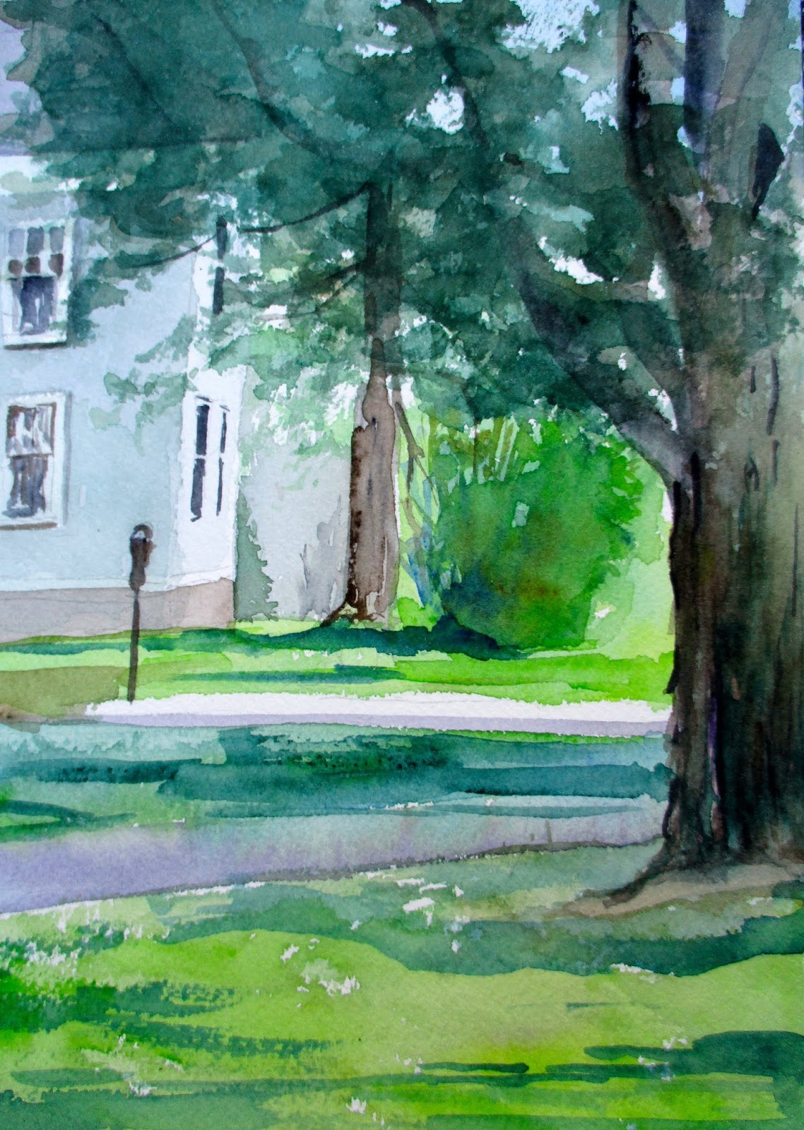
This week it was important to paint a summer scene as temperatures hovered below average with a couple of winter storms, to boot. Part of me was seeking a different subject matter to paint. It was also an opportunity to modify the landscape to my liking.

The pencil sketches on top show the evolution of the composition. I wanted the building to frame the larger landscape in the background. For me, the road rolling across the landscape like a ribbon is an exciting part of the picture. 

The painting below is underway. It was important for me to explore using complementary colors in the focal point. That is the red and green you see in the foreground.

There is a warmth in the painting which I find comforting. Pure watercolor with clean brushstrokes and solid color.

Wednesday, March 6, 2019

Ed Hopper windows

(C) 2019 Dale DiMauro

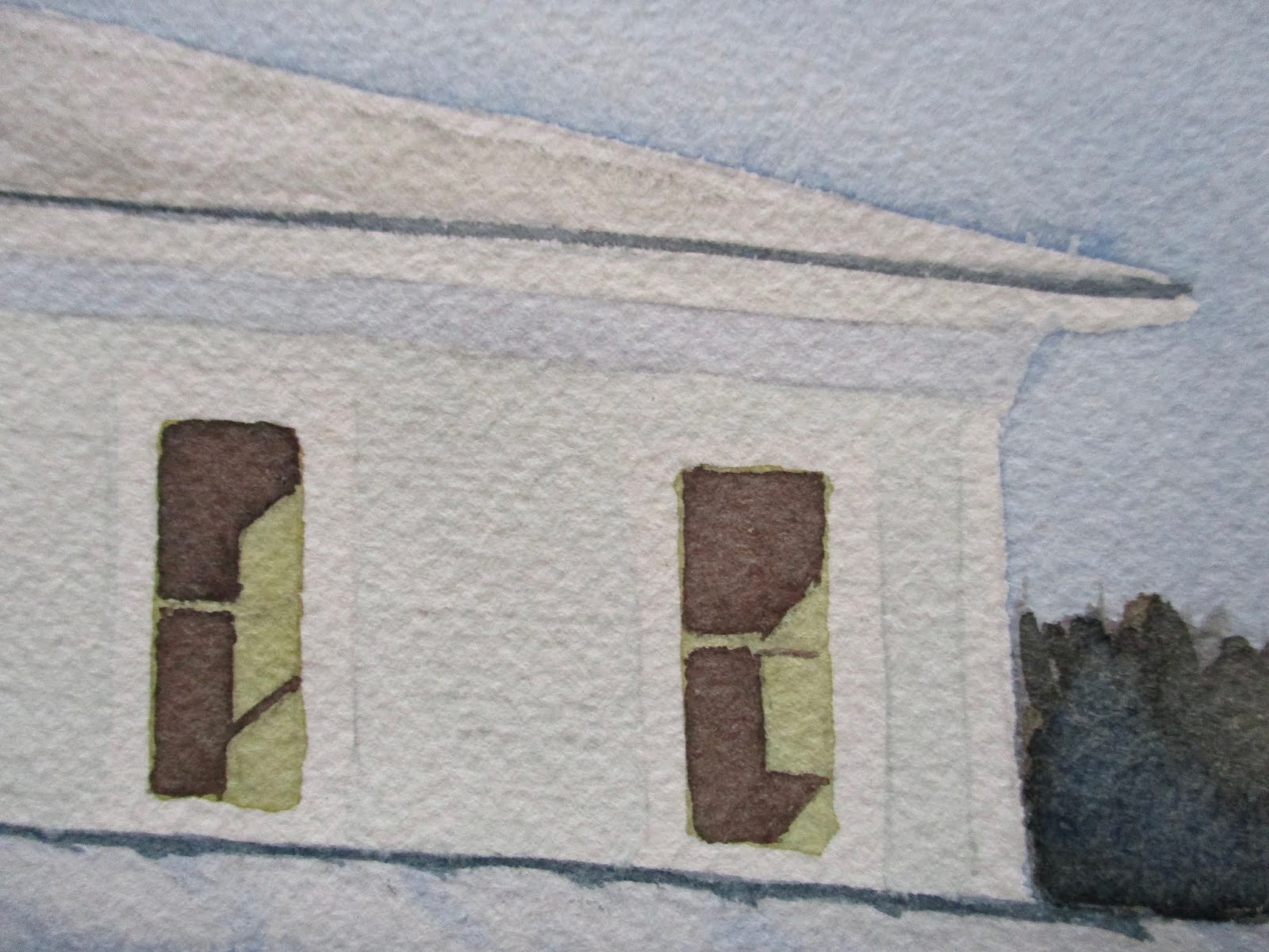
Recently, I have returned to painting New England houses and snow scenes. This is a detail from a watercolor in progress. 

There have been numerous complements on the windows painted. There is an Ed Hopper quality to the natural light projecting across the interior walls. In addition, the austere quality of the window treatment and sparse decorations make for a striking presentation. Perhaps, it makes one question what is going on with this room in question.

It further emphasizes the importance of keeping the painting simple with bold washes where possible. In fact, after the New Year, I promised myself I would paint with the largest brush I could use for any given task. Perhaps, this way I would noodle around less and avoid going back into an existing wash.

In the process of initiating these recent paintings, I have come to realize how broader my thinking has evolved when it comes to color mixing. By habit I write down in a journal any color combination I read about or come upon which peaks my interest. As a result, I am forever testing out new and exciting color combinations. These windows, I believe, have richer colors than I would have come up with in the past.

Sunday, March 3, 2019

Brattleboro Outing Club

(C) 2019 Dale DiMauro

Last Friday I cross-country skied at the Brattleboro Outing Club. I longed for the conditions experienced. The sun was glorious and the temperature was mild, requiring light layers. I didn't experience any of the hard ice that dominated much of this winter. The increased length of day made it such a wonderful time, too.

This watercolor is a sort of memento of the outing club experience. There is appeal in the yellow siding of the buildings in contrast to the cool blue shadows cast across the open space. 

I am still finding my way with this thick Arches watercolor paper(300 lb). Recently, I have experimented with hot press in addition to the rough and cold press versions. This picture is painted on the cold press paper. The 140 lb Arches paper in the block or individual sheet form I am very accustom to. 

Wednesday, February 27, 2019

Tree on the Common

(C) 2019 Dale DiMauro

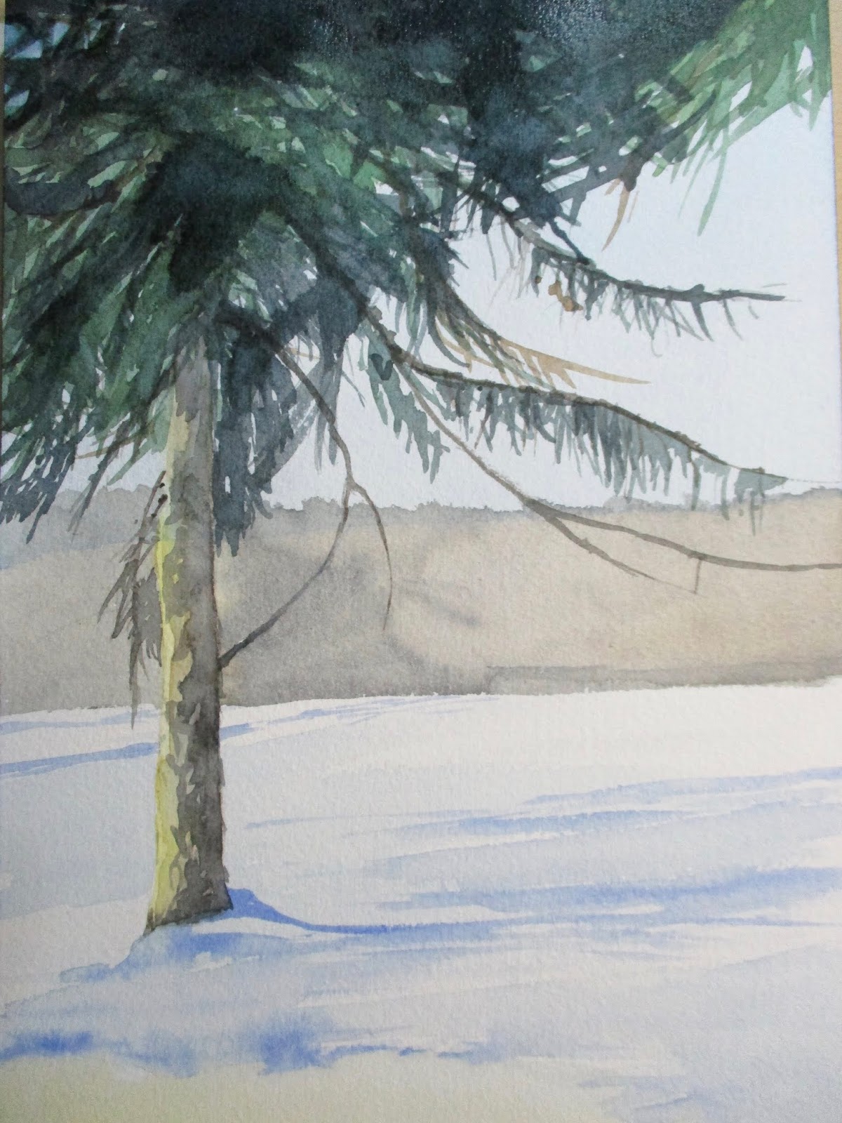
Painting trees is exciting, rewarding and at times, frustrating. Lately, I have become obsessed with these specimen trees I see exposed to the wintry elements. They have such character with their graceful limbs, speckled trunks and strong shadows. Recently, I have seen numerous birds congregate up in their crowns while chewing on seeds. On windy days I am concerned they will blow down on neighboring power lines.

It is good practice I believe, to force yourself, to paint a watercolor in a limited window. I finished this painting an hour ago and started it the prior hour. From my experience, these time constraints parallel some of the characteristics of plein air painting. I was forced to keep the composition simple along with the chosen palette and forced to paint directly.

Finally, it was frustrating cropping the photograph with the blogger software for some reason. I failed to crop the first photograph but uploaded a second and it seemed to be misplaced in the folder.   

Sunday, February 24, 2019

Adding Vehicles into Watercolors

(C) 2019 Dale DiMauro

Many artists include vehicles in their paintings. In particular, I like the work of Joseph Zbukvic. His watercolors, which feature vehicles, have an integrated quality to the overall composition.

Recently, I have been struggling in selecting vehicles to consider for painting. Some of the challenges are based on weather I do a side view or back orientation. Also, one can paint a vehicle in perspective, which offers more depth, with added detail. At this point, if I add a vehicle I intend it not to be the sole focal point.

This watercolor drawing is an attempt to get something down quickly, without too much fussing around. In this case, there was not much consideration regarding composition. However, I do like the shadows and atmospheric qualities in this picture.

Wednesday, February 20, 2019

Sketchbook drawing

(C) 2019 Dale DiMauro

It is wonderful to carry around a sketchbook and record what inspires you or draw imaginary landscapes. You can look back through the pages and see the progress an artist makes over a period of time. As individuals we develop the ability to see the world in a different light.

In the past I have made progress capturing the human head. This year my emphasis is on the whole human body. Depicting the whole human body with correct proportions while it moves requires a lot of practice. Many artists stay away from the human figure but I embrace it.

Lately I have been drawing on a daily basis, both in ink and in pencil. There is something amazing about using a fountain pen. With some practice you develop a fluidity which I believe the human body expresses. While a pen communicates through a series of lines a pencil can capture the gradations of our body mass and facial expressions.

This is exciting stuff. If you have not used a sketchbook you might consider purchasing one. Using a sketchbook forces you to notice the world around you and concentrate on a specific subject.

Sunday, February 17, 2019

Ruth Bader Ginsburg: A Life

(C) 2019 Dale DiMauro watercolor

Earlier this winter, I read a biography of Ruth Bader Ginsburg. This book, Ruth Bader Ginsburg: A Life by Jane Sherron De Hart, is some five hundred and fifty pages long. It had been classified a new acquisition by my local public library. As a result, I had to get reading because the library loan was limited.

Originally, I was curious because Ginsburg has become a legend in the public's eye and well-respected in the legal field. It is well documented that Ginsburg was a minority in a men's field. Her thorough research and precise writing in legal briefs has yielded significant advances towards reducing discrimination. The book highlights Ginsburg's remarkable achievements in the field of law. She has inspired many and become a sort of superhero, the Notorious RBG. 

Recently, in my sketchbook I have been applying watercolor washes over my pencil drawings of individuals. It seems to give life and dimension to the person. This watercolor drawing is derived from the photograph of RBG, as she is known, on the back of the book. I hope it does some justice to the Supreme Court justice. 

Wednesday, February 13, 2019

Brattleboro Common

(C) 2019 Dale DiMauro

The Brattleboro Common is such an important park in the downtown area as there is minimal open space for the public to access. In the Winter, I find the experience of walking through the Common with the deciduous leaves down, in the sun, more appealing than in the Summer.

This watercolor started out as a study of the two trees in the foreground. It wasn't necessarily going to be a completed painting but I liked the direction it was going. Initially, the feel of fresh snow and the crisp shadows on the snow were a source of inspiration..

Clearly, elements were deleted from the site to simplify the composition. The gazebo looks a bit like a folly but I like it nonetheless. I seldom use phthalo blue, but that is the only pigment used for the sky.


Sunday, February 10, 2019

Plein Air Painting

(C) 2019 Dale DiMauro

As the length of day has been increasing I am becoming more and more eager to paint outside. This may seem like an odd desire since it only February. However, at least in my mind, I am mapping out areas in my town desirable to paint. 

Over time I have learned to appreciate the simplicity and directness of plein air painting. On the one hand, the light changes quickly so an artist cannot get too boggled down in details. On the other hand, it is quite social as people feel entitled to see what your working on. Often people passing by offer there unsolicited opinion.

While painting outside I have become aware of how rapidly plants and foliage change daily. The leaves on the trees unfurl in a light hue which becomes much darker as the Summer season evolves. 

With such an early Winter and long one indeed, I am eager for signs of Spring. I suppose hope does Spring eternal.


Wednesday, February 6, 2019

Hansa Yellow Light

(C) 2019 Dale DiMauro

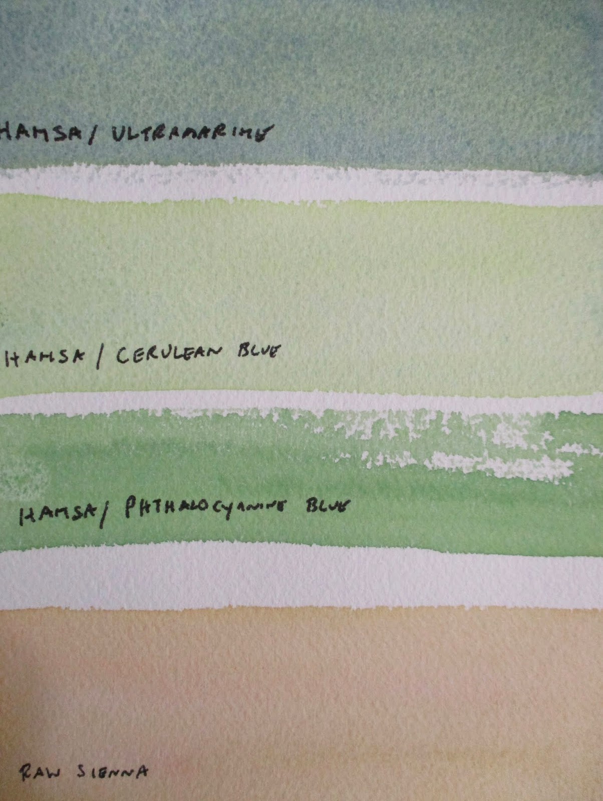
This week I introduced hansa yellow light to my palette. I had been thinking about this pigment for quite some time as it's color mixing attributes are appealing. Throughout the fall I had been searching for an opaque green to use for tree foliage. With more experimentation I hope to meet this need. 

Hansa yellow light mixes well with a range of blues creating fresh, you might say, 'garden' greens. This versatility is useful when painting the landscape.

In the color swatch above I mixed hansa yellow light with ultramarine. The next swatch consists of hansa yellow light with cerulean. The third swatch down combines hansa yellow light with phthalo blue.

In my limited exposure to this pigment I have learned that hansa yellow light is useful whether in a thin or thick application.

In conclusion, I learned this pigment is not as available as some other colors. The one I purchased is from Daniel Smith. In retrospect, this post may not be the most exciting for the reader but I believe there is value in the information presented.

Sunday, February 3, 2019

Little landscapes

(C) 2019 Dale DiMauro

Doodling little landscapes in pencil, pen and watercolor is a favorite pastime of mine. Each time I challenge myself with different color schemes or ways to to express atmospheric qualities. Along the way I hope to become more proficient with the the brush and paint.

When I have success in painting landscapes it is important to start with the sky and work towards the foreground. A weak wash to imply a distant land mass can be very convincing. This also makes the foreground vegetation stand out in contrast. The second wash over the water gives depth and makes the water along the shore appear shallow.

Over time I have learned it is best to establish a convincing horizon. Keep it simple and parallel to the bottom of the page.

Recently, I have been trying to achieve cleaner washes with simpler mixes and broader strokes. The bigger brush I use the better. It is also important to leave the wash alone once it is put down. You can always add a second or third wash if necessary after the first has dried.

Wednesday, January 30, 2019

Pencil study

(C) 2019 Dale DiMauro

Sometimes a pencil sketch says it all. A little drawing done in five minutes, with such simplicity, can communicate more than a large detailed piece. At least that is what I think when I come back to this drawing.

Without any color added, I feel the sun over the snow-draped landscape. Even the rough pencil marks remind me of the shaggy bark curling in every which way it can.

Originally, I was inspired by the sight of this deciduous tree with it's Winter silhouette, as I drove by my town's common. This tree has a life of it's own, just as each individual human being has a story to tell. From this experience I was looking to capture more of it's presence so others could notice it. However, I wanted to give it context and scale so I included the the woods in the background. I believe a painting will come of this but I am not yet completely sold on the composition.

Sunday, January 27, 2019

Snow returns to Brattleboro, VT

(C) 2019 Dale DiMauro

Last week southern Vermont received  a major snowstorm. Even though we had an early start to Winter back in November, we really didn't have much snow on the ground to speak of. In fact, in early January you could hike through the woods without any boots on.

Prior to this snowstorm it had been a great season for ice skating. It also had been icy, in general. In fact, I fell twice this Winter just walking. The first fall was on ice buried under snow which I am certain gave me a mild concussion.

Needless to say, I was eagerly anticipating the landscape covered in powder. I had been longing to paint some Winter scenes with drifting snow and late afternoon light. I did get out and cross-country ski, though. Not long after the snowstorm, rain moved in before the ground refroze. 

In spite of the kind of Winter we have had, I have started a full-sheet watercolor from a local scene I came upon in 2017. It is a fresh winter scene with incredible light piercing across the landscape.

Wednesday, January 23, 2019

American Artist Magazine

(C) 2019 Photograph Dale DiMauro

As a birthday gift last April my father-in-law gave me several 1950 era American Artist magazines. Not only were there interesting articles on watercolor painting of the day, but the advertising was fascinating. 

Before the computer dominated how we communicated with each other, advertising was created primarily through hand lettering and drawing. Of course, this is not news to many of us. However, to page through these magazines you can really sense how important hand drawing had been.  

Not only were the ads created by hand but many of them were promoting drawing products such as charcoal, fountains pens etc., and how to use them. This appreciation of an aspect of the visual arts is no longer found in our current magazines.

Fortunately, there is in general, an increased appreciation for those with the ability to utilize freehand drawing.

Sunday, January 20, 2019

The Connecticut River Valley

(C) 2019 Dale DiMauro

For this watercolor I am broadening my horizons. This birds eye view fills the watercolor sheet with characteristics of the regional landscape. We have the Connecticut River, fields, agricultural land and the distant hills of New Hampshire.

Viewing the landscape from a distance enables an artist to interpret basic shapes and then clarify them with values. I have been aiming to have clean washes of color where the open spaces occur. At the base of the wooded areas I have emphasized darker washes to give depth and height to the woodland edge.

There are foreground features I have yet to add which include two trees with their darker foliage and other foliage appearing above the river. I feel this painting has a good start and am excited where this takes me. 


Wednesday, January 16, 2019

Watercolor doodle

(C) 2019 Dale DiMauro

This is one of those watercolor paper remnants, after a painting has been cut down to size. It is exciting to draw or try out new color combinations, free of expectations. Often these are doodles when the mind is preoccupied with something else. 

Is the figure entering the picture or exiting the scene? Who is she? What is going on below her waist? These abstract qualities, for me, give the image all kinds of unforeseen possibilities.

I like to look at these images and ponder where I was artistically at this point in time. The other side of the paper is full of marks and images too.


Sunday, January 13, 2019

Warmer horizons

(C) 2019 Dale DiMauro

After thoroughly cleaning my palette I am up and running again. I have introduced more warmer pigments as can be seen on the left. Yellows, I find useful in creating rich, vibrant greens as opposed to store-bought tubes of green. Nevertheless, french ultramarine blue is the pigment I use most.  

During the process of cleaning my palette I learned it was best to knock any dry pigment loose with a screwdriver or palette knife. Then, I had less pigment to deal with, which cleaned up well with a household spray. This approach was actually less time consuming, cleaner and used much less paper towels than any other approaches I have tried to date. 

Originally, it seemed necessary to clean my palette because there was a build-up of dry, cracked pigments. It was also an opportunity to introduce new pigments while parting with some that I do not use much. Since this change I am mixing more purples and a greater range of grays.

Recently, I started this watercolor on the right. This landscape felt more like a November scene than an early January one.

Wednesday, January 9, 2019

Late afternoon sun

(C) 2019 Dale DiMauro

At this time of year the setting sun can be magical. A slice of the late day sun across the woodland edge can warm the landscape and thus, your soul. It highlights and brings attention to an otherwise ordinary landscape.

When working on this watercolor I observed the sun warmed the landscape well up into the atmosphere. I put colors into the sky that I wouldn't normally consider. There is permanent rose, raw sienna, cerulean and a lemon yellow all in this sky. Regardless, the warm wash of the woodland edge against the cold landscape at this time of year radiates.

I have learned through trial and error that the landscape is best when a few values darker than the sky or the picture will come across as weak, lacking a solid footing. 

Sunday, January 6, 2019

New colors for a New Year

(C) 2019 Dale DiMauro

This is a scene I have experienced throughout the seasons. I have recorded it many times on my camera and painted it on numerous occasions in watercolor, as well. It is good, I find, to go back and see things in a different light. 

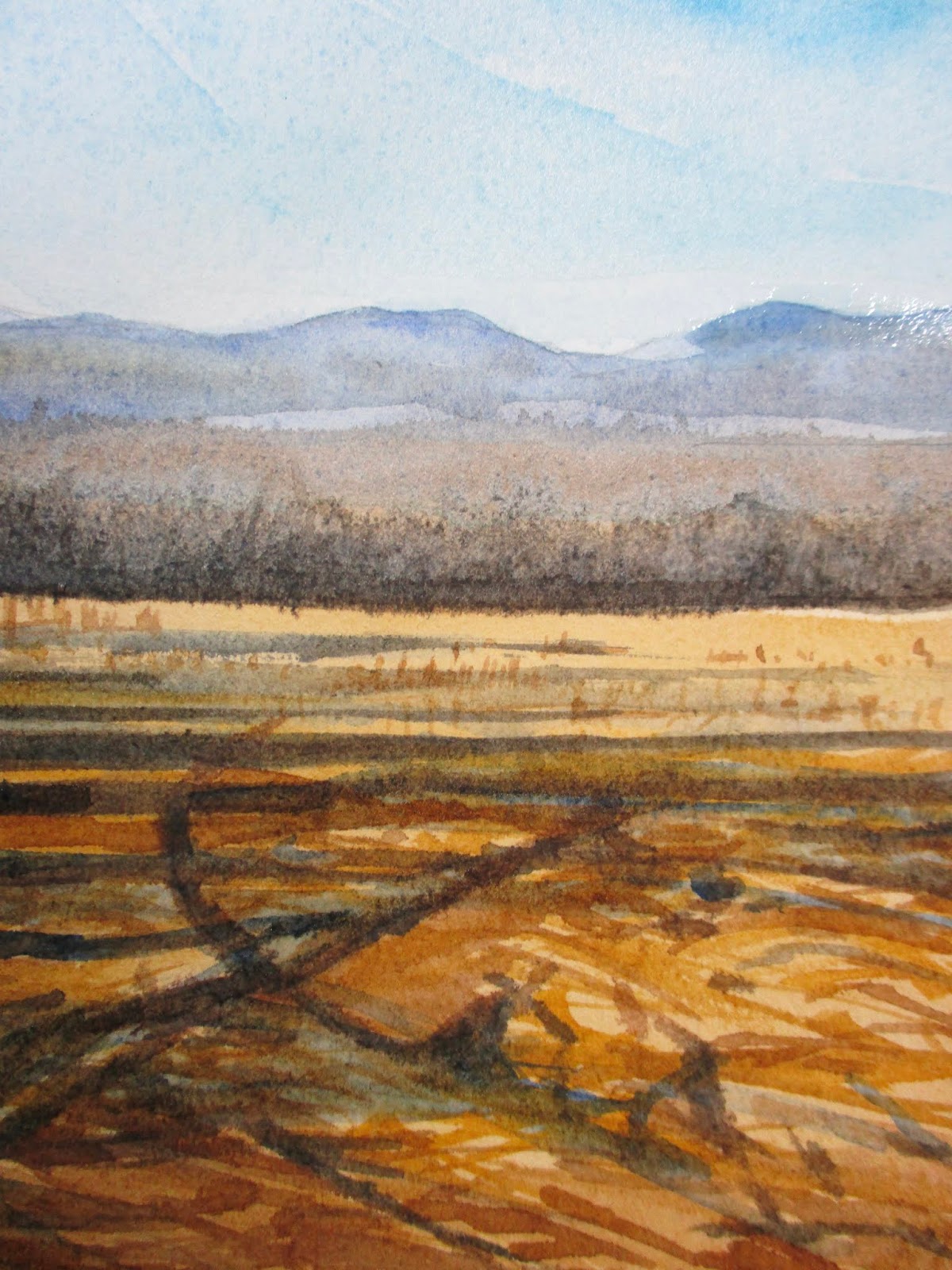
Since cleaning and tweaking my palette as I entered the New Year, this is the first watercolor completed in 2019. However, the pigments used for the most part, have not been my usual choices.

In this case I used cerulean blue for the sky, which I find, is a pigment that mixes well with others. The combination of burnt umber and ultramarine, as a dark for the base of the woodland edge, I have been experimenting with a lot, lately. Perhaps, the most important pairing in this watercolor is indian yellow with winsor violet which provides the warm brown in the foreground. In the past, I could not for the life of me, come up with that foreground color. Now I am much more satisfied with the result.

Wednesday, January 2, 2019

New landscape horizons

(C) 2019 Photograph Dale DiMauro

As 2018 came to a close, I figured it was appropriate to thoroughly clean my palette for the New Year.  During this cleaning I realized it was a great opportunity to improve the layout of my paints as certain pigments are used more than others and thus, can be better located. As a result I have not painted much the last two days.

At the same time it dawned on me with this recent string of sunny days, I had taken some good photographs of the landscape. I keep thinking about these photographs as the Vermont landscape is stunning at this time of year with or without snow.

In this photograph, I love the character of the arched tree with its red buds, the swirl of grass and the distinct blue mountains in the distance. Clearly, it's worth getting outside into nature and putting aside that electronic device you have!