Wednesday, December 15, 2021

West River Trail

                                                                    (C) 2021 Photograph Dale DiMauro
 

Last Sunday I took a walk on the West River Trail and took this photograph on the way back to my car. Once I took this picture I was certain it was a gem. 

There is something compelling about the fall colors which we underestimate. I don't mean the vivid reds or oranges of a maple tree which definitely are stunning. The warm colors of the earth, the ochres and sienna's let the other colors have the center stage. These colors warm the landscape and make the blues of the water sing.

The shadows projecting from the gate and revealing the contours have a special quality unto themselves. 

Today I had to post this photograph as it had been on my mind for several days. It pays to get outside in the landscape and experience nature and all that it has to offer.

Sunday, December 12, 2021

Lifting Paint

                                                                              (C) 2021 Dale DiMauro
 

Recently, I started this watercolor of a local field with a large puddle with reflections in the foreground. Before starting, I pre-stained the entire sheet with quinacridone gold giving the image a warm yellow feel to it.

However, the image looked flat so I have been lifting more color than I ever have from a watercolor. The horizontal bands in the field, along with the surface of the puddle and some of the passages in the foreground, with clumps of vegetation, all are areas I lifted paint.

I am curious and optimistic of the final result. I think there will be depth and variation through techniques I have not really used before. Of course you can repaint areas where paint had been lifted before. 

Wednesday, December 8, 2021

Used Book


My local library has been having a used book sale. I picked up this book, The Complete Watercolor Book, by Wendon Blake, for two dollars. Not only is this a great book with many tips on making watercolors but it is a hardcover, for again, just two dollars.

Blake has a section on painting seascapes and this composition and coloring caught my eye. It reminds me of the coast of Maine. Also, I like the low horizon line.

I quickly painted this scene, based on a photograph, of his watercolor from the book. I figure it is always a plus to tackle subjects on the edge of one's comfort zone. 


Sunday, December 5, 2021

Missing A Figure?

                                                                        (C) 2021 Dale DiMauro

This is the kind of composition where a figure would complete the picture. Some color and a strong focal point could seal the deal. 

However, I have learned to appreciate the subtleties of color and their variations, particularly at this time of year. Certain colors express the regional characteristics like no other. A combination of permanent brown and yellow ochre can look strikingly like the woodland edge in November with no further pigmentation.

Now to find a figure to finish this watercolor......
 

Wednesday, December 1, 2021

Color Swatches

                                                                                        (C)2021 Dale DiMauro
 

In a recent post I mentioned how Charles Reid wrote in his book, Watercolor Basics, that during a down time it is good practice to make color swatches. Your vocabulary of color expands and your brushwork develops too.

Well, lately I have been making many color swatches. I like this swatch in particular. This juicy, light brown was created by mixing permanent brown with quinacridone gold. At this time of year the distant hills when in the sun can acquire this warm, earthy coloring.

It is not so much the color itself that is striking as when it is combined with a red or blue which will make the colors sing.

Sunday, November 28, 2021

You Can Paint On Pretty Much Anything

                                                                                       (C) 2021 Dale DiMauro
 

This little watercolor was painted in a spiral-bound book by the Bee Paper Company. It absorbs watercolor paints, yet is only 93 lb paper. It is great if you simply want to put something down on paper quickly. Also, it is a handy surface to test pigment mixtures.

Every type of paper manufactured handles pigments differently. Thus, it is great practice to be able and willing to use different papers and find which surface suits you and how you handle the paper.

I find painting everyday, even if just for half an hour real beneficial. Continuity and progress are real important.

Thursday, November 25, 2021

Weak Winter Light

                                                                                       (C) 2021 Dale DiMauro
 

Winter definitely feels like it is moving in, here in Vermont. It is colder at night and the strength of the sun during the day seems weak. 

However, we have had many sunny days lately. I try to get in the sun whenever possible even if it means eating lunch in the car or getting a walk in at erratic times of the day.

I have discovered this brownish mix by combining burnt umber and phthalocyanine blue which I have begun to experiment more with lately. It offers a nice earthly base which you can warm up or cool down depending on how you want to tweak the colors.

At this time of year the landscape can develop an eerie quality with all the leaves gone and a dismal lack of color. It is as if the landscape is waiting for the snow to arrive.

Sunday, November 21, 2021

Moody Landscape

                                                                          (C) 2021 Dale DiMauro
 

The colors in this watercolor, for me, express this time of year here in Vermont. The sun has become weak with long shadows and you have to take advantage of it's warmth when it's out. All of a sudden I look out my window at 11AM with the sun out and there is a bunch of people squeezing in a walk or attending to their pets.

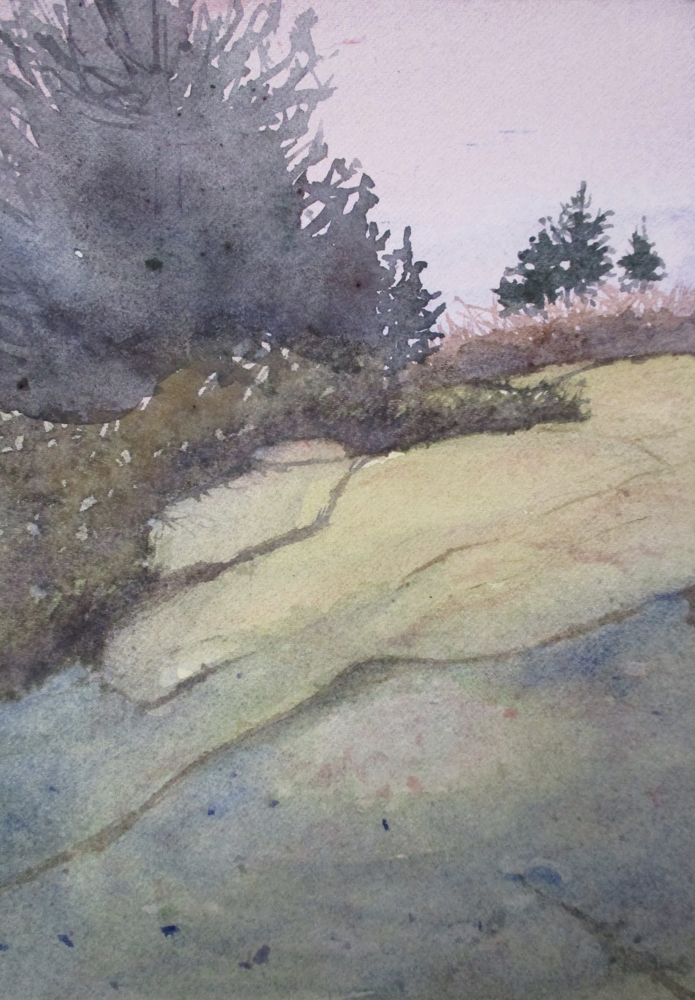
I usually don't paint gray skies but I tried a mixture of burnt sienna and cobalt blue. This sky color really sets the tone for the painting.

Often a sheet of watercolor paper curls or buckles on me once there is an accumulation of paint on it. However, this doesn't faze me so much as it might have in the past. I just turn it over and soak it under water from my sink. Next I lay it down on a flat surface and put an empty jar or two on it and then it will dry flat.

Wednesday, November 17, 2021

Blues & Greens: The Colors of Summer

                                                                                       (C) 2021 Dale DiMauro
 

Years ago I purchased one of Cheap Joe's sample packs. They offer a variety of watercolor papers cut down to a smaller size so budding artists can experiment and find out which paper they may prefer in the future.

This watercolor I did on 300lb Fabriano Artistico watercolor paper which has been kicking around in my flat file for some time. This sheet has additional watercolors I did from many years ago on the top.

I have not worked on the thicker watercolor paper for some time and appreciated the slower dry times. In addition, to my eye, the colors remain vivid, just as when I was painting on the surface.

Sunday, November 14, 2021

ULTRAMARINE BLUE

                                                                                       (C) 2021 Dale DiMauro
 

Sometimes it is best to just play with your pigments and see where it takes you. This was a test sheet for sampling color mixtures which became an imaginary landscape. There is a bit of drawing which helped in the composition. Even some memories of the landscape oozed out, too.

However, I have been trying to resist the urge to cover the whole sheet with pigment. I am beginning to see the strength of the white of the paper more and more. Also, I think the mind and eye fill in the composition with color in some spots.

The blue I used here is ultramarine blue. I use this more than any other pigment and it blends well with other pigments. One of the keys is to vary the concentration of the color which strengthens the perspective and can appeal to the eye.

Wednesday, November 10, 2021

October in Maine

                                                                           (C) 2021 Dale DiMauro
 

This watercolor is a sort of personal postcard of my trip to Bar Harbor, Maine in late October. The natural colors of the island had a natural richness one does not experience during the summer season. Also, the burden of overpopulation had dispersed by the late fall.

With family members I went on a hike on Great Head(in Acadia National Park)with lovely views of Sand Beach and the Atlantic Ocean. It always is rewarding to smell the ocean air.

The rocks have a peculiar greenish tone which I had not seen before. I did not portray this color here but they are distinctly artificial in tone. It remains a mystery to me. I am baffled at what colors to even mix to achieve that color.

Sunday, November 7, 2021

Living Memorial Park

                                                                            (C) 2021 Dale DiMauro
 

Today's painting is of Living Memorial Park, which I painted this evening. It felt great to get back to painting after spending much time preparing my house and property for this coming winter. 

My timing was great as winter feels like it has begun to move in. Most of the raking, organizing the garage and cleaning the gutters of leaves has been done.

During COVID-19 I have visited Living Memorial Park many, many times. Over the course of these visits I have come to appreciate the changing light across the fields and hills of the park. The other thing I look forward to are the views across the park and into the distant hills.

Wednesday, November 3, 2021

Large Brush Practice

                                         (C) 2021 Dale DiMauro
 

Recently, I have started doing large brush exercises before digging into the painting I am working on. I can see how the pools of pigment bleed into each other on the paper. Naturally, this involves preparing greater quantities of pigment.

However, this is a very satisfying activity. I can always go back and do more if I want but it makes me more sure in my strokes, with less fussing about. Also, I use an inexpensive watercolor pad, so there is no loss if a picture doesn't work out.

I will see where this takes me but I appreciate the increased scale and boldness of my approach. There are so many ways one can work on developing their watercolor skills and this is just my current approach.

Sunday, October 31, 2021

Memories of Maine

                                                                                     (C) 2021 Dale DiMauro
 

It felt good to get back to painting. After a weekend in Maine your perspective changes a bit. In general, I don't have much recollection of fall in Maine, but I found the colors of the foliage to be rich and striking, nonetheless.

Maine over the last two summers seems to have become a negative experience for me, due in part to the pandemic and hordes of people and uncertain accommodations. However, it is always a delight to smell the ocean no matter what time of year and see the activity that it attracts.

This watercolor is a collage of those associations of Maine that I bring home with me.

Wednesday, October 27, 2021

Landscape Doodle

                                                                                       (C) 2021 Dale DiMauro
 

It always feels good to put paint to paper. Even if time is limited. You can always come back and add more to what you started. I learn so much about the pigments the more I use them.

My most recent color exploration is combining cadmium red with turquoise(or any blue green). Depending on the proportions you come up with, a warm or grayish blue sky, or both.

I read where Charles Reid(a noted watercolor painter, author of: Watercolor Basics) suggested during idle hours painting swatches to develop greater understanding of colors and learning how to mix paint on the paper.

Just putting something down on paper keeps the mind sharp and the hand loose. Continuity is important.

Monday, October 25, 2021

Woodstock, Vermont

                                                                                       (C) 2021 Dale DiMauro
 

This summer I had the opportunity to walk the carriage roads and foot paths of the March-Billings-Rockefeller National Historic Park, in Woodstock, VT. There are such lovely vista's with open meadows and large trees which are hard to find these days.

Since I was away part of this week, my painting was limited. I fit in this watercolor earlier this evening. This view is from one of those carriage roads with a rather dramatic drop in the grade across the meadow to the distant hills.

There is always much to be learned in painting the landscape as well as interpreting what is seen.

Wednesday, October 20, 2021

Eldridge Hardie(1940-2021)


Eldridge Hardie(1940 -2021) painted sporting art in a similiar vein as Winslow Homer and Ogden Pleissner. He loved fishing, hunting and making art. He lived a good chunk of his adult years in Colorado.

I have had a used book on his art for years called: The Paintings of Eldridge Hardie: Art of A Life In Sport. I pulled it out of my bookshelf the other day. I had forgotten how much I appreciated his watercolors.

The colors in his watercolors remind of this time of year with the changing of the seasons and the vibrant fall foliage.

Above, I copied a detail from his painting: New Brunswick: September 30, 1994, both as a study of his approach and expressive brushwork. I find it hard to find figures in the landscape(who aren't moving all the time) yet I love some of the spatial qualities of the natural landscape here in Vermont.
 

Sunday, October 17, 2021

Bookmark Anyone?

                                                              (C) 2021 Dale DiMauro
 

Any size painting can lead to a lovely watercolor. This odd-size painting was done in less than half an hour. I used only two pigments in creating this picture - ultramarine blue and quinacridone red.

The gradual blending of pigments often yields positive results. In addition, recently, I have rediscovered the importance of not covering the whole page with pigment. The white of the paper is beautiful in it's own right with it's texture and all. However, up against the white of the paper, any pigment has an expressive vibrancy unlike any other medium.

It is easy to overwork a watercolor and when that happens much of the freshness or even directness is lost. 


Wednesday, October 13, 2021

River's Edge

                                                                                       (C) 2021 Dale DiMauro
 

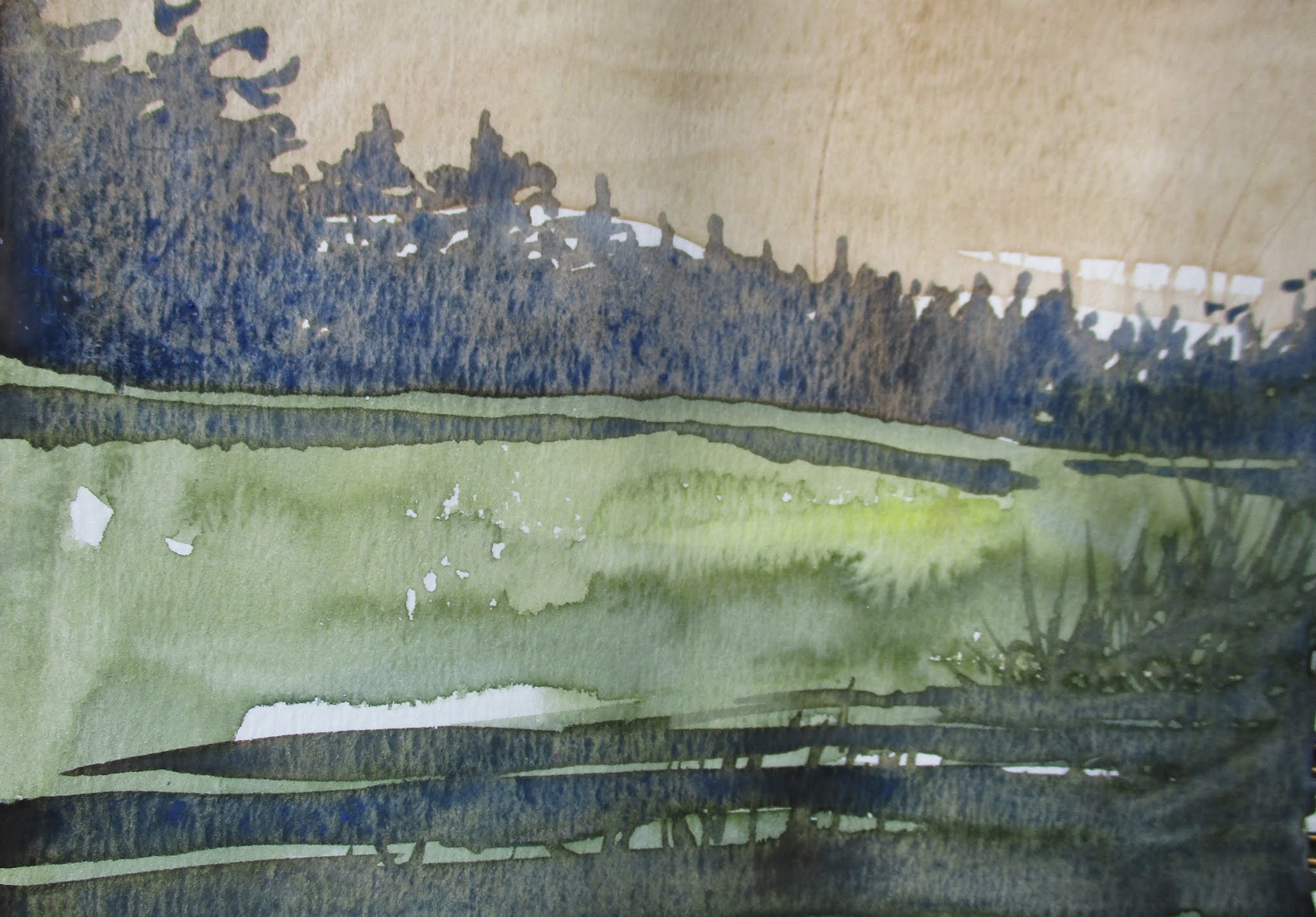
Since late summer I have been experimenting with the three primary colors: red, blue and yellow. This is the product of one of my more recent experiments. I love the rich, fluid blending of colors. In particular, I like the darks which add so much to a watercolor painting.

The pigments used in this watercolor are: yellow ochre/permanent brown/ultramarine blue. I find the absence of color(the white of the paper) compelling when edged by darks. Also, this scenario seems to add depth to the landscape on the paper.

This was painted in an inexpensive watercolor book with 80# paper. It is very smooth paper. It simply shows - that it is important to paint on as many surfaces as you can so as to be flexible or adaptive in your painting approach.


Sunday, October 10, 2021

Black & Blue

                                                                                       (C) 2021 Dale DiMauro
 

For some time, in the evening, when watching television with my wife, I have some post-it notes on hand. Often I ponder what color I will get when mixing certain colors in my mind. I then write down these color combinations so I can try them out later. 

This dark blue - black is the product of one of those evenings watching television. In watercolor, as many of you know, it is hard to find a rich dark approaching black. Most tube blacks are dull and uninteresting out of the tube. In contrast, however, when pigments are combined they usually become rich and lively.

When I mixed this combination of yellow ochre/permanent brown and ultramarine blue the whole sheet of paper came to life. I started applying this mixture in other watercolor paintings and became totally inspired.

Basically, the combination of yellow ochre/permanent brown and ultramarine blue are a variation of the three primary colors: yellow, red and blue. There are so many combinations of these primary colors for artists to explore that it is overwhelming. However, I find it rewarding to experiment along the way and increase my knowledge so that later on I can draw upon this in my painting.