|
| (C) 2018 Dale DiMauro |
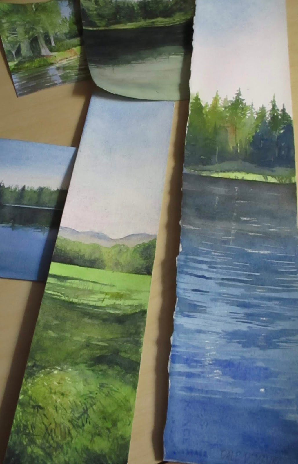
Recently, I spread out some of the watercolor paintings I have worked on lately. They were on my large drafting table where I work in the winter months. I was both impressed with the collection in general and how colorful many of my watercolors are. Since I have mostly been painting landscapes during the summer months, my palette has evolved to reflect the greens and blues of the season.
Since many are of odd sizes and shapes, they may be a challenge to mat and frame. Regardless, I have embraced the exaggerated horizontal and vertical formats when it seems appropriate. For example, a figure standing up reflects a vertical orientation when you are focusing on the individual. However, if an artist includes other figures or the larger landscape then that may lend itself to a horizontal format.
In my daily travels I make a note of colors I see out in the landscape and how I would approach a given subject. In addition, I may read or happen upon a color combination that truly moves me and find a way to incorporate this into my painting.
 |
| (C) 2018 Dale DiMauro |
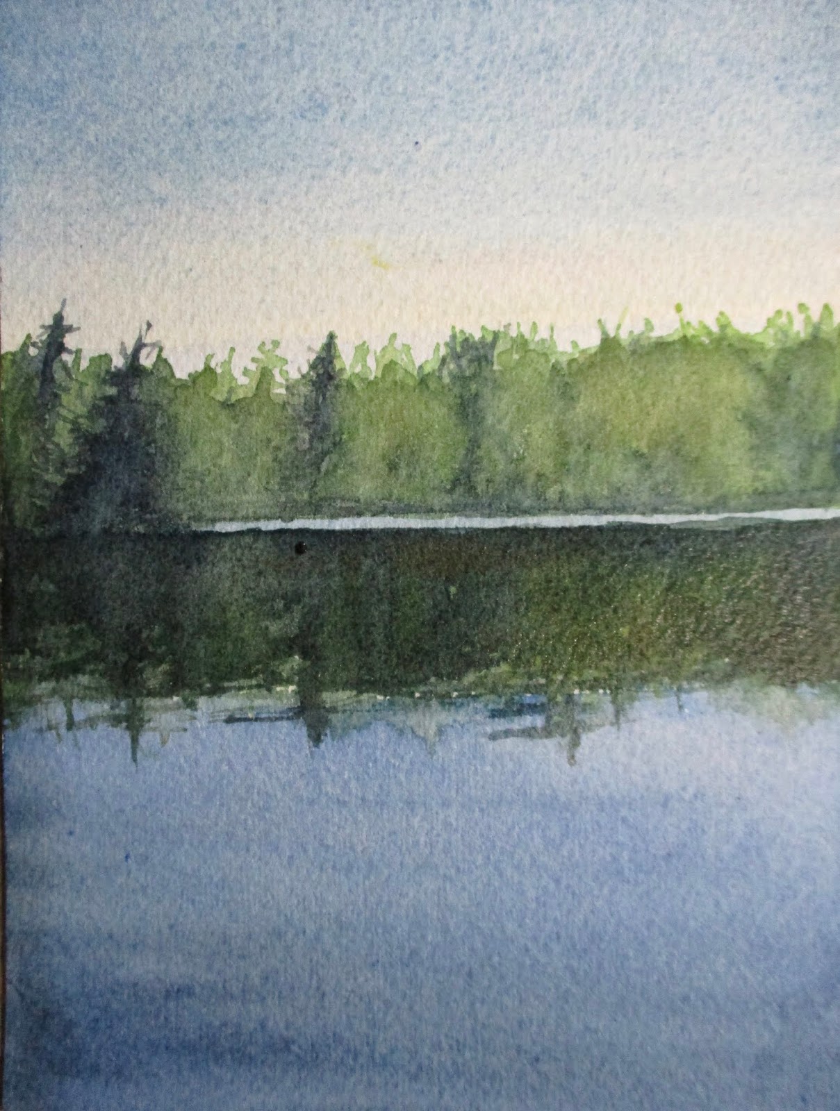
This a watercolor without layers of glazing to build up the forms. I have been experimenting with different ways to develop a watercolor when time is limited, involving direct painting. Sometimes it is best, as in plein air painting, to get something down quickly before the scene or light changes. There is a freshness with this approach, in the application of the paint as well as in the colors of the mixtures.
In watercolor, how you handle the edges of your washes says a lot. You can achieve hard edges or soften edges or little of both depending on which affect you are seeking to achieve.
Lately, I have been experimenting with dragging my brush at a steep angle across the surface of the paper. As seen in the photograph above, when you drag the brush an artist can achieve a rough edge which gives a sense of texture to your painting. As a side note, I prefer a cold-pressed watercolor paper over hot-pressed or rough sheets as it provides some surface variation, yet can be drawn upon, if needed.
This photograph was taken inside at night with artificial light. As a result, I find the photographic qualities are limited, as far as achieving a strong contrast in light. I had misplaced my camera for several hours earlier in the day. Thus, with the days become shorter, I have learned it is important to utilize natural light whenever possible.
 |
| (C) 2018 Dale DiMauro |
A few months ago I took a photograph of this scene while gliding across the water in my kayak. The composition of the three main landscape elements: sky, water and trees was stunning. Add to that the reflections from the tree-line and the placid water and you have a timeless scene. Every time I look at this photograph it stops me in my tracks.
It seems when you have two-thirds of the composition in sky or water(or landscape in other contexts) you can't go wrong depending on what you want to emphasize.
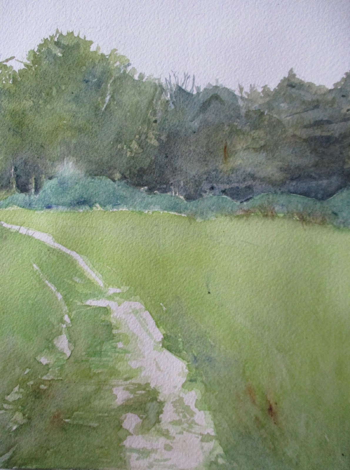
Earlier this afternoon I found a discarded, unused, sheet of watercolor paper and sought to see what I could come up with. It doesn't have the same proportions as I discussed above, but tweaked the pigments for subtle affect.
The light area in the sky has a wash which includes cadmium yellow and cobalt violet while the water has some indigo to enhance the value.
 |
| (C) 2018 Dale DiMauro |
How the seasons change. Quickly I may add. At least this year in particular.
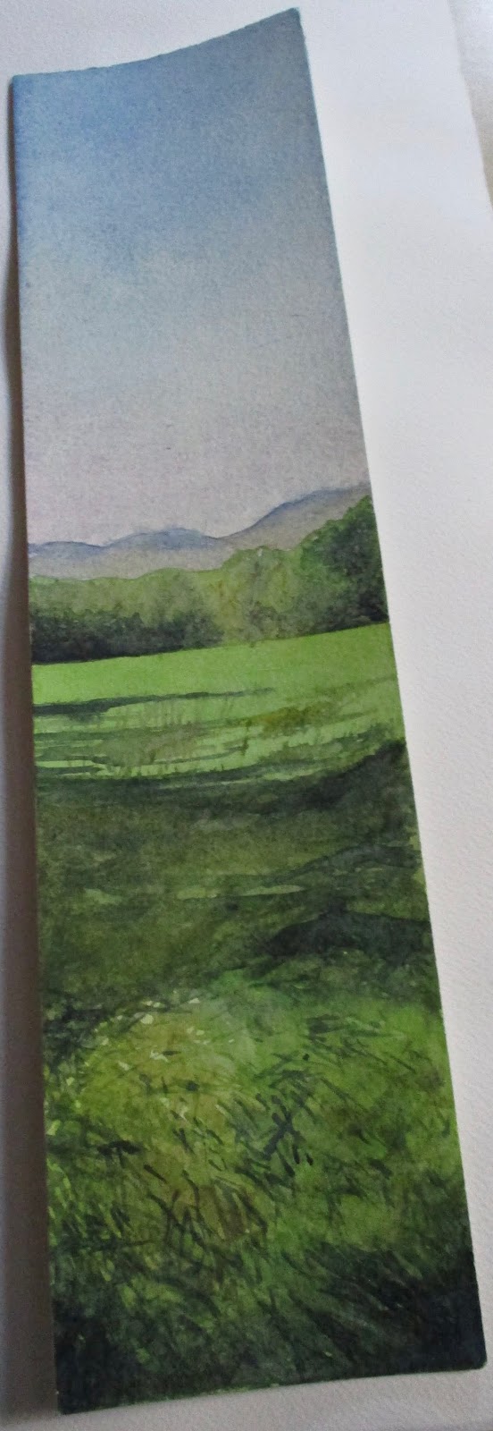
This watercolor developed over the weekend, in between getting prepared for this early Winter. It is not that I was unprepared for the coming Winter but the shock of ice along our frozen roads has settled in and will no doubt be with us for quite a while. My occasional walk will not be as intuitive as it has been. Now I must truly be prepared for the elements.
To me, this picture has the look of an oil painting even though it is in fact, a watercolor. The angular marks in the foreground make it appear as if a palate knife had been used. Perhaps it even has the look of a french landscape in technique and subject, yet is the land at the base of the Brattleboro ski jump. I do like how a river or path leads the viewer into the landscape.
 |
| (C) 2018 Dale DiMauro |
These are two color combinations I have adopted this past month. I have a very small notebook which I jot down color combinations when I read or hear about what other artists are using. However, I am not sure where I came upon these, but they certainly are useful to draw upon in your palette.
The top one consists of cadmium red and permanent sap green. As you can see from the photograph it provides the artist with a warm yellow. It is well-known that some colors right out of the tube can be rather flat and unexciting. When this particular combination is mixed on my palette it appears so rich and full of life. This pigment combination is so new to me that I am still trying to figure how to best utilize it's qualities. Certainly, it can be useful in painting landscapes such as for fields or in the details of grass. Next to a dark blue such as a surface of a lake it may be stunning.
The lower swatch consists of cadmium red and veridian. It provides the watercolor artist with a warm gray. There are such a range of grays that can be made but this one seems to be a gem. A gray like this can make other more outgoing colors sparkle. Next to a red or dark green this gray is quite pleasing. When used in the foreground, for some reason, I like this gray best.
 |
| (C) 2018 Dale DiMauro |
In late August on a hot and humid day I joined a meet-up group to paddle on Lowell Lake near Londonderry, Vermont. It ended up being the perfect day to paddle and swim away from the heat in southern Vermont. We ended up eating our lunch at a picnic table on one of the many islands in the lake.
This landscape doodle, developed into more of a study, for hopefully, a larger watercolor. The reflections on the water and the exuberant growth along the shore caught my imagination. The water is not blue at all, but attractive with it's varied colorations and cleanliness.
When my time is limited, I have taken to experimenting with various-sized scraps of arches watercolor paper, at my disposal. In addition, I am determined to become proficient in the use of masking fluid by the end of the month. Watercolor artists use this to preserve the white of the paper in certain areas while continuing to applying washes.
 |
| (C) 2018 Dale DiMauro |
In the early fall, I heard we New Englanders, would likely have a strong foliage season. With all the rain we had since the middle of July or so, we were primed for vivid colors.
After hearing this on the radio I felt an obligation to hit the local trails. I had avoided hiking in the woods primarily, because of the lyme tick threat. The day I was out was one of the most pleasant days of the season. In fact, I thought there would be many more leading up to peak season.
This is one of the last unused skinny watercolor sheets I had at my disposal. I like this slice of the landscape with it's vertical orientation.
Artists say that burnt sienna is an essential color for painting landscapes. Recently, I have increasingly embraced this pigment in depicting fields and sun-drenched foliage.
 |
| (C) 2018 Dale DiMauro |
Summer in Vermont seems like a long time ago now. This watercolor was inspired from a September paddle when it was still quite humid out. I feel like I captured some of that humidity and moisture in the greens of the foliage.
Over the course of this summer season, with all the moisture in the air and the plant growth on the land, my green palette has expanded. Some of my favorite green pigment mixes have become quinacridone gold/Payne's gray, and aureolin/Payne's gray. Also, I have taken to using Hooker's green on occasion with browns to achieve that green you may come upon in a sunny field.
In addition, shadow green was used for the water, above, which brings out the yellow-greens of the foliage along the shore.
Often I hear artists say that green is their most challenging color to work with. In watercolor it can be a grayish color or on the other spectrum become quite garish.