|
| (C) 2018 Dale DiMauro |
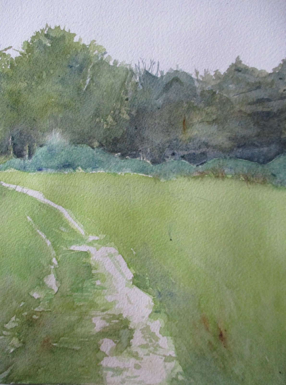
We are fast approaching the shortest days of the year. When the sun is in fact, out, I try to go outdoors and take in at least twenty minutes of direct sunshine, usually on a hike. Shadows so dominate the countryside at this time of year that it makes painting the landscape quite dramatic.
This is a plein air watercolor I painted looking through the bay window of our living room last December. The low light at this time of year reminded me of this picture. There is warmth and cool temperatures in this watercolor. Prior to painting this picture I toned the paper a warm yellow which gives the areas in the sun such as the snow increased warmth.
The slate-gray colored road at the bottom of the image provides a cool contrast with the vertical elements jutting up out of the snow.
 |
| (C)2018 Dale DiMauro |
This fall was really different here in southern Vermont. Or at least that is my feeling on the subject.
At the end of a summer that brought many rainy days, the fall foliage was forecast to be quite good. However, the rainy weather continued. In fact, I do not recall many full days of sun or consecutive days with sunshine. After that, the early winter moved in.
I had hoped to plein air paint quite a bit as the humidity waned. The damp air and low light discouraged the outdoor painting I would do. I did paint, but it was mostly done indoors.
This watercolor was inspired from a hike I took through the Brattleboro Retreat land on a pleasant late fall afternoon. This scene is what I think of when someone mentions fall in Vermont. It doesn't have the reds we tend to treasure but has much warmth in the landscape with the yellows and tawny colors.
In a previous post on October 31, 2018 I mentioned an admiration for the work of watercolorist David Curtis. He is an english painter steeped in the tradition of using neutral colors such as warm and cool grays with soft light in his work. I have his book titled, David Curtis: Light & Mood in watercolour and refer to it often.
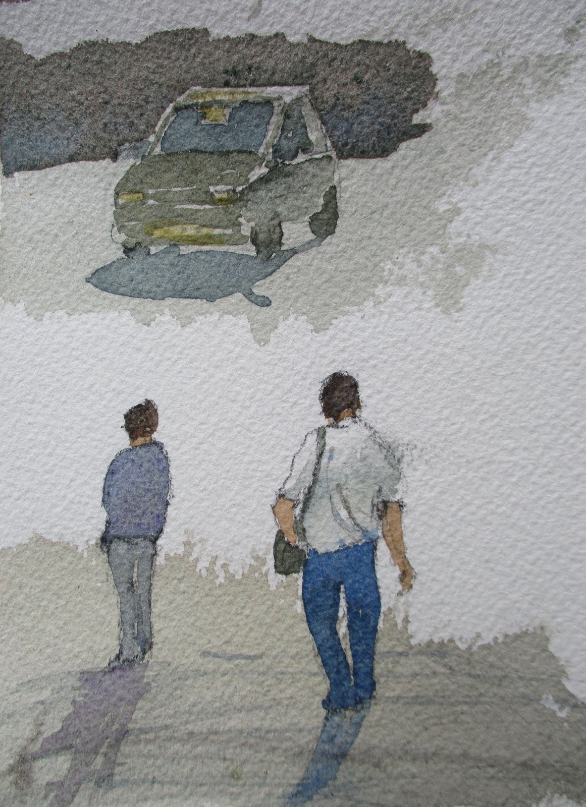
Figures and automobiles can provide a sense of scale in a landscape or suggest a time period. David Curtis paints these lovely figures and automobiles which appear so natural in his paintings.
I have been trying to learn his approach and color scheme where it might become useful in my work. These watercolor sketches are basically copied from his book. In addition, I have learned to appreciate the subtlety and range of grays that are available in watercolor.
 |
| (C) 2018 Dale DiMauro |
This is a different subject matter than I usually tackle. It is both a large self-portrait and an urban scene. In addition, this painting has a lot of color in it. More color I believe than other watercolors I have done.
The background with all the angles and planes was challenging. There is a contemporary quality with the water bottle, chip bag and sunglasses which I like. In the end, more paint was lifted in depicting this scene than on any other watercolor I have ever worked on.
Except for signing the painting, it is finished. I must say when it rests under a mat it looks impressive, both for it's size and pleasing colors.
 |
| (C) 2018 Dale DiMauro |
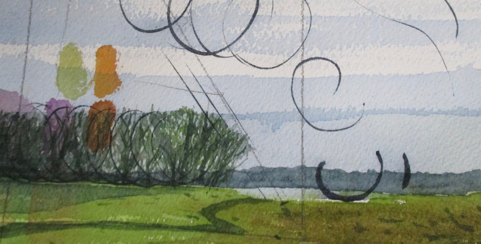
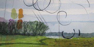
Any scrap of watercolor paper is valuable to me, assuming it is good quality paper such as Arches or Saunders which have been manufactured for centuries. If I lose interest in a watercolor for whatever reason I often turn it over and paint on the back. The other alternative is to divide the piece into smaller remnants which I can use as a test sheet for sampling color mixtures.
This is one of those test sheets. In fact, in this case, I used Arches watercolor paper which is a reliable friend where an artist can achieve an unlimited range of marks.
I had started a portrait on the back but had lost the excitement of how this watercolor was developing. Not only do I experiment with new color combinations but sample different brush techniques. For the speckled area in the sky I was experimenting with dragging the brush across the paper with a sharp angle.
It is fun to just play with the pigments and different brushes without any expectations. This intuitive approach is particularly rewarding as a way to loosen up if you have been away from painting for some time.
 |
| (C) 2018 Dale DiMauro |
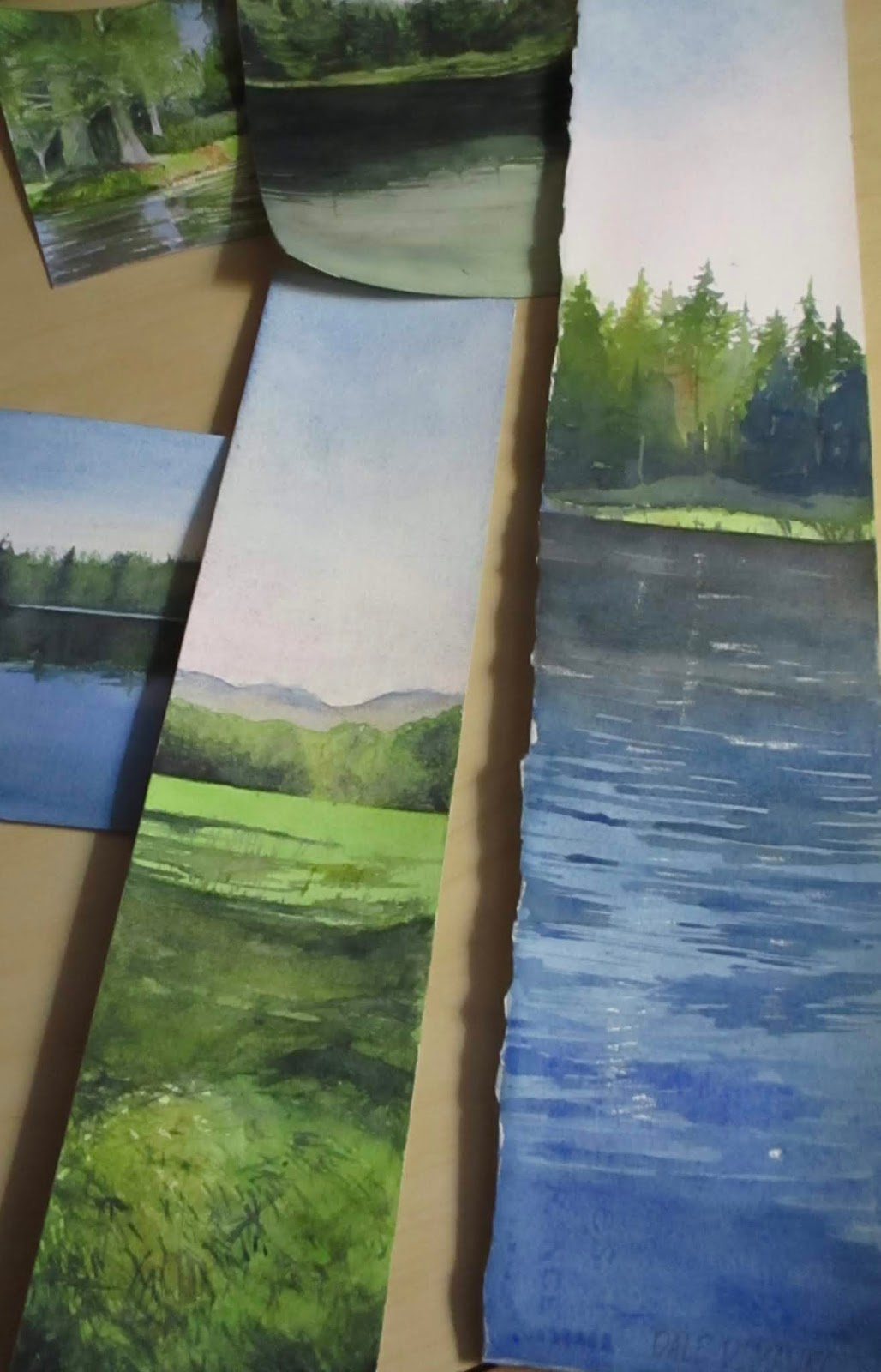
Recently, I spread out some of the watercolor paintings I have worked on lately. They were on my large drafting table where I work in the winter months. I was both impressed with the collection in general and how colorful many of my watercolors are. Since I have mostly been painting landscapes during the summer months, my palette has evolved to reflect the greens and blues of the season.
Since many are of odd sizes and shapes, they may be a challenge to mat and frame. Regardless, I have embraced the exaggerated horizontal and vertical formats when it seems appropriate. For example, a figure standing up reflects a vertical orientation when you are focusing on the individual. However, if an artist includes other figures or the larger landscape then that may lend itself to a horizontal format.
In my daily travels I make a note of colors I see out in the landscape and how I would approach a given subject. In addition, I may read or happen upon a color combination that truly moves me and find a way to incorporate this into my painting.
 |
| (C) 2018 Dale DiMauro |
This a watercolor without layers of glazing to build up the forms. I have been experimenting with different ways to develop a watercolor when time is limited, involving direct painting. Sometimes it is best, as in plein air painting, to get something down quickly before the scene or light changes. There is a freshness with this approach, in the application of the paint as well as in the colors of the mixtures.
In watercolor, how you handle the edges of your washes says a lot. You can achieve hard edges or soften edges or little of both depending on which affect you are seeking to achieve.
Lately, I have been experimenting with dragging my brush at a steep angle across the surface of the paper. As seen in the photograph above, when you drag the brush an artist can achieve a rough edge which gives a sense of texture to your painting. As a side note, I prefer a cold-pressed watercolor paper over hot-pressed or rough sheets as it provides some surface variation, yet can be drawn upon, if needed.
This photograph was taken inside at night with artificial light. As a result, I find the photographic qualities are limited, as far as achieving a strong contrast in light. I had misplaced my camera for several hours earlier in the day. Thus, with the days become shorter, I have learned it is important to utilize natural light whenever possible.
 |
| (C) 2018 Dale DiMauro |
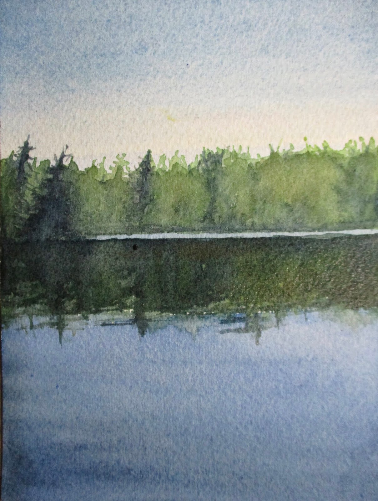
A few months ago I took a photograph of this scene while gliding across the water in my kayak. The composition of the three main landscape elements: sky, water and trees was stunning. Add to that the reflections from the tree-line and the placid water and you have a timeless scene. Every time I look at this photograph it stops me in my tracks.
It seems when you have two-thirds of the composition in sky or water(or landscape in other contexts) you can't go wrong depending on what you want to emphasize.
Earlier this afternoon I found a discarded, unused, sheet of watercolor paper and sought to see what I could come up with. It doesn't have the same proportions as I discussed above, but tweaked the pigments for subtle affect.
The light area in the sky has a wash which includes cadmium yellow and cobalt violet while the water has some indigo to enhance the value.
 |
| (C) 2018 Dale DiMauro |
How the seasons change. Quickly I may add. At least this year in particular.
This watercolor developed over the weekend, in between getting prepared for this early Winter. It is not that I was unprepared for the coming Winter but the shock of ice along our frozen roads has settled in and will no doubt be with us for quite a while. My occasional walk will not be as intuitive as it has been. Now I must truly be prepared for the elements.
To me, this picture has the look of an oil painting even though it is in fact, a watercolor. The angular marks in the foreground make it appear as if a palate knife had been used. Perhaps it even has the look of a french landscape in technique and subject, yet is the land at the base of the Brattleboro ski jump. I do like how a river or path leads the viewer into the landscape.
 |
| (C) 2018 Dale DiMauro |
These are two color combinations I have adopted this past month. I have a very small notebook which I jot down color combinations when I read or hear about what other artists are using. However, I am not sure where I came upon these, but they certainly are useful to draw upon in your palette.
The top one consists of cadmium red and permanent sap green. As you can see from the photograph it provides the artist with a warm yellow. It is well-known that some colors right out of the tube can be rather flat and unexciting. When this particular combination is mixed on my palette it appears so rich and full of life. This pigment combination is so new to me that I am still trying to figure how to best utilize it's qualities. Certainly, it can be useful in painting landscapes such as for fields or in the details of grass. Next to a dark blue such as a surface of a lake it may be stunning.
The lower swatch consists of cadmium red and veridian. It provides the watercolor artist with a warm gray. There are such a range of grays that can be made but this one seems to be a gem. A gray like this can make other more outgoing colors sparkle. Next to a red or dark green this gray is quite pleasing. When used in the foreground, for some reason, I like this gray best.
 |
| (C) 2018 Dale DiMauro |
In late August on a hot and humid day I joined a meet-up group to paddle on Lowell Lake near Londonderry, Vermont. It ended up being the perfect day to paddle and swim away from the heat in southern Vermont. We ended up eating our lunch at a picnic table on one of the many islands in the lake.
This landscape doodle, developed into more of a study, for hopefully, a larger watercolor. The reflections on the water and the exuberant growth along the shore caught my imagination. The water is not blue at all, but attractive with it's varied colorations and cleanliness.
When my time is limited, I have taken to experimenting with various-sized scraps of arches watercolor paper, at my disposal. In addition, I am determined to become proficient in the use of masking fluid by the end of the month. Watercolor artists use this to preserve the white of the paper in certain areas while continuing to applying washes.
 |
| (C) 2018 Dale DiMauro |
In the early fall, I heard we New Englanders, would likely have a strong foliage season. With all the rain we had since the middle of July or so, we were primed for vivid colors.
After hearing this on the radio I felt an obligation to hit the local trails. I had avoided hiking in the woods primarily, because of the lyme tick threat. The day I was out was one of the most pleasant days of the season. In fact, I thought there would be many more leading up to peak season.
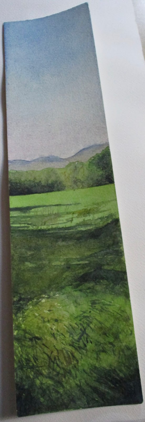
This is one of the last unused skinny watercolor sheets I had at my disposal. I like this slice of the landscape with it's vertical orientation.
Artists say that burnt sienna is an essential color for painting landscapes. Recently, I have increasingly embraced this pigment in depicting fields and sun-drenched foliage.
 |
| (C) 2018 Dale DiMauro |
Summer in Vermont seems like a long time ago now. This watercolor was inspired from a September paddle when it was still quite humid out. I feel like I captured some of that humidity and moisture in the greens of the foliage.
Over the course of this summer season, with all the moisture in the air and the plant growth on the land, my green palette has expanded. Some of my favorite green pigment mixes have become quinacridone gold/Payne's gray, and aureolin/Payne's gray. Also, I have taken to using Hooker's green on occasion with browns to achieve that green you may come upon in a sunny field.
In addition, shadow green was used for the water, above, which brings out the yellow-greens of the foliage along the shore.
Often I hear artists say that green is their most challenging color to work with. In watercolor it can be a grayish color or on the other spectrum become quite garish.
The British have such a rich history in landscape painting in the medium of watercolor. From the golden age of watercolor which spanned the mid-eighteenth century through the mid-nineteenth century, many accomplished painters emerged. Some of these watercolorists include Paul Sandby, John Constable and John Sell Cotman. Meanwhile, that tradition has carried on through the modern day.
One contemporary British painter which I have come to admire is David Curtis. This led me to purchase his book, David Curtis: Light & Mood in Watercolour several years ago. I like both his studio and plein air approach. Many of his recommended color combinations I have put to use.
These British watercolor painters are noted for their expression of warm, soft light, strong neutral colors(warm & cool grays & browns etc.) and limited in areas of strong contrast.
I have painted some watercolors based on his approach. Some of these most likely will find their way into a future post.
 |
| (C) 2018 Dale DiMauro |
There is no better place to hike than on Mount Desert Island. I truly mean that. Except this year the trails were overpopulated. My wife and I read the National Park Service is going to limit private vehicle access by instituting an extensive bus service in the future.
This is one of those late afternoon hikes we took to escape the heat of the day. This year in particular, the heat felt unrelenting day after day, even in Maine.
The views of the water are always captivating. It always a pleasure to see one of the large schooners glide by with their mast peeking above the tree line or glide behind a clump of evergreens.
This is a classic landscape subject with sky, trees, rocks and water. There is an intimate quality to the foreground space with the larger landscape in the background. I like it when the whole story is not revealed in one glimpse. It is better to leave something for the imagination.
 |
| (C) 2018 Dale DiMauro |
There is a lot of color in this painting, which I like. There is also a lot of space above my head which is important in this composition. It gives this picture context with all it's urban lines. In fact, there are few soft materials expressed in this watercolor.
However, it is good to take on new subject matter. Not only is it a self portrait, which is a challenge in of itself, but the perspective is complicated.
This watercolor is painted on a full sheet which measures 22" x 30". On this scale the viewer is immediately drawn into the scene.
The building behind me is One Monument Square. Thus, this location feels rich in history. A cross roads, literary, of travelers, fire and cultural relevance.
 |
| (C) 2018 Dale DiMauro |
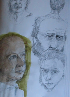
This is the time of year when I truly dig into my sketchbook as the days become shorter.
I am always eager to improve on capturing the human anatomy. Or at least I aim to.
Lately, I have been adding watercolor washes to some of my portrait studies done in pencil. This gives life to the drawings. I am usually thinking about composition and which color combination to consider when working on these.
This is also the time of year when I do the bulk of my book reading. In the last month I have been actively reading six books. Two that I finished. One, Grant, by Ron Chernow, is nearly one thousand pages long. Often information from these readings seeps into my drawings. For example, how can you not sketch Grant without considering his involvement during the Civil War.
 |
Photograph Dale DiMauro
|
Last April my wife and I took the Amtrak to Philadelphia, PA. We toured the city largely by foot, primarily exploring the historic sites. I had won two free nights at a hotel of my choosing. So Philadelphia seemed like a logical destination as Spring would be further along than here in Vermont.
While touring some of the old buildings we came upon an exhibit featuring the portraits of Charles Wilson Peale(1741-1827). I learned that he was not only a painter, but a scientist, inventor, politician and naturalist.
However, we learned that he was a prolific, portrait painter. He is best known as a painter of the leading figures of the American Revolution including close to sixty portraits of George Washington. In addition, Peale painted Ben Franklin, Thomas Jefferson and Alexander Hamilton amongst others.
Recently, I learned that Peale's full-length portrait, Washington at Princeton, painted in 1779, sold for $21.3 million. This sale, in January 2005, set a record for the highest price paid for an American portrait.
These paintings are not watercolors but done in oil.
 |
| (C) 2018 Dale DiMauro |
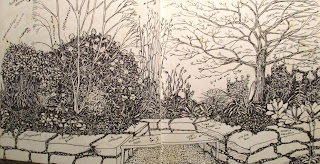
This weekend in southern Vermont we had our annual Brattleboro Literary Festival. Writers and readers from all over converge on our small town. I worked this event setting up and taking down venues all weekend. As a result, I am tired and did not do much painting lately.
This drawing I did many years ago. It is in essence a planting plan for a small, local garden with a new retaining wall. Most landscaping you find around peoples homes use a limited variety of plants. The selected plants here are allowed to grow to their natural state instead of being hacked back all the time. In addition, these plants bloom at overlapping times, throughout the growing season.
I posted this image because it demonstrates the power of drawing. A drawing can move people in ways no other means of communication can. It leaves an indelible print on the mind. In fact, I have had people attempt to steal my landscape drawings as they were so compelling in expressing ideas.
With a solid drawing your watercolors are so much more impressive. You can address problems areas earlier in the painting process or eliminate them altogether.
 |
| (C) 2018 Dale DiMauro |
A few summers ago, my wife and I were taken by a relative, to this prime blueberry picking field in Maine. The landscape was lush with moisture in the air and on the ground. There was even an old, stone structure commanding the high point in the field, capped with a green roof. In the distance is the site of the notorious dragon concrete plant.
Capturing the atmospheric qualities of this landscape may perhaps, best be achieved in watercolor. If I exaggerated the misty horizon, you the viewer, may have had a better sense of what this place was like on this particular mid-summer afternoon.
One of the challenges to communicate in this picture is a sense of depth or perspective when there is
no road or river to draw the viewer into the scene. If done well, the patterns of growth and coloration
will meander across the field and upon the dark green foliage taking you to the distant body of
water.