Sunday, October 17, 2021

Bookmark Anyone?

                                                              (C) 2021 Dale DiMauro
 

Any size painting can lead to a lovely watercolor. This odd-size painting was done in less than half an hour. I used only two pigments in creating this picture - ultramarine blue and quinacridone red.

The gradual blending of pigments often yields positive results. In addition, recently, I have rediscovered the importance of not covering the whole page with pigment. The white of the paper is beautiful in it's own right with it's texture and all. However, up against the white of the paper, any pigment has an expressive vibrancy unlike any other medium.

It is easy to overwork a watercolor and when that happens much of the freshness or even directness is lost. 


Wednesday, October 13, 2021

River's Edge

                                                                                       (C) 2021 Dale DiMauro
 

Since late summer I have been experimenting with the three primary colors: red, blue and yellow. This is the product of one of my more recent experiments. I love the rich, fluid blending of colors. In particular, I like the darks which add so much to a watercolor painting.

The pigments used in this watercolor are: yellow ochre/permanent brown/ultramarine blue. I find the absence of color(the white of the paper) compelling when edged by darks. Also, this scenario seems to add depth to the landscape on the paper.

This was painted in an inexpensive watercolor book with 80# paper. It is very smooth paper. It simply shows - that it is important to paint on as many surfaces as you can so as to be flexible or adaptive in your painting approach.


Sunday, October 10, 2021

Black & Blue

                                                                                       (C) 2021 Dale DiMauro
 

For some time, in the evening, when watching television with my wife, I have some post-it notes on hand. Often I ponder what color I will get when mixing certain colors in my mind. I then write down these color combinations so I can try them out later. 

This dark blue - black is the product of one of those evenings watching television. In watercolor, as many of you know, it is hard to find a rich dark approaching black. Most tube blacks are dull and uninteresting out of the tube. In contrast, however, when pigments are combined they usually become rich and lively.

When I mixed this combination of yellow ochre/permanent brown and ultramarine blue the whole sheet of paper came to life. I started applying this mixture in other watercolor paintings and became totally inspired.

Basically, the combination of yellow ochre/permanent brown and ultramarine blue are a variation of the three primary colors: yellow, red and blue. There are so many combinations of these primary colors for artists to explore that it is overwhelming. However, I find it rewarding to experiment along the way and increase my knowledge so that later on I can draw upon this in my painting.

Wednesday, October 6, 2021

Today's Plein Air

                                                                           (C) 2021 Dale DiMauro
 

It turned out to be such a beautiful day after many days of rain. As a result, it was great to get outside and fit in some watercolor painting.

This picture was done at the Brattleboro Common, which has a service road that can look at times like a dirt path. Many people were taking advantage of the services the park provides today.

Overall, it was a pleasant painting experience. However, after the watercolor dried and I had stepped back some, I noticed the lack of variety in the spacing and size of the trees in the background. Other than that I have no complaints.

I did use a Winsor Newton watercolor block. All summer long I have been painting on Arches but I am fine with either painting surface.

Sunday, October 3, 2021

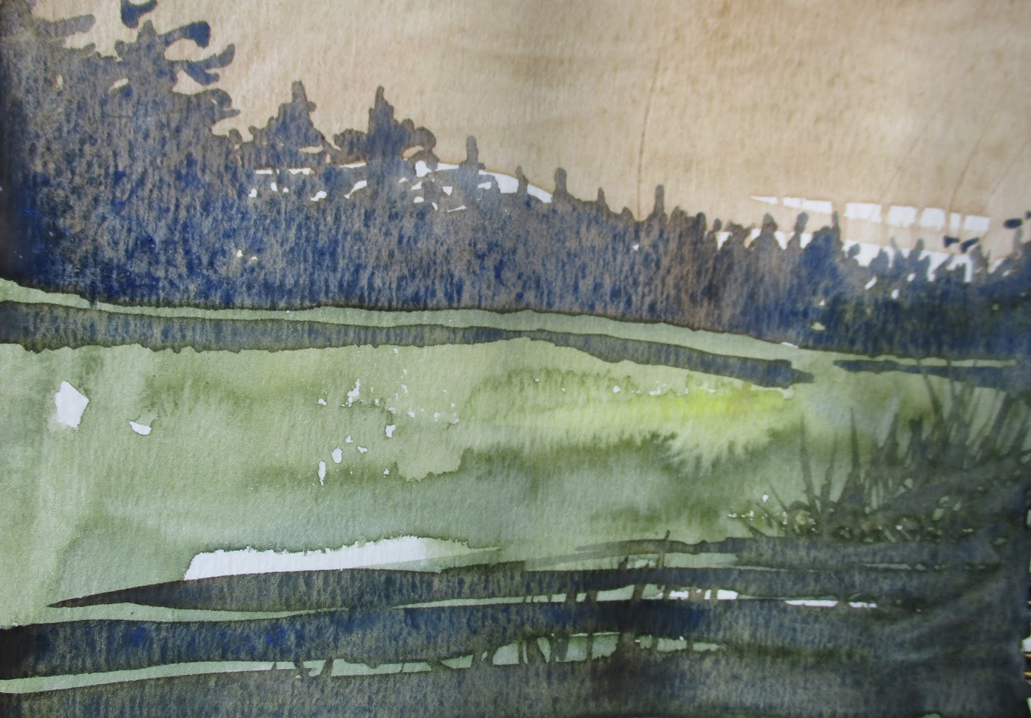
The Retreat Meadows

                                                                             C) 2021 Dale DiMauro


My wife and I attended one of these Thursday evening food roundups late in the summer, down by the Retreat Meadows. We couldn't believe the number of people in attendance nor the length of the lines to each vendor.

What we did experience was this amazing sunset over the Retreat Meadows, which lit up the landscape in a most spectacular way. The glow across the distant hills and grasses in contrast to the shadows across the water was striking.

This experience became the inspiration for this watercolor, which I soon started. Also, I was struck by the dark foliage which framed the view on the top of the painting. 

With peak foliage upcoming I am sure to view this area much differently than the grungy-feel of the earlier summer milfoil season.

Wednesday, September 29, 2021

USING DARKS

                                                                                       (C) 2021 Dale DiMauro

Many artists complain their colors appear bleached or lack strength. Thus, they do not get greater depth in their paintings.

I have certainly complained when my watercolors lack life. Over time I learned to combine dark umber and ultramarine when I want a warm dark. After time experimenting with this combination I can say this dark has transformed my painting. 

In almost every painting I drop in this color combination, whether it is at the foot of a woodland edge, the trunk of a tree or the edge of the lawn etc. 

Nevertheless, I am often searching for other darks to utilize in my painting. This purplish color above is the result of combining ultramarine blue/alizarin crimson and burnt siena. The jury is still out on this dark but I embrace the variety of options for when the right opportunity presents itself.

Monday, September 27, 2021

Color Swatches

                                                                            (C) 2021 Dale DiMauro
 

If I have less than an hour of idle time I often make color swatches. There seems to be an endless number of pigments one can combine on a sheet of paper. However, over time I believe I have learned much about the characteristics of certain pigments.

Along the way one learns how the pigment reacts to certain paper or dries in a particular way. For example, Payne's gray, in general, dries much lighter than the value you see when it is wet.

Often, I paint little landscapes over the initial washes as time allows. This includes a wide range of colors for the sky as it is here that sets the mood for the image. In particular, I like it when the sky develops a mottled appearance, with variation, from the settling pigments.

Wednesday, September 22, 2021

Groton State Park

                                                                           (C) 2021 Dale DiMauro
 

Last summer, by accident, my wife and I discovered Groton State Forest, east of Montpelier, VT. This forest totals 26,164 acres with seven state parks, eight lakes and ponds and a nature center. The civilian conservative corps was critical in developing the area - constructing roads, trails, picnic shelters and planting trees.

Due to Covid-19, last year, we drove inland away from the coast(and populated areas) on our way back from Maine. This summer we re-visited Montpelier, Vt which has the smallest capital of any state in the United States. We made a day trip to hike in the Groton State Forest in July.

This watercolor was inspired from that experience. As the picture shows, there is a great uninterrupted expanse of forest with zero development to the horizon. You really feel like you may run into some form of wildlife you have not seen before or rarely see when hiking on these trails.

Monday, September 20, 2021

Abstract Wash

                                                                                 C)2021 Dale DiMauro

Watercolor painting seems to largely involve applying washes of color while developing soft and hard edges. How you articulate these edges you paint is really descriptive of your subject matter and reflect your signature style at the same time.

The quinacridone violet I used here reminds me of a visit to the mall, in Washington DC, in the spring, when the cherry trees are in bloom. We carry these strong color associations with us throughout our lives.

The hard edges in this image guide your eye through the landscape which I find fascinating. My parting wisdom is that it is always rewarding to play with color to see where it will take you.


Wednesday, September 15, 2021

Along the West River(Brattleboro, VT)

(C) 2021 Dale DiMauro
 

Recently, someone added benches along the West River Trail in Brattleboro, VT. They are sited to take advantage of lovely vista's up or across the river. It even appears that someone cut back the brush in some areas to expand the views.

This was painted from one of those benches. However, it started raining once I set-up my plein equipment. One result was a bunch of watermarks and brown blemishes, on the paper, once dry. So I came back a week later and carried on. 

This picture has an English feel to it with muted colors and diffused light. I feel that all that is necessary is to add some finishing touches. The unpainted figure is a man paddling his red canoe which happened right before my eyes.


Sunday, September 12, 2021

63rd Annual Art in the Park

                                                                            (C) Photograph Dale DiMauro
 

On Saturday, September 4, 2021, my wife and I attended Keene, NH's annual Art in the Park. It was a beautiful sunny day and many people were out. As a matter of fact, I couldn't believe how many people  visited the park. 

I had been to Keene, NH twice in the last two years and one of the times was to have a colonoscopy. So I didn't know what to expect of our visit. However, we ran into many people we knew at the festival, including some who were vendors.

With the ongoing Covid-19 pandemic, it was unclear, at least back in the spring, whether they would even have Art-in-the Park this year. Well it was a hit this year even though on the closing Sunday, the last day of the event, the weather was not nearly as nice.

Wednesday, September 8, 2021

Latest Plein Air

                                                                   (C) 2021 Dale DiMauro
 

We have had such beautiful weather, lately, that I have been making a strong emphasis of painting outside, when possible. Recently, late day has been my preference for painting outside.

I painted this picture prior to dinner on Sunday. It evolved rapidly, as I wasn't sure what direction I wanted to go as far as subject matter was concerned. This picture was completed in one sitting, all outside.

This watercolor has a unique perspective which drew me to the subject. There is a lot of elements in this picture with a sense of an elongated depth, which the light dramatically reveals.

Painting outside educates me in more ways than one. Also, I find it is important to use my time wisely. Finally, the experience makes me truly see things as they are  - whether it is the colors of nature or the lay of the land.

Monday, September 6, 2021

Plein Air

                                                                                      (C) 2021 Dale DiMauro


This plein air was painted entirely outside last week on a lovely afternoon. It was painted very much in the spur of the moment. I am sure it is a quirky little picture and that may be why I like it. After I started this watercolor I was swarmed by kids - as this area was where they waited for their rides home from school.

When I go plein air painting there usually is a location in mind with an understanding of where the natural light might fall. In this case I found the lay of the land appealing and this shed full of character with some boards tacked on in a rather random manner.

The warmth of light and how the trees in the background came out were quite satisfying as I progressed through this picture.

Wednesday, September 1, 2021

Plein Air Painting

                                                                            (C) 2021 Dale DiMauro
 

The sun finally broke out yesterday afternoon, so I got an hour in, on this plein air painting. Little did I know that a sizeable bullfrog was with me at the base of this wall. He or she must have been at least six inches in length. It was simply bathing in the afternoon sun. No matter what noise I made or how close I got it would not budge the whole time I was there.

This watercolor is directly the result of painting what I saw in from of me, minus some extraneous stuff. I like the abstract qualities of the elements in this landscape. Before long the sun had become strong and I could sense a quality of fall rapidly approaching.

Lately, I have seen a great heron frequenting a log in the water as it hunts for a meal. It is quite a site with it's long angular wings tucked in by it's side.

Sunday, August 29, 2021

Local Woods

                                                                              (C) 2021 Dale DiMauro
 

This scene pretty much sums up the 2021 summer for me, here in southern Vermont. From my perspective it was very wet and humid, for long stretches, while even dark at times. I can't remember a summer like this and I hope it is way different next year, in all aspects.

On the other hand there is a quality to this watercolor which I find calming and refreshing with the various greens of the forest vegetation. Perhaps, it is that these recognizable colors and patterns of the local flora are familiar and recognizable. 

Seldom do I work on a painting that doesn't really have a sky. This is what may evoke an element of mystery to the whole scene. After all, watercolor is the medium for conveying atmospheric conditions.


Wednesday, August 25, 2021

Oil Painting

                                                                                   (C) 2021 Dale DiMauro
 

Lately, I have been getting the itch to paint in oil. I realize this is a watercolor blog but there are times when working in other mediums can improve your painting skills. 

What is most appealing to me is painting with a palette knife. Paint thinners are not necessary making clean-up very simple. You can even paint a whole picture with just one palette knife which provides room for a lot of creativity.

Last week during the heavy rains I thinned out some books and came upon this small book by Hazel Soan, titled Learn Oils Quickly. I immediately read it and in the process became inspired to paint in oil again.

Sunday, August 22, 2021

Plein Air: Neighborhood Park

                                                                                       (C) 2021 Dale DiMauro

Of all the plein air painting experiences I have had, this was one of the most pleasant. You truly don't know what's going to happen - it could snow or an unfed dog could come bearing down at me.

Yesterday my wife and I decided late in the day we would walk to an outdoor concert - once we figured the rain would hold off. So I had about one hour and a half to settle on a site to paint and then paint it. This is a result of that time spent three blocks from my house. Fortunately, the park had only a handful of people as I had to focus on my task at hand.

This watercolor was painted on a small watercolor block so I had to simplify my composition. Many trees in the foreground I excluded from the picture both due to a lack of time and it would have made the scene way too crowded.

The colors were much more livelier and richer when the paint was wet, but I like the overall character of the scene and the vegetation in general. When you paint outside it is good to have modest expectations because you don't always know what you will come up with in the end.


Wednesday, August 18, 2021

Watercolor Study

                                                                             (C) 2021 Dale DiMauro
 

For some time I have been meaning to plunge into a watercolor without much planning and this is what I have to show for it. Mentally, I broke the composition down into thirds(as in a third of the paper), made a pencil mark and started painting. 

Actually, this is how I have been painting smaller landscapes for over a year with either one third of the composition dedicated to the sky or the landscape. If the sky is really interesting that area becomes more dominant but usually the landscape is two-thirds of the painting. I find this approach pleasing to the eye as the landscape has much variation with it color changes or gradations of light.

On the top of the sky I did have a mishap with too much red looking like a blob. I was able to lift most of the pigment out after it dried with a scrubber.

I do love the simple contours of the land and the vibrancy of the colors.

Sunday, August 15, 2021

Watercolor Study

                                                                             (C) 2021 Dale DiMauro


The beautiful weather today led me to Guilford, Vermont - to the Green River and it's covered bridge. I hadn't been there in years and forgot how special it is to be there with the river, waterfall and historic bridge all in one location.

This watercolor was today's plein air painting. Often it is a challenge to finish a painting outside. However, I am pleased with how far I got with this picture. My only criticism after stepping back from the painting is that the river in the foreground doesn't quite read as water. It needed to be a bit darker in value but it has many of the colorings I found on site.

This year in particular seems to be a season of greens and browns with all the rain we have received. The river bottoms have been stirred up for much of the season and the greens are more vibrant than I can recall for so late in the season.

Wednesday, August 11, 2021

Abstract Landscape

                                                                                       (C) 2021 Dale DiMauro


If I am pressed for time I at least try to put down some washes on a piece of paper or make a quick sketch. This image is one such case. By doing this I continue to evolve or maintain engagement intellectually as far as color mixing or considering the next step in my painting process.

This landscape primarily has pigments I had not combined before. However, Cerulean blue is dragged across the paper to suggest the sky with no other pigments included. The foliage is the combination of Hansa yellow and Phthalocyanine blue which gives me a lively green. The beach color is the pairing of quinacridone red and yellow ochre which creates a substitute for raw sienna. On top of this I painted ultramarine blue which gives the water a grainy, yet transparent quality.

Lately, I have been limiting my use of cadmium colors while finding substitutes. It seems that cadmium pigments are being phased out for health reasons. Also, it is important to be flexible and make use of what ever pigments you have available even if they are not always neatly arranged on your palette.

In conclusion, I keep thinking about this little watercolor doodle as it has left such fresh and lively markings on the paper and in my memory. It is something to build on for future reference.